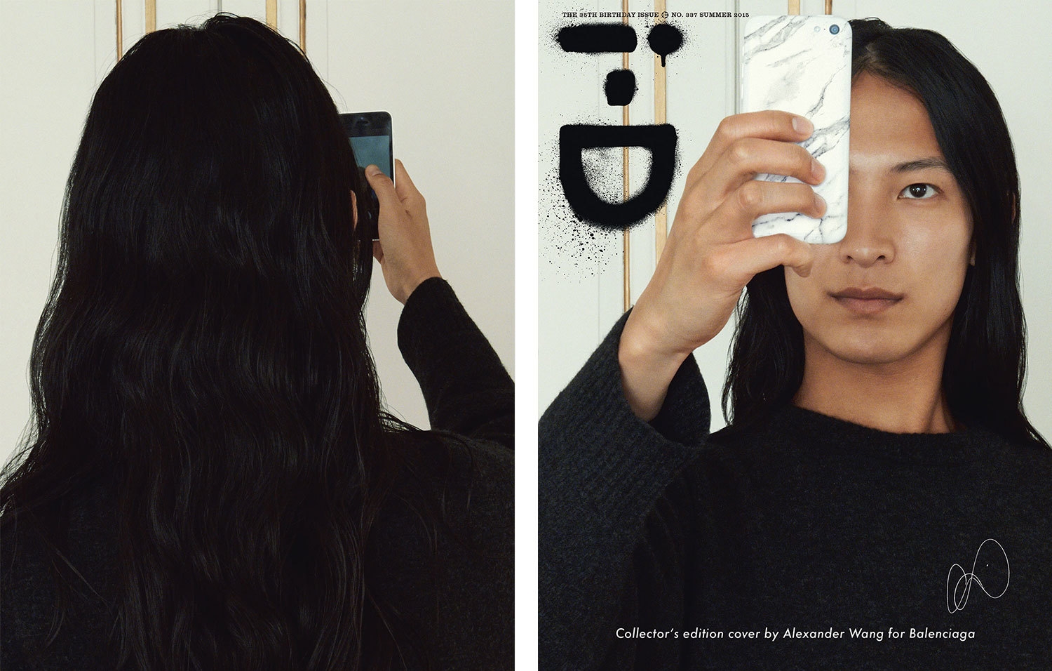
magazine cover // 35th birthday issue of i-d magazine
11 designers re-imagined the i-d magazine cover for their 35th issue. raf's is my favorite!


11 designers re-imagined the i-d magazine cover for their 35th issue. raf's is my favorite!
robert rauschenberg once said, "curiosity is the main energy." he was the father of the found image and has been my favorite artist since high school. although my tastes are always changing, rauschenberg's words and art continue to inspire me, some ten years later.

hannah whitaker // "used in-camera masking to produce different views of a globe on a single sheet of film. the process transforms the world into a random configuration."
so excited by the new york times magazine relaunch. the covers are magical as is this recap of its recent evolution. jake silverstein says, "we have set out to honor the shape of the magazine as it has been, while creating something that will, we hope, strike you as a version you have never read before."
the design director, gail bichler, on the many covers: "we asked several artists to make works based on the idea of chaors in the word, and this is something we have all learned to live with. the only constraint we gave them was that they had to use imagery of the earth or a globe."

maurizio cattelan and pierpaolo ferrari // "their image of the globe shows "a protaginist erasing the surface of a troubled earth. all at once there is equal terror and peace"

sara cwynar // one of my favorite artists, "took an old photograph of a globe and ran it through a digital scanner to show "the conflation of old imagery with new technology, a view of a globe drastically altered."
* images via nyt *
i've long been fascinated with images. there's something thrilling and visceral about seeing an iconic or poignant image. images are like works of art and symbols of visual culture that i curate and collect every day. and these snapshots continue to inspire and inform me beyond my first glance.
magazine covers often catch my attention with their juxtaposition of text, graphic design and photography. i've come across several different bloomberg businessweek covers that have really stuck with me. although this is a magazine i wouldn't typically pick up (it's a financial publication), i find the covers to be bold, ironic and clever. i like that they are visually stimulating and that they make me think (and sometimes laugh). now i need to sign up for a subscription!

bloomberg businessweek // june 2-8, 2014

bloomberg businessweek // feb 7-13, 2011

bloomberg businessweek // aug 15-28, 2011

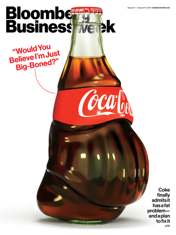
bloomberg businessweek // aug 4-10, 2014

bloomberg businessweek // may 2-15, 2011
some thoughts: i previously used this steve jobs cover in one of my collages and i dig this cover as well. interesting yet odd that my favorite covers came from 2011 and 2014.