small talk // kristy santelli // jewelry designer of drift / riot


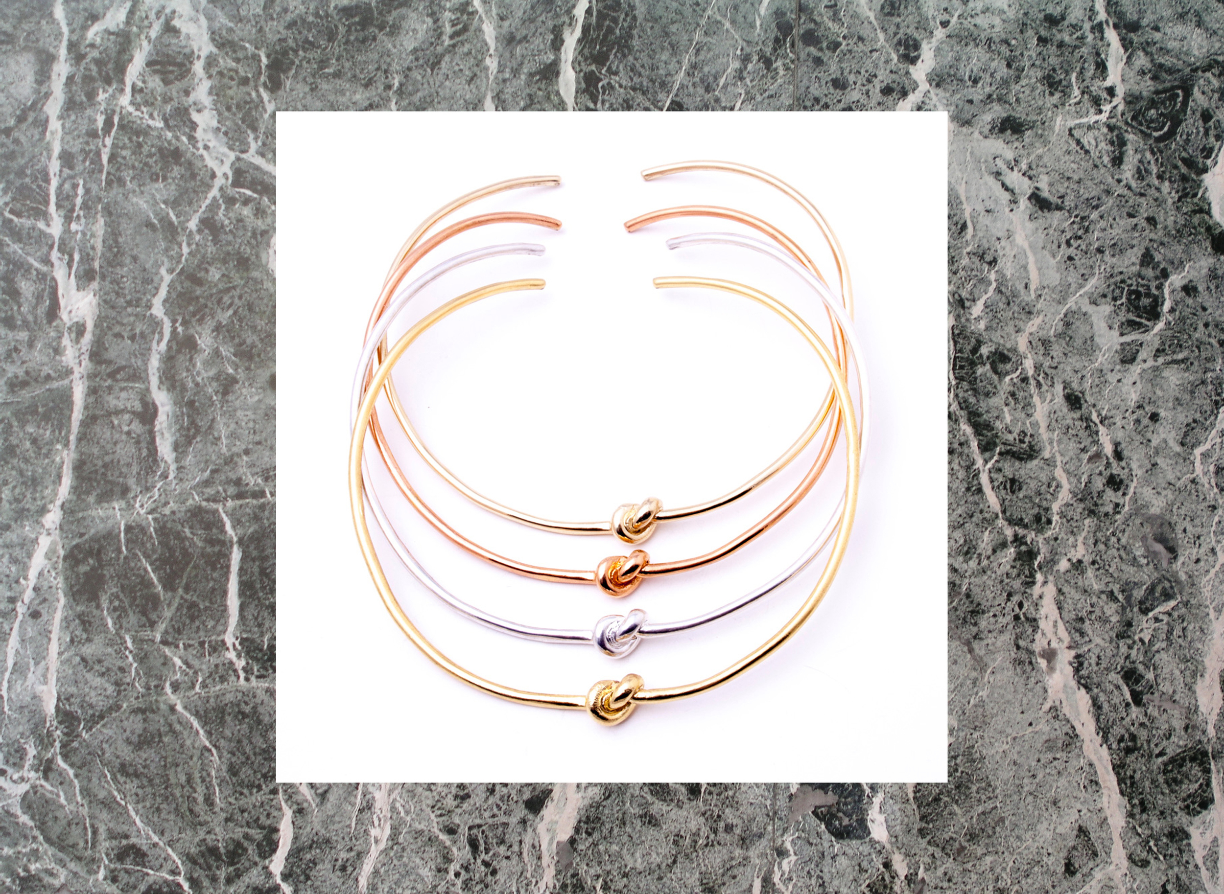
i met kristy santelli at the capsule womenswear tradeshow this past february. kristy is a jewelry designer and art educator based in richmond, virginia. she runs drift / riot, a line of incredibly cool handmade jewelry. i immediately fell in love with kristy's knot chokers above and found chatting with her just like talking to an old galpal. since metals are very malleable, kristy's design process is both organic and sustainable allowing her to easily re-use jewelry by melting it down and starting over. is it just me or does this sound like a life metaphor?

more about kristy + drift / riot below:

cultureisland: tell us more about you.

kristy santelli: i moved around a lot growing up. that's really where the drift concept comes from. i was always moving to the next place and readjusting to my surroundings -- i loved it! i studied at fit for my undergrad and have a degrees in fashion merchandising + ad comm. i took the first job i could get out of college and waitressed to make my rent, i was first a set designer (working on sets for oprah + jay-z) and then got into fashion pr. i realized working there that i had to do something with my hands, i hated sitting at my desk and writing. so i started taking a photoshop class to help with press releases and flyer's. then took a lifestyle drawing class at sva and became addicted to making. i decided to pursue teaching art where i could work with students making all day and still teach. i'm in my 5th year teaching high school art classes while also running drift / riot. it's getting harder and harder to juggle both but i really love working with my kids so i will keep teaching as long as i can. i started working with metal at fit but revisited the medium during my masters at vcu. taking metals at vcu started as way to get out of taking another theory class but it really became something i feel in love with. i would be at the studio until midnight working on a ring instead of working on my thesis! from there i started making pieces for friends and then met my fiancé, who not only is the love of my life but really the reason i began drift / riot. he motivated me to take it to the next level and just go for it. he also designs my kick ass website so we're a pretty good team! 

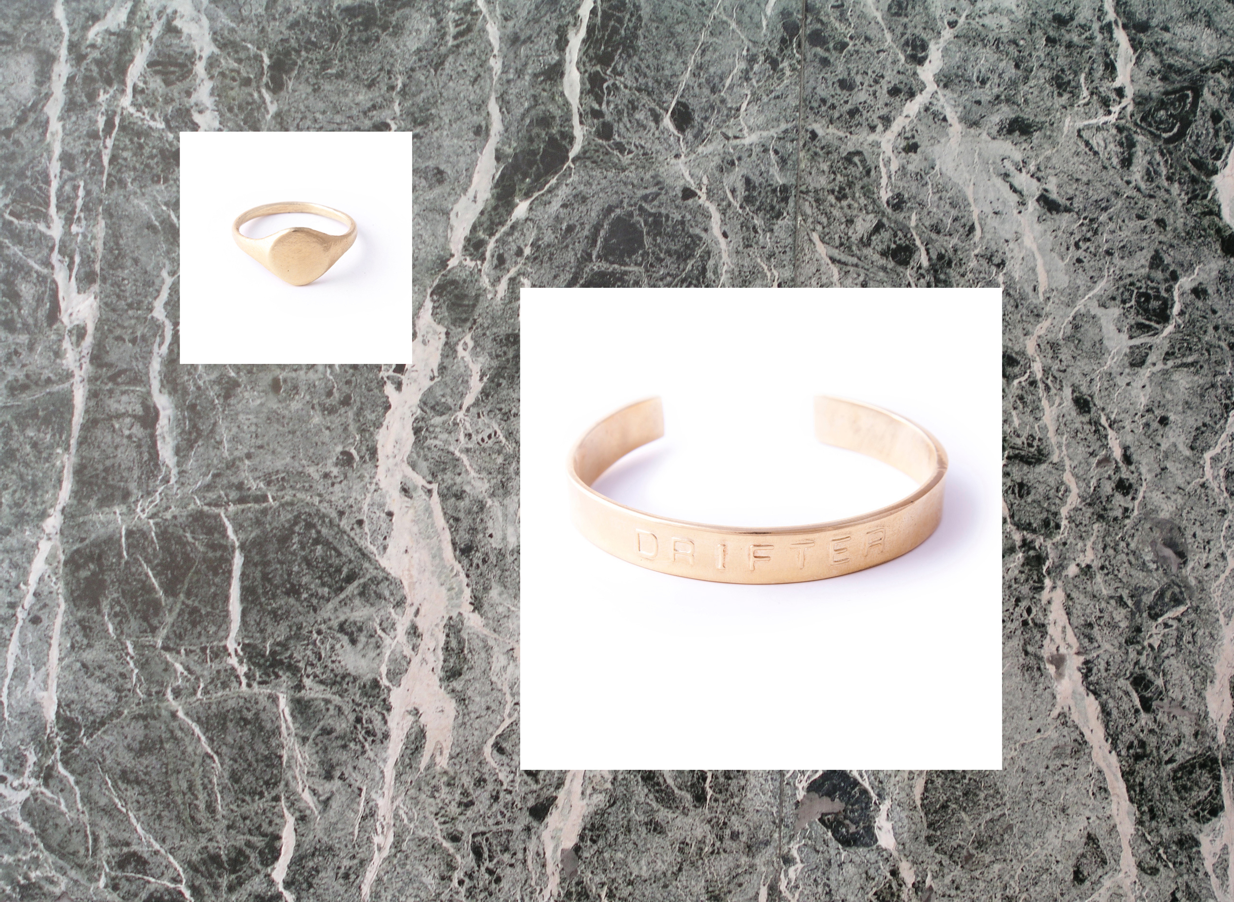
drift / riot signet ring + drifter cuff

drift / riot signet ring + drifter cuff

cultureisland: tell us more about drift / riot.

kristy santelli: drift / riot is my baby. i started selling at a local boutique before i had a name. but product kept moving and people wanted to know about the brand. i decided it was finally time to put myself out there. i am a drifter at heart and have always drifted so that was the easy part. but i wanted my company to be more dynamic than just drifting. so my sister and i started brainstorming names that might work. i think she came up with riot  and as soon as she said it that was it! i like how it's a juxtaposition, kind of dueling philosophies. i liked the idea of making it a riot -- going crazy with it, maybe adding a little humor, and really just going for it! i like to hear what other people think it means. 

drift / riot brass tube + textured hoops

drift / riot brass tube + textured hoops

cultureisland: what is your design process? what kind of products do you make?

kristy santelli: we make lovely things for your ears, neck, fingers, and wrists! i just started making tie clips for men and hair pins which i love. my design process is a bit chaotic. i don't have a lot of time so when i'm in making mode i tend to kind of vomit all of my ideas i've had built up. i'm working on creating more of a collection when i design now and trying to sketch out my ideas before hand. i want to have more of a theme or fluid direction. but it's definitely challenging when time is limited. 

cultureisland: do you stick with the same styles and/or release new styles seasonally?

kristy santelli: i have products that i love and that are really timeless so they will stay but i'm working on releasing new products that have more of a theme every season. i go back and forth and cut products when i don't feel like they fit anymore. again, it's hard for my to scale it back! a lot of times it's about the challenge of making it. 

cultureisland: who is the drift / riot customer?

kristy santelli: i love our customers -- it's crazy but we really cater to every age. i know high schoolers that rock drift / riot but i also sell at many high end boutiques that cater to women 40 and up. i have a lot of women that are in their 50's that are my best customers! and they know how to wear it. that's another thing i love about making jewelry -- it's something you collect over your lifetime + pass down. 

cultureisland: what plans do you have to grow the brand?

kristy santelli: oh wow -- where do i begin? we are looking at buildings in rva to open a store. my dream is to have the bauhaus of jewelry. where people can come and learn, shop and hang out. to create a place that encourages other artists and helps them expand. would love to house visiting artists and help them get their start, build them a website and watch them grow as well. it's not about me but it's about the community and bringing people together.

cultureisland: where can we find drift / riot in stores?

kristy santelli: we have always been focused on bringing people to our site as an in-house brand. but have just started working with wholesalers. although we are trying to be mindful as to where we place the brand. we want to sell to store we admire and care about their customer. right now we are at need supply co., sunroom austin, rosewood clothing co. and have a few others on the horizon which we are very excited about! 

cultureisland: where do you find inspiration?

kristy santelli: everywhere! it's hard not to be inspired. i have to sometimes shut off my surroundings so i can focus on a collection. it's so easy to go crazy but limiting that selection is what's challenging for me. 

cultureisland: what are your favorite places to shop, eat, hang out and grab coffee around richmond? any other richmond based brands we should check out?

kristy santelli: my favorite places to shop are need supply co. + rosewood clothing co. they are my go-to's. my favorite restaurant is stella's and the most amazing coffee is the nitro brew at sasion. richmond full of makers! my two other favorite jewelry brands are giantlion + young frankk, na nin makes my favorite candles + perfume oil, emimade has really cute ceramics, and ledbury for the men in your life. 

cultureisland: what are you listening to right now?

kristy santelli: ha, right now kygo / firestone is playing! but i also teach spin classes at a local boutique here in richmond so i'm constantly making playlists and love love love all music. when i first started drift i named all the product after songs. i think i'm going to start that again. 

* check out drift / riot jewelry here // instagram // facebook // twitter *

required reading // links worth sharing vi


1. red comme des garçons: innovation, provocation is an exploration of rei kawakubo’s radical approach to design with an exhibition format that takes inspiration from her 2001 comme des garçons presentation at walter van beirendonk’s antwerp fashion festival mode2001.

2. the department of signs and symbols is a new art project space that recently opened in vinegar hill, brooklyn // founder mitra korasheh says, "what we want to do is use the section in the back as a studio space for artists because we want to show emerging artists who do not necessarily have a studio space in new york. so part of our programming is going to be that the artist can have the space while a different exhibition is going on, preparing for their show.”

3. in the studio: photographs is a three-part show organized by gagosian gallery that explores the relationship between an artist and ones studio // hyperallergic writer jeff mcmahon questions, "any of these photographs of artist studios call into question just what is this thing called 'studio.' perhaps the establishment of such a place displaces the centrality of 'home,' setting a place apart for creation (and commerce). is the studio an externalization or perhaps a partitioning of the artist brain?"

4. marc jacobs recently announced the dissolution of his marc by marc jacobs line // w interviews him about his future plans + re-making his mark: “marc’s is a brand of his own experience, a brand of his whole world, and we want to show that on a bigger stage than we have so far,” says pierre-yves roussel, chariman + ceo of lvmh.

5. an excerpt from brittany howard's interview with joe rhodes of nyt on the new alabama shakes album, sound & color: “i don’t care if we get another chart-topping hit,” she told me. “i suppose it would be nice for my family. i could buy my dad a truck.” but if she and the shakes had to go back to being a barroom band in northern alabama, she would be fine, she insisted. she would get a day job and write songs, just like before. “i’d write probably even better songs,” she said, “ ’cause then i could write about how i had everything and lost it.”

6. visual history repeats itself: “we live in times now that show we clearly haven’t learned. what function do these images have if they are to inform us?” says clare grafik, head of exhibitions at the photographer's gallery in london // nyt reports on a new exhibit there, human rights human wrongs, open thru april 6

7. fran lebowitz, cultural critic, writer and occasional actress, tells elle "what's the point of being young if you're not going to make new things, i wonder? // wise words.

8. heated words // a recent london exhibit examines iron-on typefaces from the 70s + 80s.

9. "the gift shop" is a recent pop up at redbull studios new york by alldayeveryday // it's "a take on the traditional museum shop that sells specialty goods carefully curated  by creatives... the new, permanent fixture engages independent artists from within its own community with the purpose of creating a participatory experience that evolves with time and space."

10. and an entertaining tumblr worth sharing: animated text

* random research led me to the above documentary


small talk // michael yuasa // yuasa studios


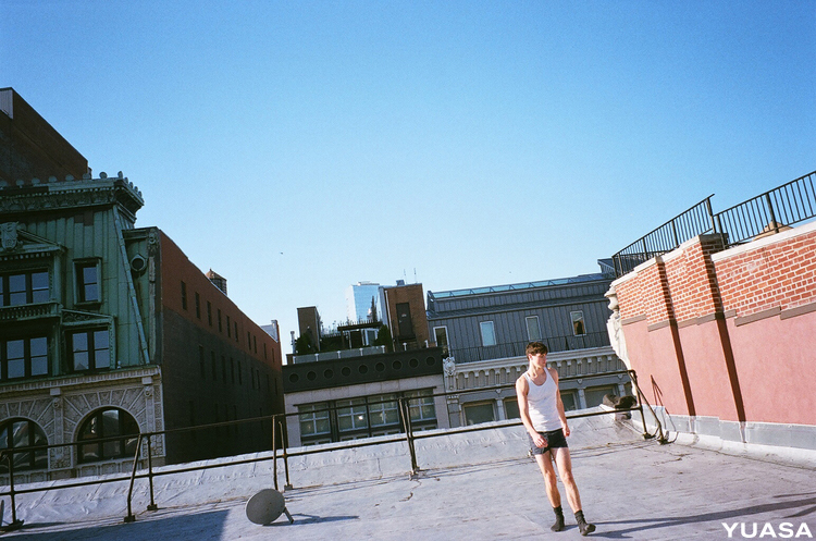
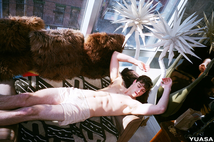
yuasa shot by andreas lux

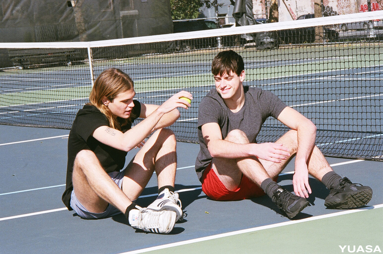
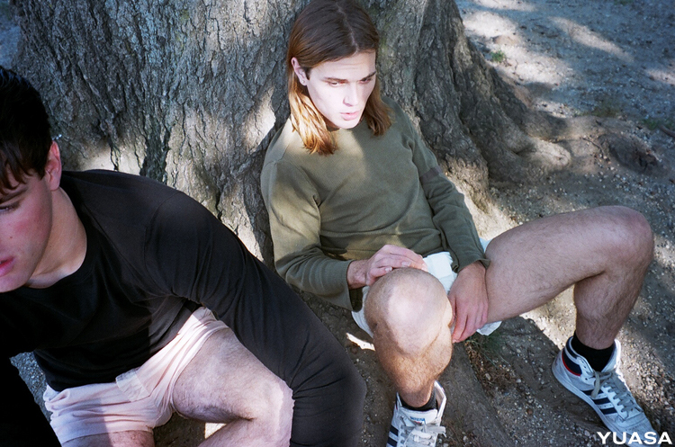
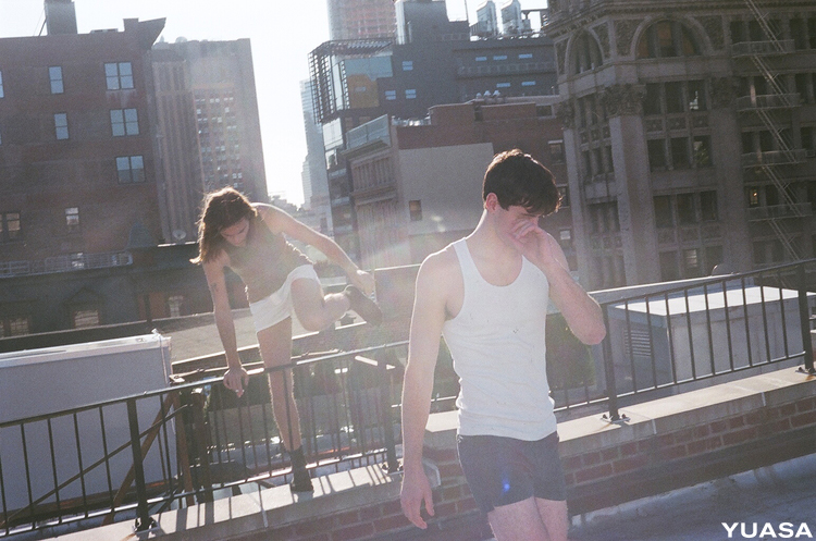
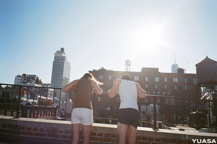
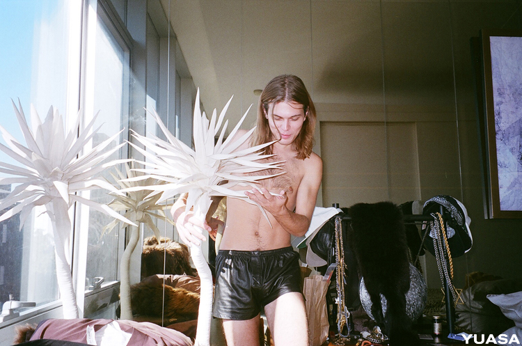
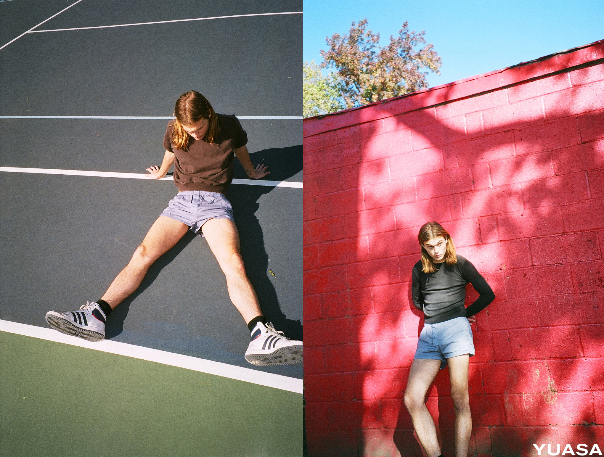
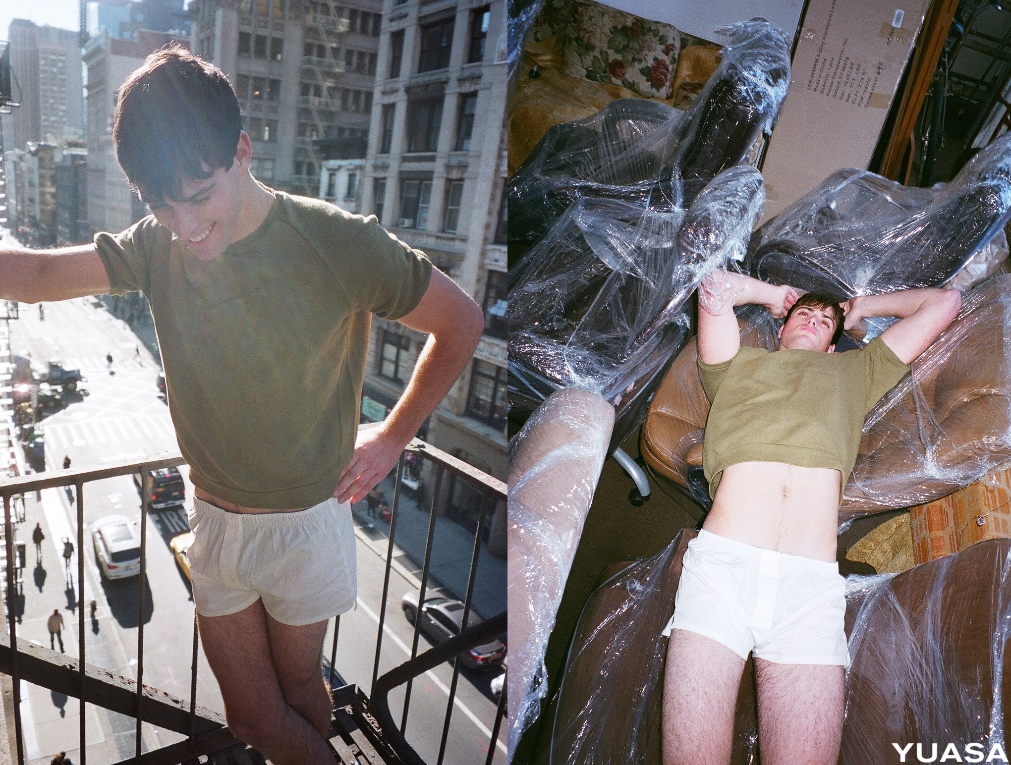
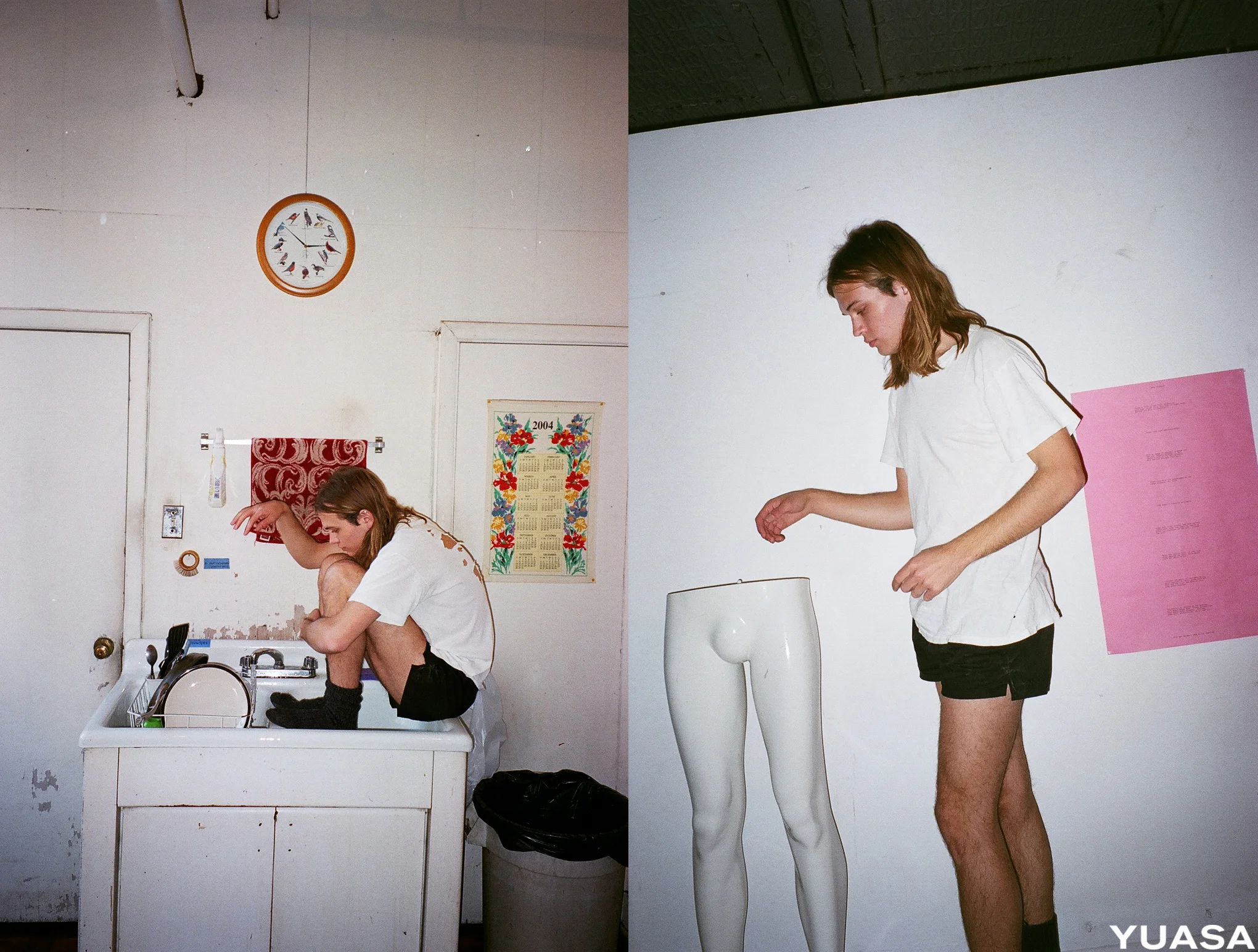
i first came across the yuasa brand at the capsule menswear tradeshow this past january and loved their minimal approach to men's boxers. i especially fell in love with their leather boxers, immediately imagining them as a staple in my summer wardrobe. as a little lady, i would wear any of their boxers, to sleep in or for the everyday. i met up with michael and his boyfriend james who run yuasa together last month to hear more about their brand. they had just moved into a new place in the west village. we talked parties, collaborations and their simple yet unique approach to men's underwear over a hot tea during the perfect sunday snowstorm. their digs had wonderful plant life and an awesome old fireplace. i'm excited to see what michael and james will do with yuasa next. i also hope to collaborate with them someday soon since they're as kind and cool as they come. this summer all i want to do is frolic around in some yuasa boxers, just like the male models in their andreas lux shoot featured here.

more about yuasa below:

cultureisland: tell us more about you.

michael yuasa: i grew up in seattle, washington and was living there before moving to nyc. i used to throw a lot of parties in seattle, which were always really fun to do. we had a great following! i was tour managing as well as releasing records however i knew that in the long run promoting parties would not necessarily be sustainable and the music industry was shaky. a clothing line seemed like it would be more sustainable in the long run and continue to keep me motivated from a creative perspective. from there yuasa was born and launched a few months after arriving in nyc.

yuasa shot by andreas lux

cultureisland: tell us more about yuasa.

michael yuasa: yuasa strives to create clothing that is simple yet powerful, paying homage to the modern american design aesthetic: minimal, experimental, and innovative. the brand started as a platform for all of my artistic and creative interests. the boxers are the physical product combining my interests in fashion, photography, art and lifestyle. it's also about exploring the evolution of creative expression and working on a collective product where i can involve my friends in totally opposing worlds. our sole product is a men's short cut boxer, every season we introduce a few new colors. i wanted to create a boxer that could be worn under jeans comfortably or around the house. the boxers from other brands that are currently available in the market are long and clumsy and totally devoid of sexiness. yuasa boxers were designed to make you feel desirable, sexy and confident.

yuasa shot by andreas lux

cultureisland: what kind of collaborations have you done?

michael yuasa: when i started the brand i knew that i wanted collaborations with other artists or like minded companies to be a part of our dna as a brand. our main ongoing collaboration is the yuasa photo series which we have been releasing periodically over the last year. each few months we put together a shoot with an up and coming photographer. at the most recent shoot andreas lux shot michael baily gates, who i've been wanting to shoot for so long. i love how the shoot came out, the guy of yuasa appears more multifaceted and complex and the shoot adds a lifestyle glimpse into the brand. the andreas lux shoot was styled by my friend david casavant who is beginning to make waves with his personal archive. we have also previously worked with remi lamande and shannon sinclairthe photo series are awesome as we get to collaborate with photographers and stylists in an intimate setting and dive deeper into who the yuasa man is, exploring him. last year, for pride we did a collaboration with international playground and visual aids where we printed four images from photographer benjamin fredrickson's photos on yuasa boxers in support of visual aids. we sold the boxers at international playground and at printed matter nyc with the funds raised going to visual aids.

yuasa shot by andreas lux

cultureisland: how do you hope to grow the brand in the future?

michael yuasa: i want to have more fun with the brand in the future, we're working on getting out our made to order leather boxer campaign now and we are working on designing a few swim trunks. for the summer, i want to have a tie dye collection. it's really interesting to see how we will start with a design idea and it will lead us to some amazing location. the swim trunks will give us reason to do beach shoots in the winter and get out of nyc which sounds like a good plan to me. we will of course continue to build out our mens essential offerings with the adding of briefs and trunks to the line.

yuasa shot by andreas lux

cultureisland: what are your favorite places to see art, shop, get coffee, eat and hang out around the west village?

michael  yuasa: my boyfriend james and i just moved to the west village. there's not a lot here that we haven't seen already, but it's awesome to be so close to the chelsea galleries. i really like installations by diana thater, she had one at david zwirner a few weeks ago. i'm really into sound and lighting immersive experiences. i've lived in nyc for five years now and james for eight so i'm really excited to explore new neighborhoods. i love hanging out at kenka on st. marks for some izakaya cheap eats and a sopporo for $1.50. my favorite coffee is caffé vita in the lower east side on ludlow. once the weather warms up a bit more we'll probably continue riding our bikes east to boerum hill and deep brooklyn and pick up where we left off last exploring out there and riding to the beach in the summer. i'm really into prospect park -- one of my favorite spots is the boathouse, built at the turn of the century. grabbing a kite and a sandwich and hanging out at the boathouse with our bikes and friends is a perfect day in my opinion. i would love to create some sort of installation in the meadowport arch, which is one of the beautiful aging archways in prospect park.

yuasa shot by andreas lux

cultureisland: what are you listening to right now?

michael yuasa: on my playlist lately has been tops, this really great band from montreal, real estate and miles davis when i feel like really chilling out.

* check out + purchase yuasa boxers here // instagram // facebook // soundcloud *


watch // sophie calle // voir la mer


sophie calle // voir la mer // 2011

i came across this article on vice featuring a beautiful, simple and touching video of a man seeing the ocean for the first time shot by conceptual artist sophie calle. i've always seen the ocean as my own sort of temple. nature is innately inspiring, but everything seems to come together at the beach.

i also felt connected to this excerpt from her interview:

sophie butcher: when you were younger, i heard you didn't want to be an artist.
sophie calle: it's not that i didn't want to be an artist, i didn't think of it.

sophie butcher: but now...
sophie calle: but now i'm 62 and it's the complete opposite, i can't think of not being an artist. now when i walk in the street, i think how can i use it? i hear a phrase, i register it, and think how can this be an idea? i'm aware in situations, i think of how i can use or transform it. yesterday, i spent 12 hours in the hospital of montreal. i have a little health problem. in those 12 hours there were two to three hours where i was afraid, two to three where i was bored, because it was very long, and two to three where i thought, what can i do with this? as life happens a project is always a possibility. but when i go eat with a friend, i'm not thinking what's the possibility of this becoming a project? when i'm at a nightclub, i'm not watching, thinking who can i photograph? but phrases, an article in the newspaper—not my love life, not my friend's life—but an event has potential. there are many things in life that i don't use... and sometimes, i'm invited to istanbul and i have to find an idea—a project sometimes just appears in a miraculous way."

well said. and interesting that it was a dialogue between two women named sophie.


small talk // karen light // gallery owner // garde rail gallery + the show on the road


i met karen light at the outsider art fair in nyc a few months ago. i loved her gallery's booth which featured paintings of everyday objects by self taught artist holly farrellembroidered muslin pieces by self taught artist rebecca shapiro and drawings by gregory blackstock, an autistic savant. karen actually runs two art businesses: 1. garde rail gallery which started in seattle and now operates online. the gallery specializes in work by contemporary folk, self-taught, outsider, visionary, and developmentally disabled artists // and 2. the show on the road, a mobile gallery that brings art to the streets and people of austin, texas.

i've enjoyed getting to know karen and hearing more about her unique journey as a gallerist. what's been even more enjoyable is that she's taken an interest in what i'm doing too. i am grateful for this and we've discussed working together on a concept for art basel miami next december, which i hope can come to fruition. more about karen below:

cultureisland: tell us more about you and garde rail gallery. how did the name garde rail come about?

karen light: i grew up in georgia and worked as a flight attendant for nine years. along the way, i saw art all over the world and began collecting folk art. i quit delta in 1997 and moved to seattle. one day i was visiting artists in a homeless shelter and a stranger came in and said he had space for rent in a building that was going to be demolished several months later. it was a 1930s art deco building and he was charging $200 a month for rent. i immediately jumped at the opportunity and became an art dealer over night. ultimately we renovated the space like we would be there forever. garde rail gallery opened in june of 1998 in the belltown neighborhood of seattle. since i recently moved to austin, i now operate the gallery online. garde rail has specialized in what is known as self-taught, contemporary folk, and outsider art. the gallery represents 30 or so artists from the northwest, deep south and other regions of the united states and canada. i've traveled extensively to hand pick artists from alabama, florida, georgia, louisiana, michigan, ohio and the carolinas. many of the artists have been included in major collections, museums, and traveling exhibits. many of the artists are african american and all are self-taught. the name garde rail actually came to me in a dream. it's directly related to prolific southern folk artists obsessively creating art, filling their house, their yard, and on out to the guard rails, visible from highways.

gregory blackstock // the huts // 28.5" x 45 3/4" // 2013 // graphite, crayon, ink, marker on paper

gregory blackstock // the huts // 28.5" x 45 3/4" // 2013 // graphite, crayon, ink, marker on paper

cultureisland: how did you discover artist gregory blackstock? tell us more about him and his work.

karen light: gregory blackstock's cousin's neighbor knew me and my gallery and recommended his drawings to me. he had worked as a pot washer at the washington athletic club for twenty five and a half years where his work was featured in the company newsletter under the title "blackstock's corner" since 1986. i went to see him and he began pulling roll after roll of drawings from under his bed and in his closet. they were all stunning, catalogue-like drawings. his subjects range from state birds to state prisons, tools to wwii bombers, and mackerel to boeing jet liners. gregory's drawings are often large, on several sheets of paper pieced together with tape and glue. using pencil, crayon, ink and marker, gregory depicts insects and baskets with incredible precision, straight lines and text executed without the aid of a ruler. the detail is minute and the shading is impeccable. in gregory's world, everything around him needs to be identified, ordered and arranged. discovering his work really changed everything.

gregory is an autistic savant and has overcome many of the limitations of autism. he exhibits many of the remarkable traits of the autistic savant; he speaks many languages, is an incredible mimic, and is able to recall events with uncanny precision. it is without doubt in our minds that gregory blackstock would be an artist under any circumstance -- his autism did not make him become an artist, nor is he an artist because of it. still, autistics exhibit an inherent inability to show intimacy and intimate communication with those that are close to them and others. it is through his art and his music (he plays the accordion), that gregory has effectively been able to combat this disability and to meet the challenge, with fantastic results. discovering gregory's work changed his life and he's the happiest he's ever been. he brands all of his shirts with the word "artist" and has truly enjoyed the positive identifier of this title. circa 2007, commes des garçons contacted me about wanting to collaborate with him for their men's ready to wear. they chose several images and used them as patterns on the clothing they sent down the runways. the seattle art museum gift shop once produced a t-shirt using his drawing of "the art supplies." gregory is also in the permanent collection of the collection de l'art brut in lausanne, switzerland.

cultureisland: you recently moved from seattle to austin and started a new gallery, the show on the road. what is the concept?

karen light: in austin there is no gallery district or art space building yet. while austin is full of food trucks, i got the idea to do a visual food truck that would sell art and art "produce" such as t-shirts, cards and art books. i bought a truck on craigslist and it took a year to get it renovated and ready as a full-service art gallery. i call it road art. it's an unexpected model for a gallery as it's friendly and approachable. i launched it a year ago and i drive around different areas of austin and tweet the location. i try to be in as many places around town as possible. the art features mostly small scale original art of all disciplines, from a carefully selected roster of contemporary artists. most works are $500 and under. (watch video above)

poster was designed by christian bland of the black angels.

poster was designed by christian bland of the black angels.

cultureisland: tell us more about your upcoming exhibit, the visual transmission tour, at sxsw.

karen light: during south by south west, the show on the road will be stationed indoor the austin convention center for the music gear expo. the truck will feature rock-and-roll themed paintings by berlin-based eddie argos of art brut and the lost highway drawings and record etchings of sonic youth guitarist and co-founder lee ranaldo. the show will be inside the convention center from march 19th through the 21st and the work will be up in my truck until june. my vision for the sxsw show is rooted in my love of music and my interest in spotlighting another level of creativity of musicians. on tour and during their downtime, these artists can effectively escape their hectic schedules and touring demands by making art –- expressing a quieter side of their creativity. touted by rolling stone and spin magazines as one of the “greatest guitarists of all time” (along with bandmate thurston moore), lee ranaldo is an accomplished singer-songwriter, guitarist, writer and record producer. he has also been a visual artist for many years, exhibiting his work in numerous galleries and museums, as well as in several published books. his lost highway drawings were inspired by over 30 years on the road as a musician. not ironically, eddie argos’ art brut band name is also the term for ‘outsider art’ coined by french artist jean dubuffet. argos is considered one of the most charismatic lead singers in rock ‘n roll and will be in austin for sxsw with two appearances at the show on march 19th + 20th. my hope is that by revealing the visually-creative side of some of our favorite musicians, people will develop a deeper sense of connection to art and music since the two work so well together! 

lee ranaldo // to bilbao 042413 #12 // 16.25" x 13.75" // 2015 // block print

lee ranaldo // to bilbao 042413 #12 // 16.25" x 13.75" // 2015 // block print

eddie argos // transparent mixtape // 12" x 24" // 2014 // acrylic on canvas

eddie argos // transparent mixtape // 12" x 24" // 2014 // acrylic on canvas

cultureisland: what are your favorite places to see art, shop, get coffee, eat and hang out around austin? and what are you currently listening to?

karen light: for cocktails, rio rita is my cheers. best pizza, bufallina. my favorite music venue is hotel vegas, it's very psych heavy. best shopping is blue velvet vintage. favorite lunch spot is the austin daily press. best coffee shop is cenote. and my favorite place for true austin grub and atmosphere, the texas chili parlor. i just bought a record, "lost souls volume 1, arkansas psychedelic and garage rock from the 1960's, the dodos, fat white family and bass drum of death and i still can't get over that perfect salad days by mac demarco.

* check out garde rail gallery and the show on the road // and if you're in austin during sxsw, check out karen's exhibit at the austin convention center from march 19th -- 21st *


compare + contrast // motorway mood


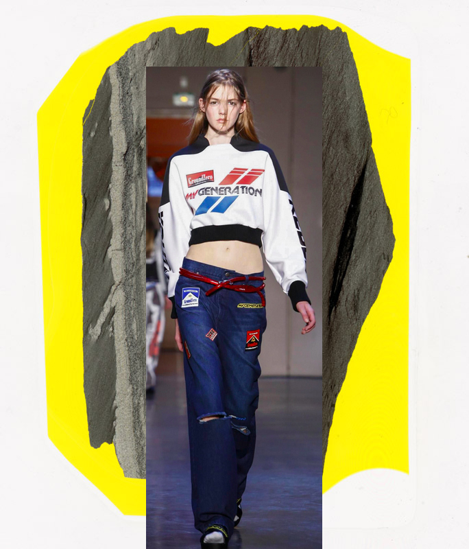
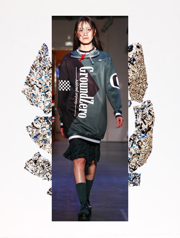
motorway mood // cultureisland 2015 // ground zero rtw fall 2015 // schmott transparent cuts 2015

motorway mood // cultureisland 2015 // ground zero rtw fall 2015 // schmott transparent cuts 2015

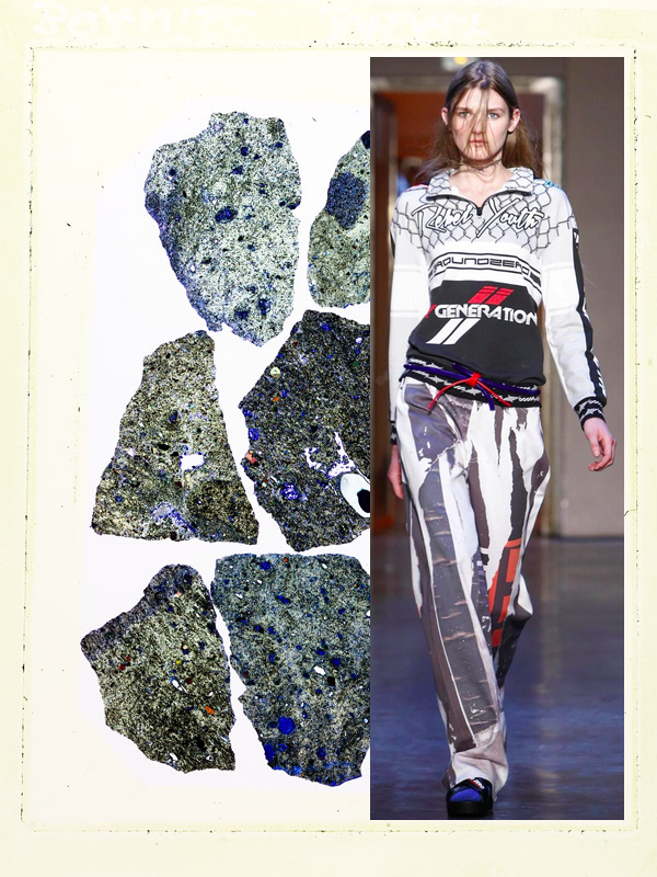
two completely unrelated things i've been inspired by lately: ground zero's recent fall 2015 ready to wear collection and these "transparent cuts" photographs of stones by schmott.

ground zero's collection uses photocollage, patches, bold + clever verbiage and graphics that look like a cross between a cigarette pack and a car racing uniform. plus oddly shaped futuristic sunglasses that are wonderful and weird.

schmott's photos feature thin sections of stone samples from the f.a. finger institute for building material science weimar, which come from motorways and buildings. the stones reflect light making them appear transparent, then they are enlarged in the darkroom and reproduced on color paper.

motorway mood // cultureisland 2015 // ground zero rtw fall 2015 // schmott transparent cuts 2015

motorway mood // cultureisland 2015 // ground zero rtw fall 2015 // schmott transparent cuts 2015

motorway mood // cultureisland 2015 // ground zero rtw fall 2015 // schmott transparent cuts 2015

motorway mood // cultureisland 2015 // ground zero rtw fall 2015 // schmott transparent cuts 2015

motorway mood // cultureisland 2015 // ground zero rtw fall 2015 // schmott transparent cuts 2015

motorway mood // cultureisland 2015 // ground zero rtw fall 2015 // schmott transparent cuts 2015

motorway mood // cultureisland 2015 // ground zero rtw fall 2015 // schmott transparent cuts 2015

motorway mood // cultureisland 2015 // ground zero rtw fall 2015 // schmott transparent cuts 2015

motorway mood // cultureisland 2015 // ground zero rtw fall 2015 // schmott transparent cuts 2015

motorway mood // cultureisland 2015 // ground zero rtw fall 2015 // schmott transparent cuts 2015

motorway mood // cultureisland 2015 // ground zero rtw fall 2015 // schmott transparent cuts 2015

motorway mood // cultureisland 2015 // ground zero rtw fall 2015 // schmott transparent cuts 2015

motorway mood // cultureisland 2015 // ground zero rtw fall 2015 // schmott transparent cuts 2015

motorway mood // cultureisland 2015 // ground zero rtw fall 2015 // schmott transparent cuts 2015


magazine // the new york times magazine relaunch


hannah whitaker // "used in-camera masking to produce different views of a globe on a single sheet of film. the process transforms the world into a random configuration."

hannah whitaker // "used in-camera masking to produce different views of a globe on a single sheet of film. the process transforms the world into a random configuration."

so excited by the new york times magazine relaunch. the covers are magical as is this recap of its recent evolution. jake silverstein says, "we have set out to honor the shape of the magazine as it has been, while creating something that will, we hope, strike you as a version you have never read before."

the design director, gail bichler, on the many covers: "we asked several artists to make works based on the idea of chaors in the word, and this is something we have all learned to live with. the only constraint we gave them was that they had to use imagery of the earth or a globe."

maurizio cattelan and pierpaolo ferrari // "their image of the globe shows "a protaginist erasing the surface of a troubled earth. all at once there is equal terror and peace"

maurizio cattelan and pierpaolo ferrari // "their image of the globe shows "a protaginist erasing the surface of a troubled earth. all at once there is equal terror and peace"

sara cwynar // one of my favorite artists, "took an old photograph of a globe and ran it through a digital scanner to show "the conflation of old imagery with new technology, a view of a globe drastically altered."

sara cwynar // one of my favorite artists, "took an old photograph of a globe and ran it through a digital scanner to show "the conflation of old imagery with new technology, a view of a globe drastically altered."

* images via nyt *


small talk // florence tang // co-founder of lot, stock and barrel


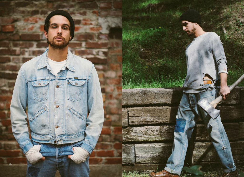
i came across lot, stock and barrel at the pop up flea in nyc several months ago. there, the brand had a unique selection of interesting vintage tees, lots of quality denim and outerwear, and several items that had beautiful embroidery and huge patches. i reached out to florence tang, the co-founder of lsb, to pick her brain about the company and have since learned a few things: 1. the embroidery and patches are created by the chain gang in la who are experts at chain stitching (florence's partner ben is currently apprenticing and learning their techniques) // 2. most of lot, stock and barrel's apparel was made in the united states and is sourced on their many trips across the country // 3. the product is mainly menswear with some smaller sized items but the company also offers custom tailoring and repairing // 4. lot, stock and barrel recently did a pop up with the chain gang featuring a full assortment of repaired, refurbished and quality vintage levi's denim at the levi's headquarters // 5. their store is located in downtown la, an area where people understand and appreciate what they do.

lsb's tagline "inspiring vintage goods and curiosities" has stuck with me and i love their thoughtful, personal approach to vintage buying and selling. you can really sense their own journey and the history of clothes through their curated offering and the "stories" section on their website. more about florence tang and lot, stock and barrel below:

lot, stock and barrel lookbook 2015 // photography by jon dragonette // chain stitch work by chain gang la

lot, stock and barrel lookbook 2015 // photography by jon dragonette // chain stitch work by chain gang la

cultureisland: tell us more about you.

florence tang: it's been quite a long journey to where i've landed in starting lot, stock and barrel. growing up in toronto, i started with a degree in graphic design from york university and then continued my education in visual communications at fidm in san francisco. i then started my career as the assistant visual merchandiser for levi's xx at levi strauss working at their office before moving down to los angeles where i joined a creative consulting company, working for companies such as filson and spiewak. there was a point where i realized that there were many other interests i had and wanted to pursue those endeavors. i then teamed up with my partner, benjamin phillips, in building lot, stock and barrel last year. combining our passion of vintage items with our background from the creative field, we are a design studio servicing multiple other brands with anything ranging from store design and visual merchandising to seasonal concept design and graphic design. our store in downtown los angeles is our home base where we showcase vintage apparel, accessories and home goods in a retail setting to share our passion with other like minded individuals.

lot, stock and barrel lookbook 2015 // photography by jon dragonette // chain stitch work by chain gang la

lot, stock and barrel lookbook 2015 // photography by jon dragonette // chain stitch work by chain gang la

cultureisland: tell us more about lot, stock and barrel. how did the name come about?

florence tang: lot, stock and barrel is a vintage store in downtown los angeles where we curate vintage items with select production pieces and also offer the service of chain stitch embroidery. we have been lucky to meet some great friends along this path such as the chain gang, who are the ones creating the beautiful chain stitch pieces that we have in our store. in addition to our store, we offer a large variety of design services derived from the backgrounds of both benjamin and myself. the concept came about very organically as we started out as an e-commerce website only, and quickly realized that we missed the human, tactile experience. we then opened a store by the ace hotel to showcase our vintage products to the public in an environment that was not ideal, but worked for the budget we had. shortly after we moved to the arts district of los angeles to continue growing the store presence and we've been loving it ever since. the name came from the saying "lock, stock and barrel" which means all or everything. we used "lot" instead as we are also a wholesale business where we offer large lot units to other resellers. we also offer a very broad assortment of vintage items, hence the name lot, stock and barrel seemed very fitting.

lot, stock and barrel lookbook 2015 // photography by jon dragonette // chain stitch work by chain gang la

lot, stock and barrel lookbook 2015 // photography by jon dragonette // chain stitch work by chain gang la

cultureisland: what kind of products do you sell and what other brands do you feature? what is your process for sourcing products?

florence tang: we try to include something for everyone at our store, which includes anything from kids lee jackets to vintage biker tees and levi's cut off shorts to vintage french indigo textiles. our product categories include vintage native american turquoise and sterling silver jewelry, vintage apparel, accessories such as bandanas and hats, and home goods. we travel all over the country to source and secure items for the store. on our last trip we went to colorado, new mexico and arizona where we stopped at multiple private dealers, thrift stores, and even hoarders. every item is handpicked, washed, and repaired before it is placed in the store. we pay very close attention to details in every repair and even try to replace missing buttons with the historically accurate ones we find. 

lot, stock and barrel lookbook 2015 // photography by jon dragonette // chain stitch work by chain gang la

lot, stock and barrel lookbook 2015 // photography by jon dragonette // chain stitch work by chain gang la

cultureisland: tell us more about the "stories" section on your website.

florence tang: all of the stories on our website are written by benjamin and reflect a theme that we've either found in the items we source, or something we find interesting and want to share while curating vintage garments with each theme. for each story, we only use imagery we've found in vintage publications or private family photo albums. we like showcase material that has not been seen multiple times and we go through very extensive research to keep everything in our stories authentic. 

lot, stock and barrel lookbook 2015 // photography by jon dragonette // chain stitch work by chain gang la

lot, stock and barrel lookbook 2015 // photography by jon dragonette // chain stitch work by chain gang la

cultureisland: what plans do you have to grow lot, stock and barrel in the future? 

florence tang: we would love to open another lot, stock and barrel store on the east coast to expand our offering. as of now we have our hands full but we would love to be bicoastal and showcase our findings to a larger audience and offer the best possible store experience in addition to continue our creative consulting work where we can help other brands tell their story. we want to continue collaborating with like-minded individuals and we would love to open a space some day to host other related brands including makers, furniture and accessories.

lot, stock and barrel lookbook 2015 // photography by jon dragonette // chain stitch work by chain gang la

lot, stock and barrel lookbook 2015 // photography by jon dragonette // chain stitch work by chain gang la

cultureisland: have you discovered any unique places or hidden gems on your travels?

florence tang: sedona is one of my favorite places to visit and on a recent visit, we found a store on the top of a mountain where there was a beautiful selection of vintage native american jewelry. but the best part of our visit was being able to get to know bob, who's been working there for over 10 years and has been repairing vintage jewelry for as long as he could remember. not only did i learn quite a bit that day, but it also reminded me that the experiences of meeting and learning from people on my travels is what has become the most fun and exciting part of my travels. 

lot, stock and barrel lookbook 2015 // photography by jon dragonette // chain stitch work by chain gang la

lot, stock and barrel lookbook 2015 // photography by jon dragonette // chain stitch work by chain gang la

cultureisland: what are your favorite places to see art, shop, get coffee, eat and hang out around la?

florence tang: my go to places include creatures of comfort for shopping, blue bottle for coffee, proof bakery for eating, and the thirsty crow for hanging out.

lot, stock and barrel lookbook 2015 // photography by jon dragonette // chain stitch work by chain gang la

lot, stock and barrel lookbook 2015 // photography by jon dragonette // chain stitch work by chain gang la

cultureisland: what are you listening to right now?

florence tang: ryan adams.

lot, stock and barrel lookbook 2015 // photography by jon dragonette // chain stitch work by chain gang la

lot, stock and barrel lookbook 2015 // photography by jon dragonette // chain stitch work by chain gang la

* check out the lot, stock and barrel website here // facebook // instagram // twitter *


required reading // links worth sharing pt. v // current curiosities


1. beatrix ruf, amsterdam's newest director of the stedelijk museum, on how her "training as a choreographer... has likely contributed to her facility to envision how things could be without having to look at them." // "you have to ask questions,” she [insists] "i don’t think it’s interesting to confirm what you know. i’m just too curious for that."

2. curators of a new exhibit, ‘the cranbrook hall of wonders: artworks, objects, and natural curiosities’ at the cranbrook art museum, "have created the equivalent of an art mix tape, with exacting attention paid to the relationships and transitions between objects, which constantly shift as the viewer moves through the allover installation."  // it also includes scheduled "acts of curiosity" i.e. live events that allow the artists to create work in response to the exhibit.

3. alexander wang's moodboard for spring 2015 // "i’m drawn to objects that juxtapose seemingly contradictory ideas. it’s arresting when something mundane is done in an über-luxurious way. that has become a through line for how i approach design—i love a good surprise."

4. spring/break art show was my favorite of the recent art fairs in nyc // it featured some unusual yet approachable curations at an atypical venue >> more about it here.

5. while i've been finding style blogs less inspiring + meaningful as of late, one thing is for certain: ivania carpio is a style innovator who lives and breathes her minimal aesthetic in everything that she does. // here her "ode to nothing / nothing is everything," explains her unusual love for the aesthetics of nothingness.

6. the beat generation was one, "of crazy, illuminated hipsters suddenly rising and roaming america, serious, curious, bumming and hitchhiking everywhere, ragged, beatific, beautiful in an ugly graceful new way." // photographer larry fink documented individuals of the era.

7. floriana gavriel and rachel mansur, the designers behind mansur gavriel on their creative process // "we didn’t know where to begin...but we knew what we identified with intuitively." while mansur was living in la and gavriel was in berlin, the two spent two years posting images to a private tumblr, "developing and honing their concept into one that...was “beautiful and clean but also had a warmth to it." #happygirlhappybag

8. rip filmmaker albert maysles // in 1994 he told the nyt, "making a film isn’t finding the answer to a question; it’s trying to capture life as it is.”

9. the book as a work of art // pilure (meaning "fold" in french) is a book-based small show, curated by paulo pires do vale, about the artistic metamorphosis of books dating from the 15th to the 21st centuries. the exhibit questions: how is art transformed in dialogue with the paper book, and how is the paper book transformed by art?

10. i'm digging deeper into the art of mindfulness + meditation as of late ~


small talk + some sounds // tyson schenk // graphic designer + mix maker


Screen Shot 2015-03-04 at 7.22.13 PM.png

tyson schenk is another graphic designer friend from converse. tyson is wildly talented and makes rad monthly playlists with equally rad album art under the moniker, keep your face radical. since i'm working on incorporating more music into cultureisland, tyson created a playlist specially for his interview titled "polar sunburn." the mix features up-beat indie meets tropical sounds, making it the perfect contrast to this never ending winter. i love how his artistry translates into both the audio and visual worlds. hope you dig his words, images and sounds just as much as i do.

tyson schenk // keep your face radical // polar sunburn mix

tyson schenk // keep your face radical // polar sunburn mix

cultureisland: tell us more about you.

tyson schenk: i grew up in idaho falls. it's a town of about 60,000. so pretty low key. it sits somewhere around the middle of salt lake city and yellowstone national park. i spent most of my time skateboarding, snowboarding, drawing and learning to play instruments. i'm mormon, so when i was 19 i chose to serve a two year mission and was sent to mexico city. being so young and living in a foreign country really exposed me to other ways of life, which i'm extremely grateful for. while in mexico i became heavily influenced by latin american culture, especially typography. i came home and decided to study design. i got a minor in illustration and a bachelors of fine art with an emphasis in graphic design from byu-idaho. i began experimenting with apparel design/t-shirts during my last year, which later led to a job at abercrombie and fitch. i worked for their brand ruehl no. 925 for three and a half years. after it closed i moved to new york city and started working for american eagle outfitters. after a year or so of that, i ended up designing apparel for converse. i still work for converse, but remotely, back in idaho.

tyson schenk // keep your face radical // august 2014 mix

tyson schenk // keep your face radical // august 2014 mix

cultureisland: how did keep your face radical come about?

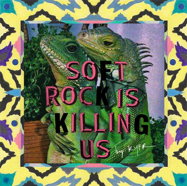
tyson schenk: in college i got really into the indie music scene and music blogging. i played in several bands during college and music has always been a massive part of my life. the first blog i started writing for was called "oh no oh my." the guys that ran it were two friends from canada. they were into a lot of the same music i liked. i reached out to them to give them a few music suggestions and they asked if i wanted to be a part of it. the blog got taken down because they were posting full album leaks. we later started another blog called "former child star." again it didn't last long. music blogs back then were a dime a dozen. one thing i learned doing these blogs was that i love to share music with people. looking for new music will always be a hobby of mine, and sharing it with others is equally important. back in college, some friends and i had started a mix-share called "ssemtc" (super secret elite mix tape club). if you were in the club you would make a physical mix (cd) every couple of months, with custom art. then you'd send it around. it was great because every month you would get 8-10 custom created mixes. some were pretty elaborate with letter-pressed or silkscreened art. the idea of creating mixes always got me super stoked. but the club kinda died and i wanted to keep the mixes going. so i started doing my own mixes, adding custom artwork every month. back then i called them blogmail mixes and i would just send them over email, trying to avoid all the legal issues with posting music online. i did my first blogmail mix in january 2008 and i've been doing one every month since then. it wasn't until january 2012 that i stopped calling the mixes blogmail and started using the name keep your face radical. the term "blogmail" always felt vague. i had started getting a big following and really felt the need to rebrand everything with kyfr to give it more of a voice. the name came from a band called radical face that i used to listen to in 2006. at the end of the emails i would write something like, "ENjo! the mix, hopefully it keeps your face radical." music makes me happy in so many ways and i have always felt like it can keep your face feeling radical and alive.

tyson schenk // keep your face radical // february 2014 mix

tyson schenk // keep your face radical // february 2014 mix

cultureisland: what is your process for creating the mixes?

tyson schenk: the process has more or less remained the same since i started. during the month i start the hunt for new music. i use rss feeds to stay on top of my favorite music blogs. i use feedly for all that. i create a playlist in itunes and begin adding songs that fit the kyfr vibe. throughout the month i am constantly listening, adding and editing tracks until near the end of the month i have a solid mix that i'm happy with. sometimes earlier, but usually at the end of the month i will design some covers and then work on track order etc, getting the mix ready for upload. another thing i’ve been doing for a while is creating ridiculous, ironic music genres to describe the songs. i'm sure a lot of people never notice them, but i have a lot of followers that love reading all the insane music genres. it seemed like 5-6 years ago there was all this nonsense of trying to describe up and coming indie bands with nonsensical genres. for example: chill wave, beach wave, lo-fi, slow core, and post psych-pop. it was always super crazy hearing all these music blogs trying to one up everyone with some new made up genre one of them had coined. i take that a step further and really get weird with it. for example: post-halloween, post-macarena, windmill hippie psych pop, post partum indie, clam bake retro pop, space sunburn, jet ski rock, hipster telephone on hold pop, unicorn fangs, weirdo friendo electro, i could go on. it's a fun little bonus for the followers that look for it, and i actually think it describes some of the songs super well. that clam bake retro pop genre is from a tennis song, and yeah, that pretty much describes tennis. 

cover art for polar sunburn // keep your face radical x cultureisland

cover art for polar sunburn // keep your face radical x cultureisland

cultureisland: tell us more about this mix and your album art.

tyson schenk: knowing that this mix was going to focus on tropical/beach songs to help us get through the rest of winter, a friend suggested the title polar sunburn. after that, the concept just became juxtaposing images of summer and winter. i collected a bunch of images and then filtered them to make them fell old. i love to do hand-done collages but ultimately decided to do everything digitally. it was easier to work with the unexpected cropping of the images. the bold stripes help tell a clean story and I kept the type small so it wouldn't distract from the images.

tyson schenk // keep your face radical // special valentines mix february 2014

tyson schenk // keep your face radical // special valentines mix february 2014

cultureisland: how does your background as a graphic designer influence this project?

tyson schenk: i think since college i realized that the "art scene" is where i always felt most inspired. all my hobbies have heavy connections to the arts. i make a living off being an artist and i can't help but immerse myself in it from every angle. i am grateful that i have a career that allows me the freedom to be creative and express my ideas through visual media.

tyson schenk // keep your face radical // september 2014 mix

tyson schenk // keep your face radical // september 2014 mix

cultureisland: where do you find inspiration?

tyson schenk: my answer for this has changed in the last year and 1/2 after leaving Bbrooklyn and moving back to idaho. inspiration was around every corner in nyc. i could stop at a gallery on my way home from work, see someone doodling something in the subway or hear a concert happening in prospect park from my apartment window. nyc, and especially brooklyn, will always have a soft spot in my heart. but now that i live in rural idaho i get inspired by different things, mostly nature. i snowboard 1-2 times a week during the winter and some of my best ideas for t-shirt designs or mix art come from sitting on the chair lift admiring nature. being on a mountain exposed to the elements is very alien if you think about it. we choose to be out of our element and exposed. i find it strangely therapeutic. besides nature i try and travel a lot. i have been spending lots of time in san francisco and northern california and am constantly amazed by that area of the country.

tyson schenk // keep your face radical // august 2012 mix

tyson schenk // keep your face radical // august 2012 mix

cultureisland: what are your favorite places to hang out, eat, shop and see art where you live?

tyson schenk: i'll answer this in 3 parts. nyc: places - prospect park, lower east side, redhook, coney island brooklyn flea and the high line area. and the subway for the best people watching in the world. eats - lucky's burgers, blue ribbon sushi, pineapple fried Rice at pong sri. fried shrimp at balaboosta in nolita. tacombie's esquites and tacos. dough donuts. brussle sprouts at thistle hill in park slope. and ample hill’s ice cream. i could go on and on about this. art - Seeing friends do gallery shows was always a highlight (tipi thieves) and probably my favorite art related thing i did was seeing the frieze art show on randalls island. that, and just stumbling into places around the city. in sf/northern california: mission street, the entire coastline but hurst castle, mendocino, and monterey have stood out. eats - tacolicious anything. burma superstar tea leaf salad and pork curry with potatoes. and the lamb kebab at kokkari. and the burger and brussel sprouts at tempest bar in the tenderloin area. idaho: places - palisades area, grand targhee resort, jackson hole, bear lake and the teton mountains. eats - snake bite, republic, and morenita's. art - thrift stores and vintage signage. idaho fashion. to be honest, most of the art i see in idaho is pretty bad.

* check out more keep your face radical album art here and contact tyson (tysonschenk@gmail.com) if you want to sign up for his monthly mailing list *

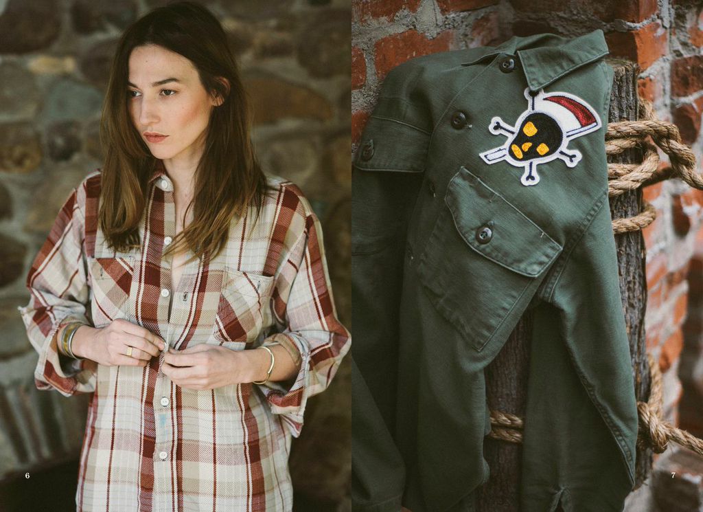
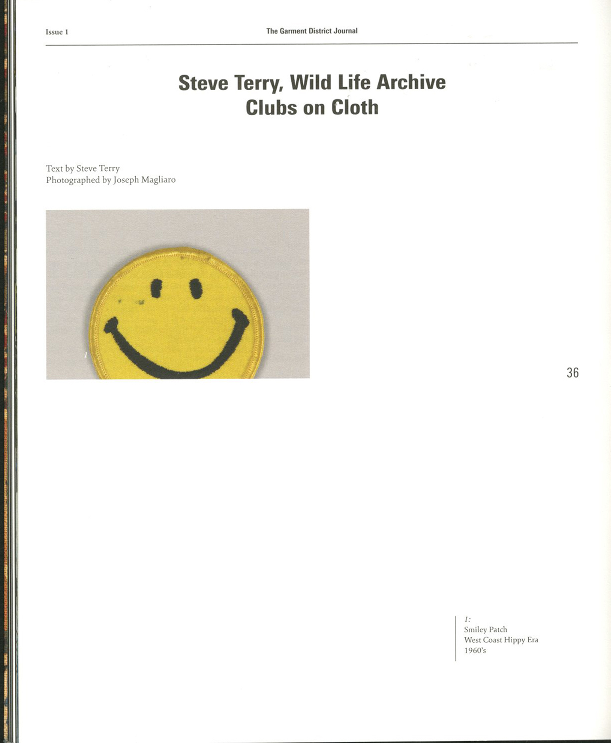
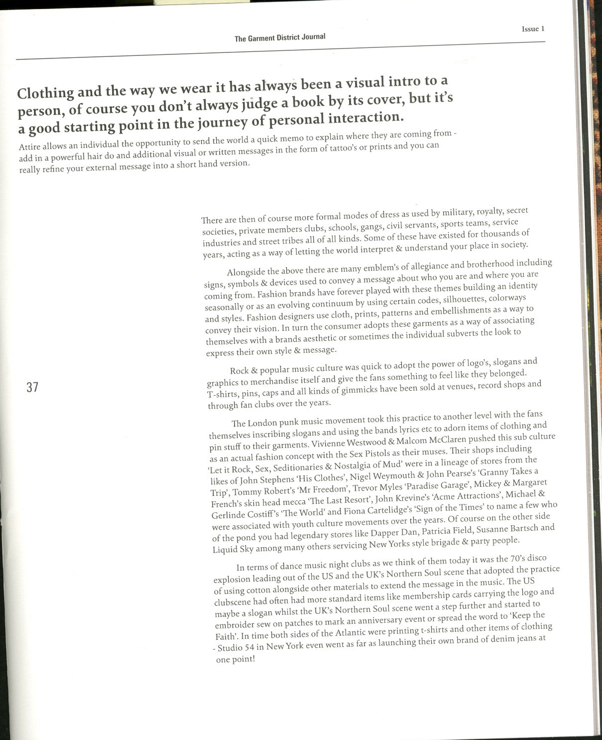
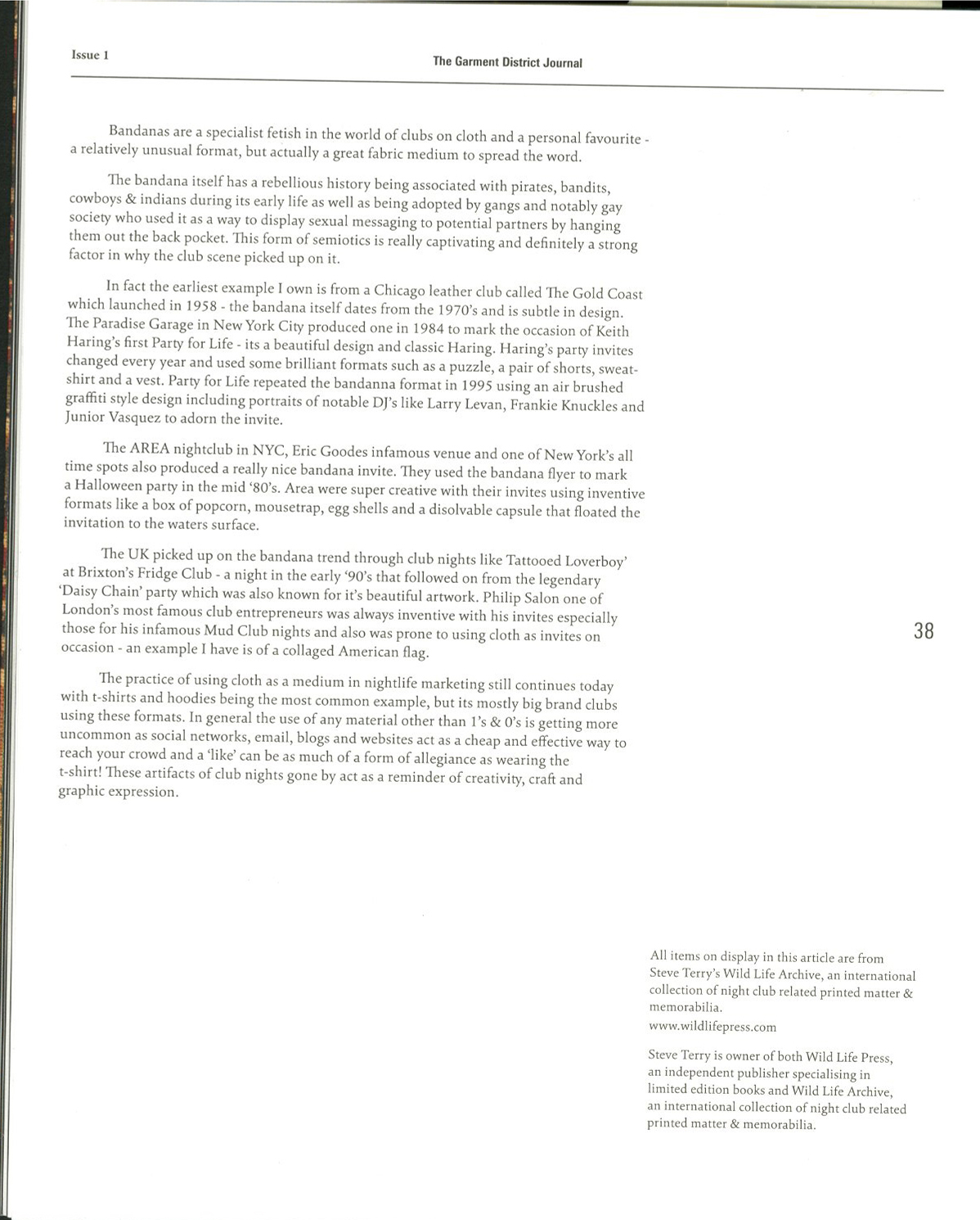
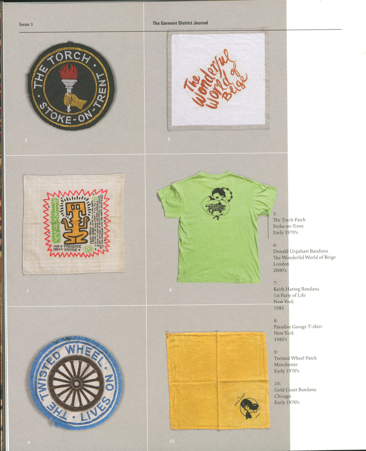
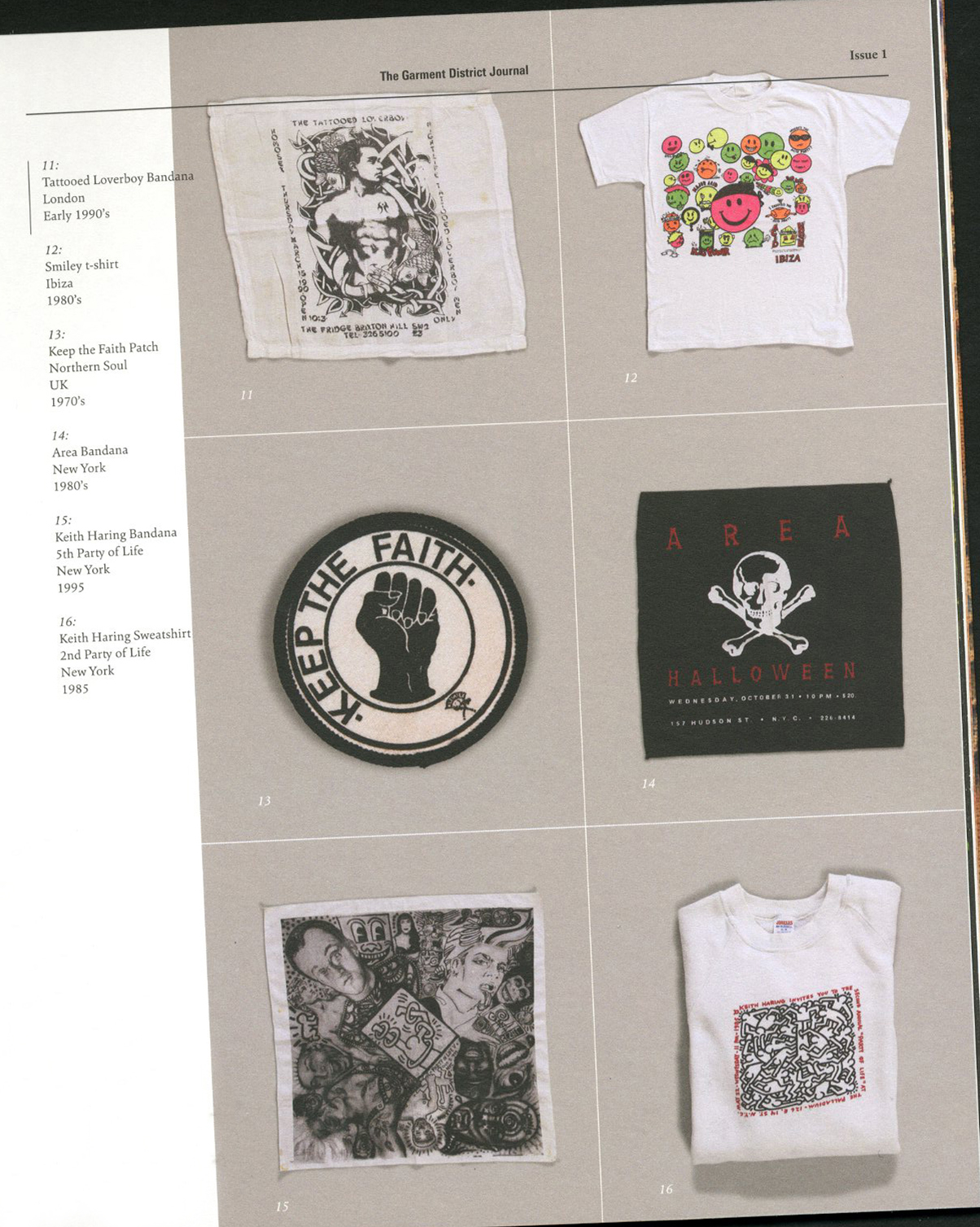
required reading // "steve terry, wild life archive clubs on cloth" // the garment district journal issue #1


i spend all my money on magazines, and although i am broke at least i am inspired (and gaining knowledge). last week i discovered the garment district journal at kinokinuya, my favorite japanese magazine and book store. on the cover, the journal declares its focus on "investigating the world with observations and conditions of our time between objects, people, words and conversations." from a close examination and internet search, i learned the journal is actually published by well-known new york menswear store, nepenthes. i found the article below super interesting:


small talk // artist caris reid


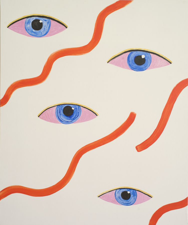
i recently discovered caris reid's work on instagram. she's a brooklyn based visual artist who also runs a curated collage workshop, in which she "soothes you with scissors" (@collagewithcaris). we sat down a few weeks ago at her studio in greenpoint and had a lovely chat about her paintings, spirituality and her recent residency in corsicana, texas. with metronomy's "love letters" playing in the background, i immediately learned that both caris and her work have an energy that is at once calming and intriguing. i have since attended one of her collage workshops and it was lovely. there's just something about caris that makes you appreciate the simple moments. more about caris below:

cultureisland: tell us more about you.

caris reid: i had a nomadic childhood, we lived in washington d.c, chicago, boston, austin, and dallas before i graduated high school, often living in multiple homes and attending multiple schools within each city. growing up, change was a constant, which may have played a role in cultivating my more introverted side, so did a lot of reading, drawing and painting: all solo activities. later, i went to art school in boston, and moved to ny straight after graduating. i've been here ever since.

cultureisland: what is your artistic process?

caris reid: my work deals with inner worlds: emotional, spiritual, and psychological. meditation has become a part of my process in the studio, it helps take me to the mental space needed to paint for hours. i've been working with a psychotherapist named andrea k. baum, who works with hypnosis, and together we co-designed a 20 minute guided meditation, inspired by the high priestess card in tarot, which i listen to before painting, to help get me into deeper states of consciousness. i've also been doing a lot of work with reiki and visualizations, working closely with a friend and reiki healer in joshua tree named kathrin smirke. my paintings themselves use water based paints, mostly acrylic, on wooden panels. my palette tends to be very saturated, with flat planes of color, and lots of repetition. in my most recent paintings, there's a lot of symmetry and undulating shapes.

cultureisland: can you tell us more about your recent work, water warrior?

caris reid: the water warriors are an archetypes for a powerful feminine energy, an energy that comes from a deeply intuitive place, that sees emotion as a strength rather than a weakness, that understands the power of compassion and of empathy, and uses wisdom to not only improve oneself, but others as well. and of course, the energy i'm capturing is that of a warrior, someone who is unbelievably strong. the energy is feminine, but i see it as existing in both men and women. we live in a very patriarchal society that places great value on more traditionally masculine attributes, which are incredibly vital, but need to be balanced. formally, the paintings work with symmetry, circular and undulating forms to create a very visually soothing space. the waves in her hair mimic the waves of her lips, as well as the water, and many of the designs on her chest.  this idea of a tattooed woman was inspired by an image i had seen years ago of a pictish warrior, covered in tattoos of flowers... it felt as though the psyche was imprinted on the flesh. 

cultureisland: and you recently did an artist residency in corsicana, texas -- how did the location affect the work?

caris reid: i just got back from a residency in corsicana, texas, where i had an enormous studio in a building built in 1898 that was originally owned by the oddfellow, an all male fraternity.  my actual studio was the room where their meetings were held, and i would sit on the podium at the end of the room, where i imagine the head officials must have stood during meetings, and start every day by meditating there. it felt very powerful. the room had these gorgeous arched widows that faced in three different directions, so the sun had a strong presence in the room, and rotated around the studio every day. in the evenings, as the sun would set, birds would travel from all over and land on the tree just outside where i painted. most days i would stop to watch the birds and the sunset. my days were filled with order, beauty and simplicity. it infused the paintings. i've been studying buddhist mandalas and making work for an upcoming show called "diamond seat" with amanda valdez at circuit 12. to be in such a focused and contemplative space was perfect for this body of work. the word "mandala" is a sanskrit word that means "essence" or "center" and all the paintings made there have very concentric, repetitive designs. the rhythm of my days mirrored the rhythms of the paintings. 

cultureisland: where do you find inspiration? who are some of your favorite artists?

caris reid: lately i've been really inspired by mandalas and tantric art, and from reiki and hypnosis. i'm deeply interested in the meeting point between the physical and the spiritual and ways in which i can actively control my mental state in order to affect the energy of the paintings.  my favorite artists are always changing, but not suprisingly, i've been drawn to those who use the spiritual as part of their subject. artists like  dorothy iannone, stephen muller, kenneth noland, and hilma af klint.

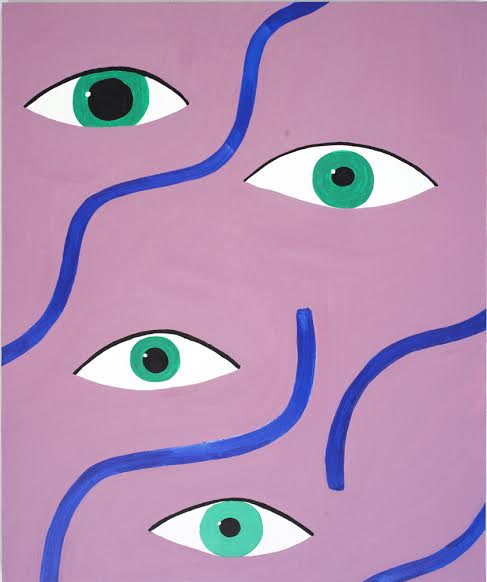
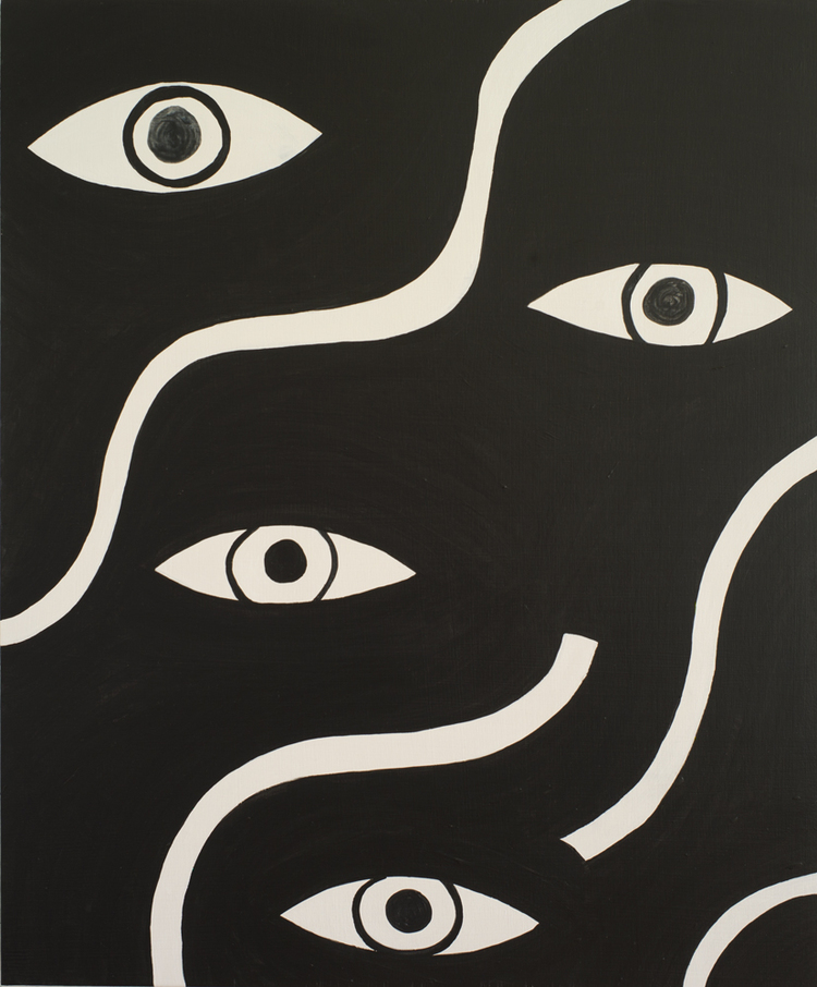
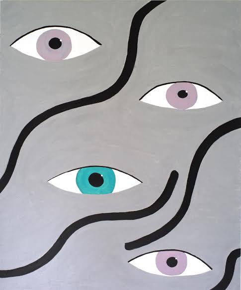
caris reid // clarity. after claire. // acrylic on wood // 2015

caris reid // clarity. after claire. // acrylic on wood // 2015

cultureisland: what are your favorite places to see art in nyc/brooklyn?

caris reid: when i'm not in the studio i'm usually out seeing art. i try to see as much as i can and support as many artists as i can. there are galleries everywhere... the lower east side in particular has amazingly vibrant galleries: sargent's daughters (i was in a group show there this past summer), nicelle beauchene, denny gallery, lisa cooley, longhouse projects and james fuentes. in brooklyn there's interstate projects, cleopatra's, among others. i recently saw some amazing phillip taaffe paintings at luhring augustine's bushwick space, which is worth the trip. the space is enormous.

* check out more of caris's work here and follow her on instagram here *

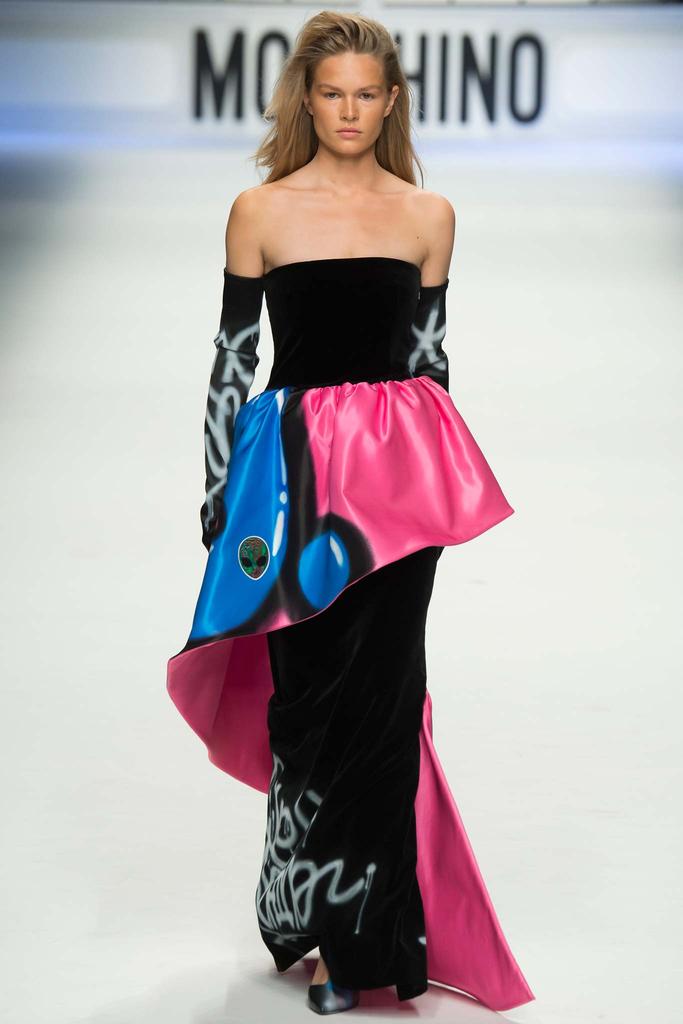
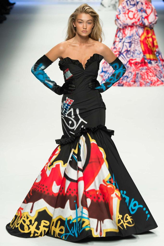
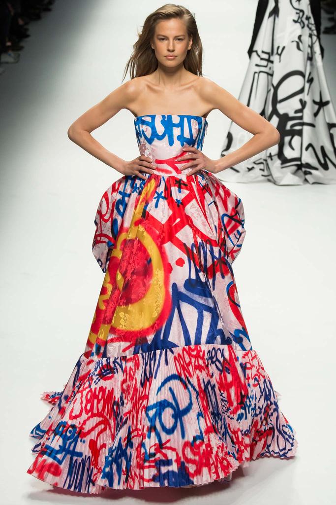
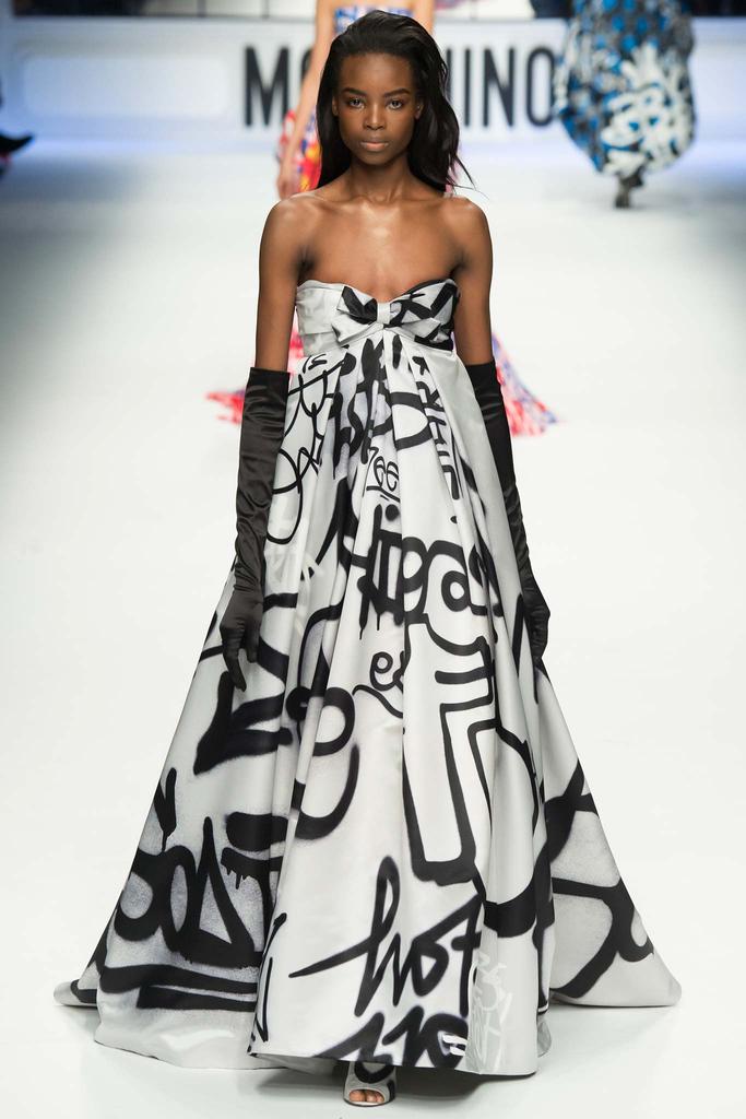
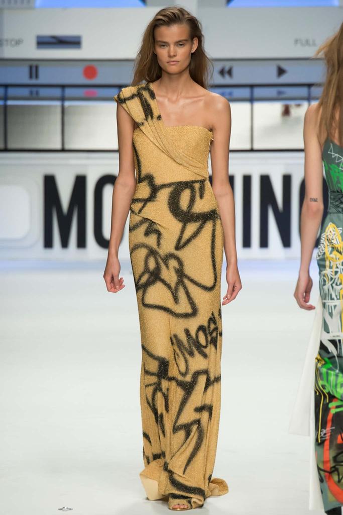
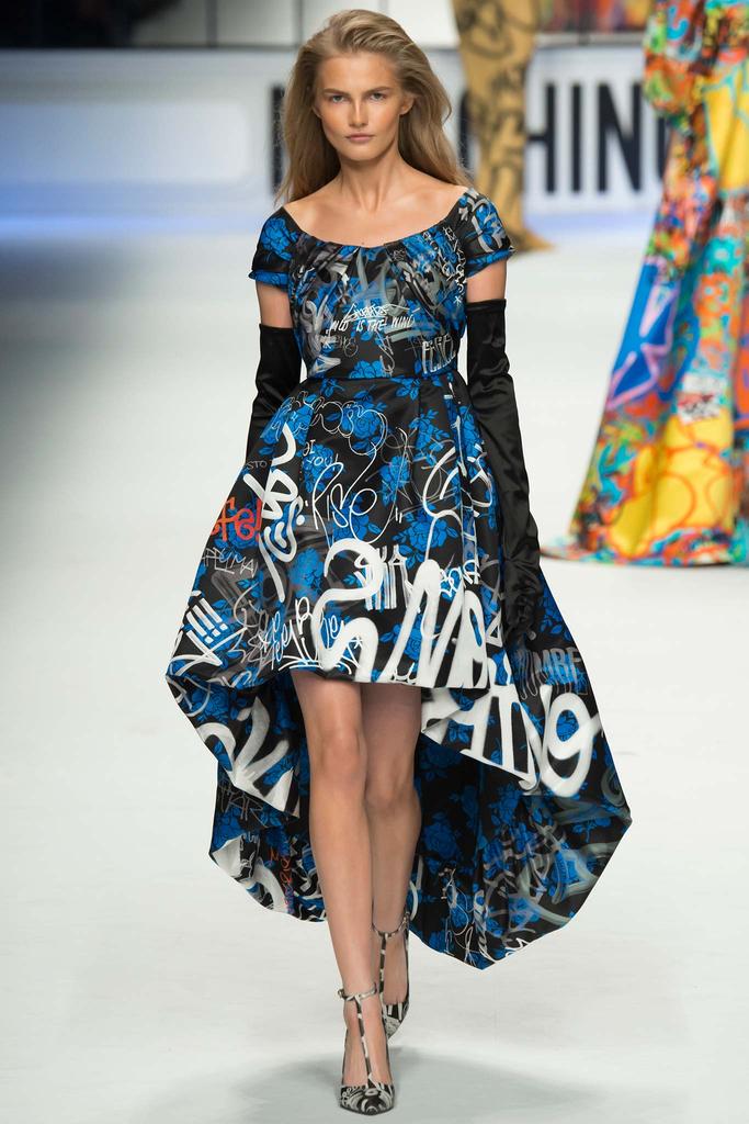
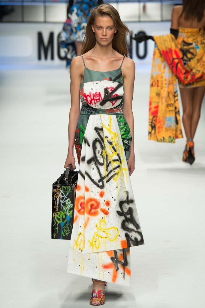
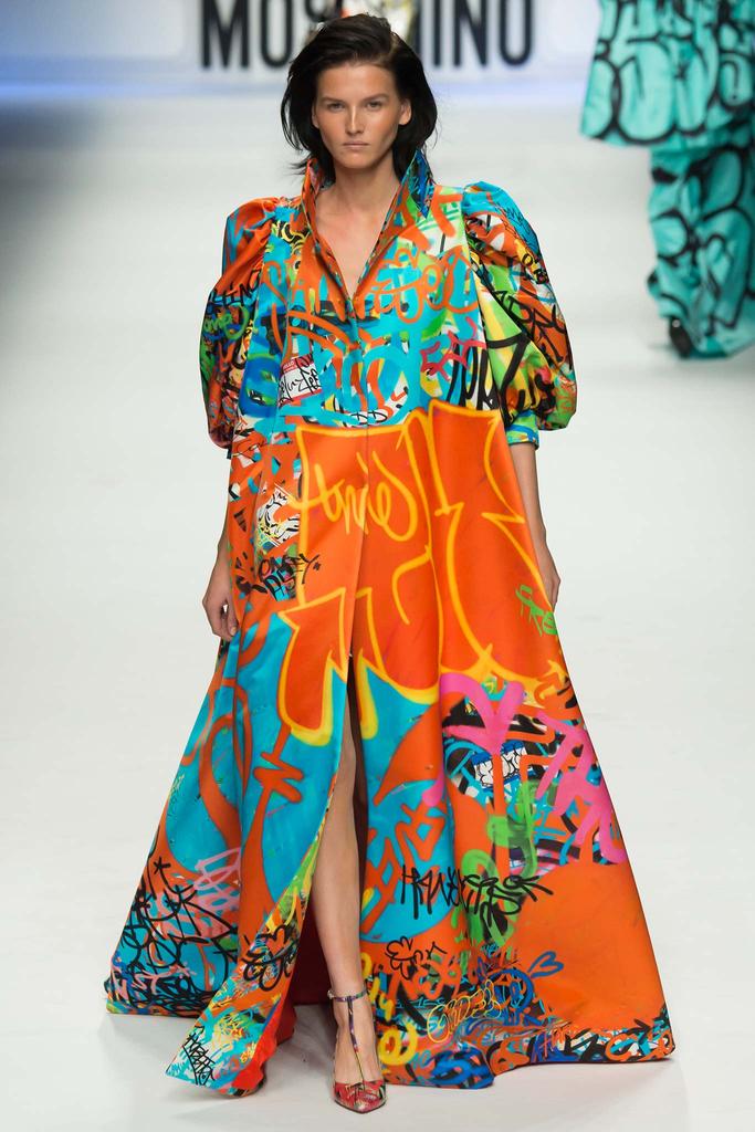
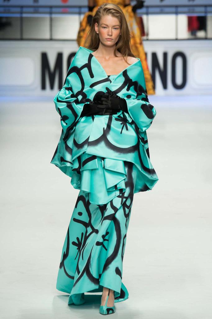
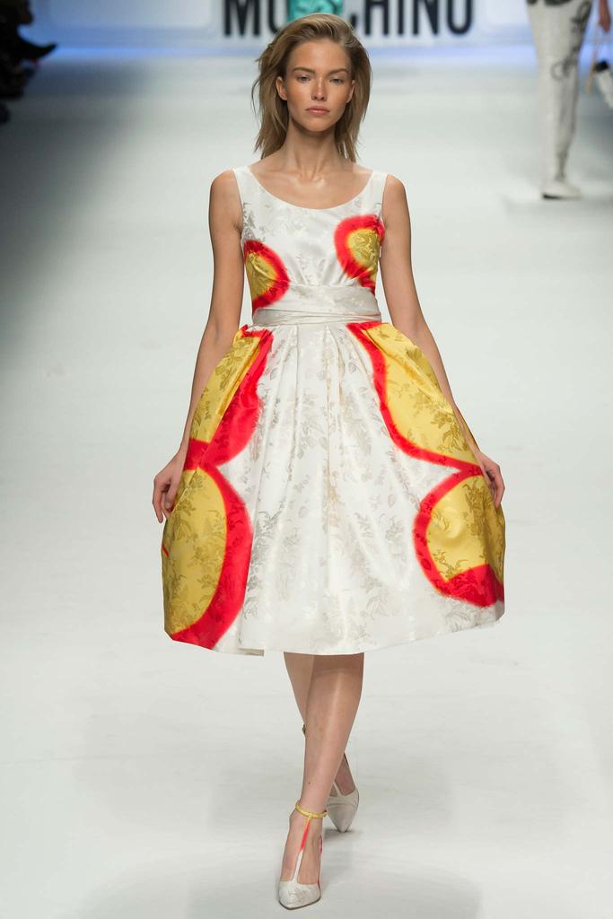
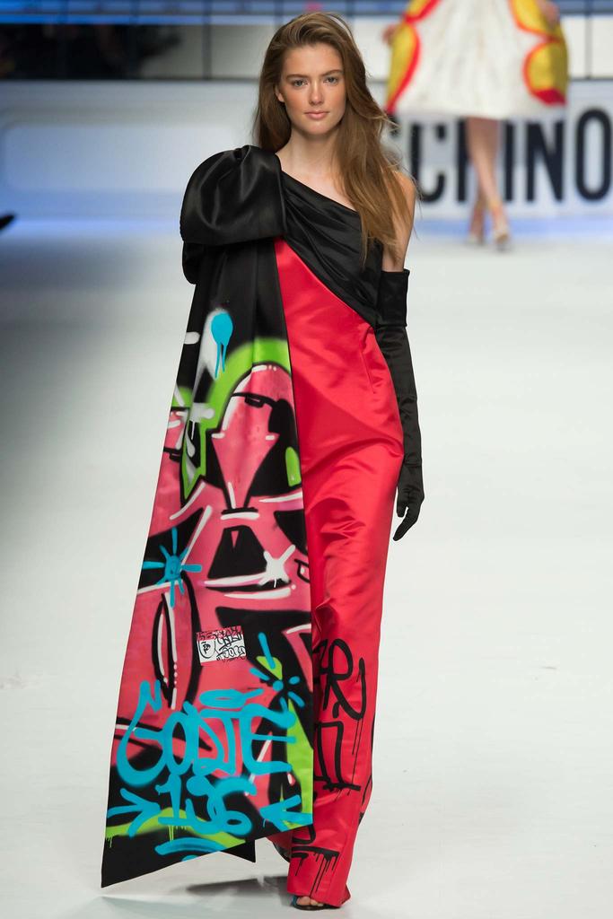
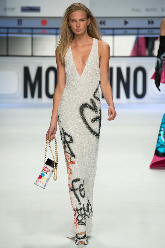
runway // moschino's graffiti gowns // rtw fall 2015


moschino // rtw fall 2015

moschino // rtw fall 2015

jeremy scott kills it every time. he's a genuine genius when it comes to high-low culture. these graffiti gowns from his recent moschino fall 2015 womenswear collection are so wonderful and weird. if only they were around when i went to the high school prom in 2007. the hello my name is sticker graphics are my favorite detail. a quote from his november 2014 interview with the cut's veronique hyland has stuck with me for awhile now, "i don’t really dissect too much when ideas come — they just kind of pop into my head, i just take them and run. i’ve always loved things that are [either] teeny-tiny or ginormous. like, a giant toothbrush: i always find humorous. i love all these things where proportions have been changed and altered." wise words.


curatorial // 5 phat art exhibits recently


i make it my mission to see art as often as humanly possible. living in chelsea means free, easy access to constant visual stimulation and inspiration. these were 5 of my favorite exhibits as of late:

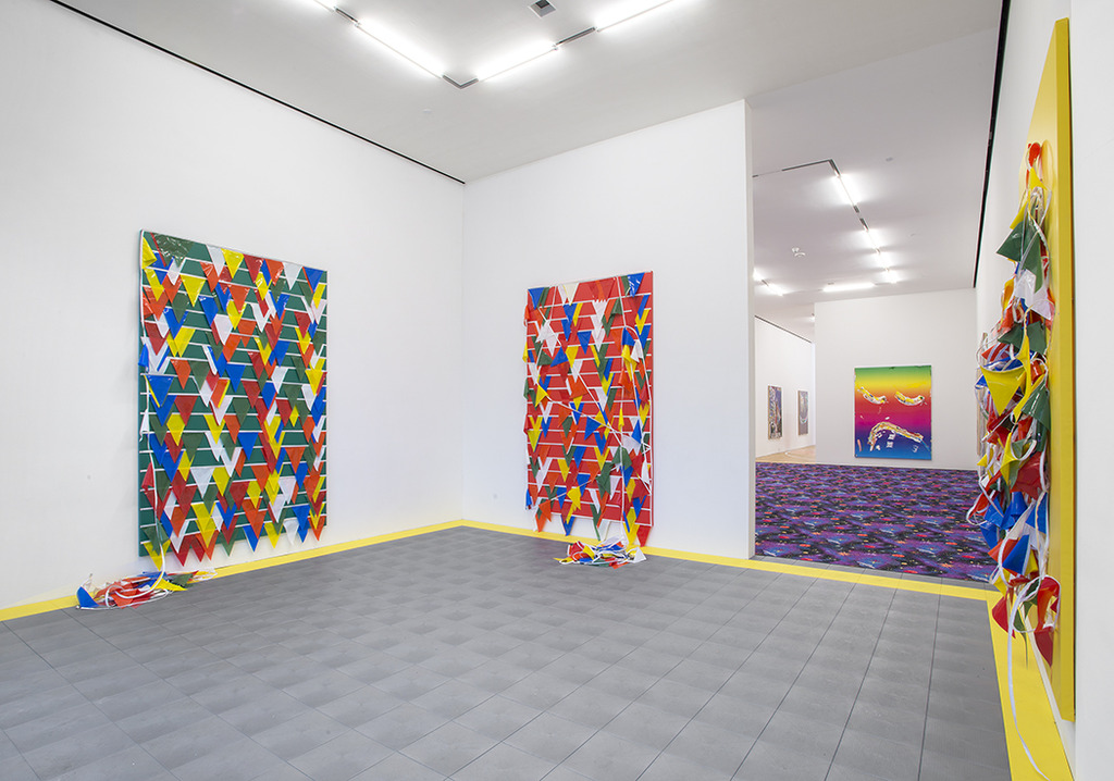
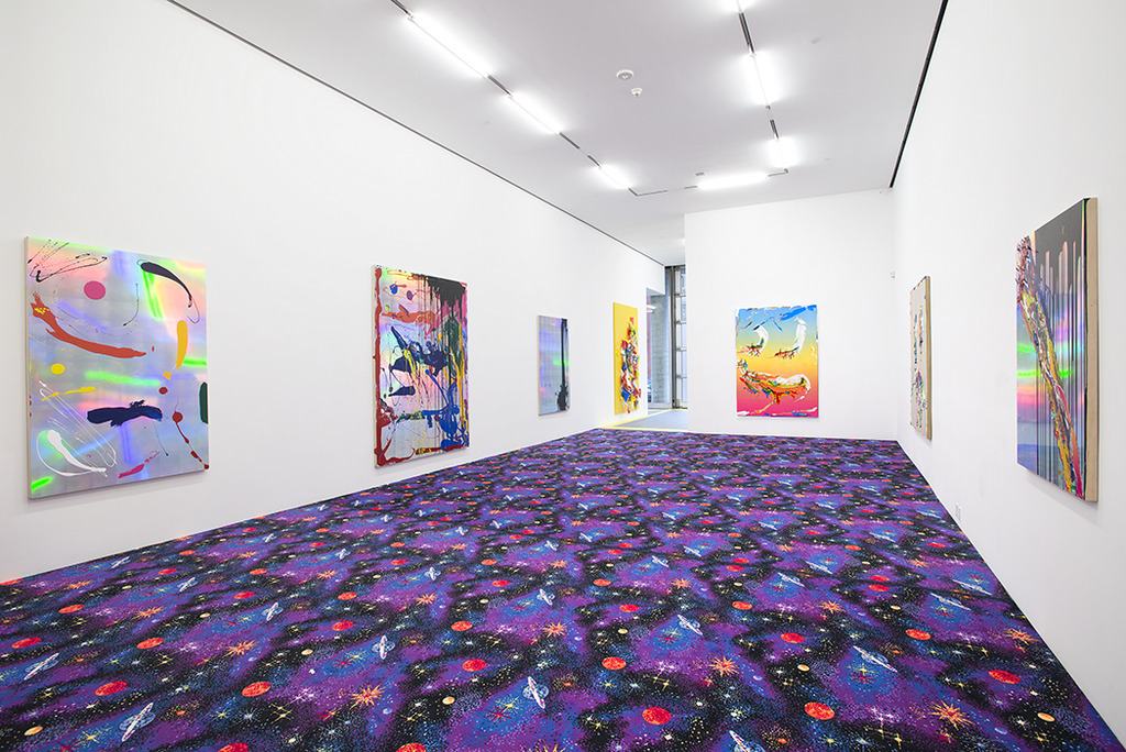
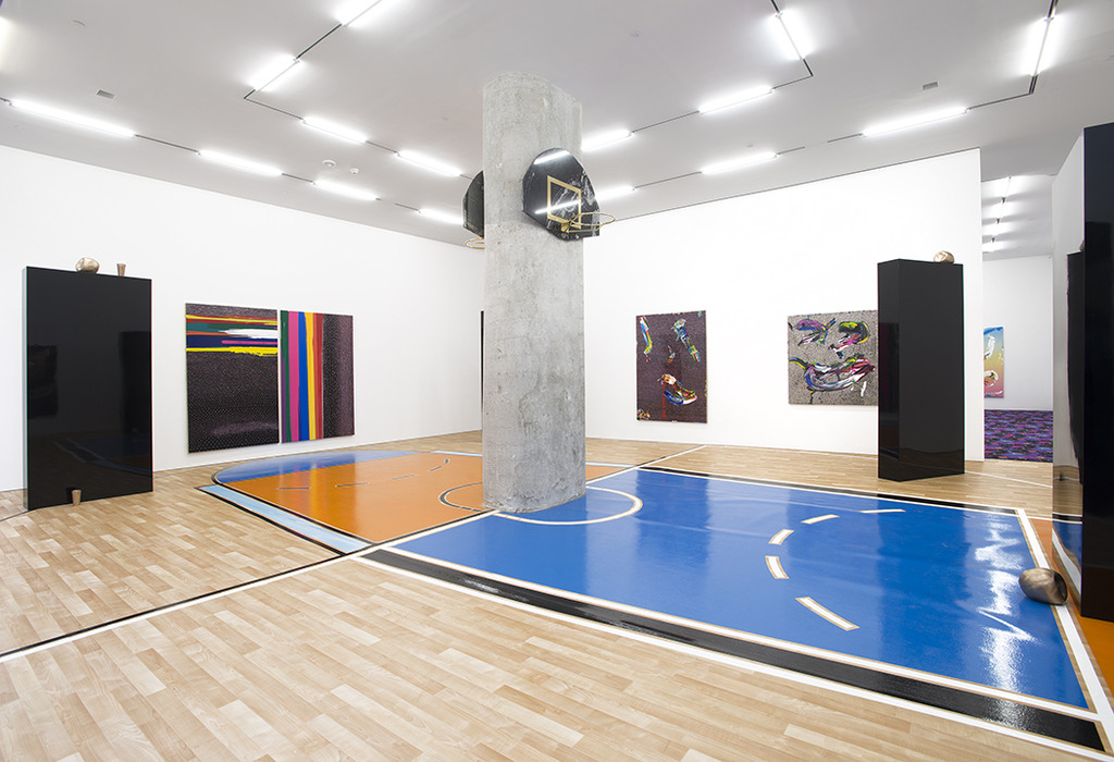
1 // devin troy strother: space jam at marlborough chelsea

from the press release: "the exhibition’s title, space jam is taken from the hit 1996 film starring michael jordan and the looney toons. conceptually strother looked towards space jam as a sentiment, a film he grew up with, but also a play on words: “space” in relation to being challenged with marlborough chelsea’s large space, and “jam” as a verb meaning to do something quickly, art and growth in this case. the galleries will be paved with three different floors, two replicating proper basketball courts, and one of stock carpet depicting outer space, typically for outfitting movie theaters or children’s daycares. the paintings and sculptures further Strother’s existent artistic lexicon, which challenges stereotypes, and points to pop culture and art history. strother explores the idea of basketball not necessarily as a sport or form entertainment, but rather an aesthetic: the hats and trading cards that have hologram stickers, the flags that are strewn about a stadium, the souvenir cups that visitors take with them. all of these important symbols at an event have transpired into strother’s paintings. there is also the allusion to space, from the exhibition’s name to the gradients in the paintings that reference jordan’s limbo state in the film. the feeling of the unknown and darkness are ever present."

2 // the memphis group at koenig & clinton

from the press release: "following its debut at the milan furniture fair in 1981, the memphis group grew to include numerous artists, designers, and architects. the gallery’s presentation spotlights a small sliver of memphis’ numerous associates: martine Bedin, andrea Branzi, aldo cibic, michele de lucchi, shiro kuramata, peter shire, ettore sottsass, and george sowden. these individuals were part of a larger group that also included founding members marco zanini, matteo thun, and nathalie du pasquier. the emblematic furniture and lighting designs on view demonstrate the collective’s greater ethos of irreverence, a challenge to modernist tenets of good taste and efficacy. pillars of memphis design include unconventional combinations of materials—such as slabs of marble alongside fiberglass and laminates—and historic forms embellished with kitsch patterns and gaudy colors. joyful, witty, and rebellious, memphis forms do not follow function. instead, memphis infiltrates the traditionally feminine domestic space with stubborn architectural structures that playfully overturn the roles of comfort and practicality in interior design. and while memphis is often classified as postmodern because of its provocative blending of historic styles, it was also international in origin and reach."

3 // lili reynaud-dewar: live through that?! at new museum

from the press release: "lili reynaud-dewar creates environments and situations in which she uses her own body, as well as those of others, to examine the dual experiences of vulnerability and empowerment associated with acts of exposing oneself to the world. evolving through a range of mediums such as performance, video, installation, sound, and literature, her works consider the fluid border between public and private space, and in so doing, challenge established conventions relating to the body, sexuality, power relations, and institutional spaces."

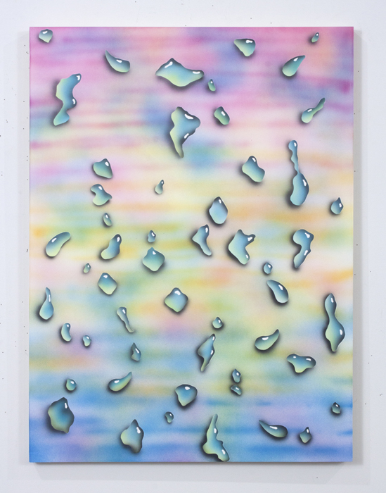
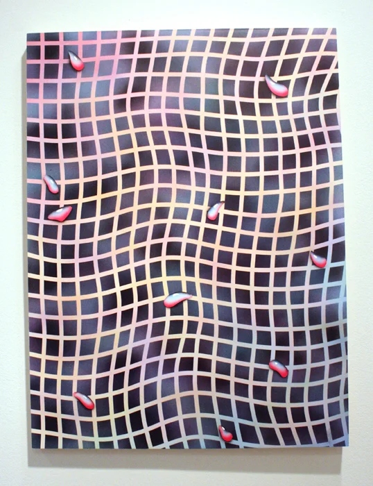
4 // show #24: brian willmont nevermore at field projects

from the press release: "continuing his investigation into graphic abstraction, willmont combines painting techniques- from tromp l’oeil and airbrush to hard edge abstraction- to create a unique visual vocabulary that is at once phenomenological and atmospheric. employing a surprising palette of bright pastels, Willmont’s paintings hum, pulse and vibrate, before coming into focus."

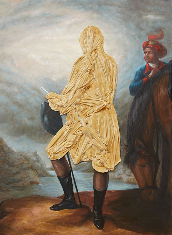
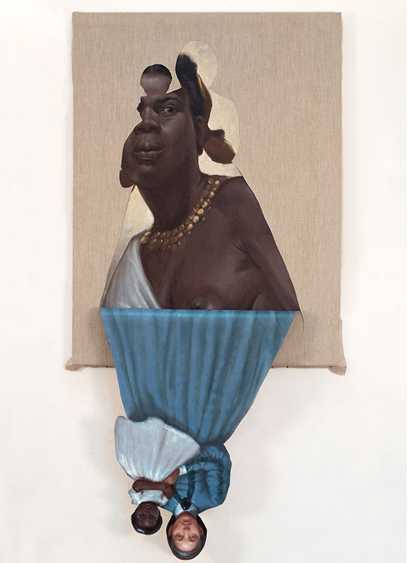
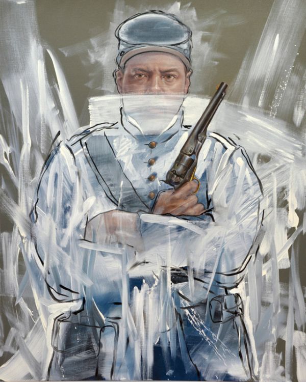
5 // titus kaphar: drawing the blinds at jack shainman

from the press release: "through the manipulation of seemingly classical and canonical imagery, kaphar introduces us to an alternate history that runs concurrent to the dominant narrative. truths emerge to reveal the fiction and revisionism inherent in history painting and the visual representation of a moment or memory. kaphar cuts, slashes, erases, layers and peels back the surface of his paintings. each method is specific to the subject and meant to ignite and recharge the image, often that of the underrepresented body."


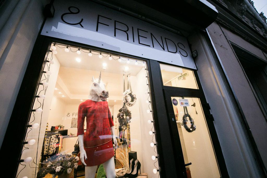
small talk // ira tataurova // shop owner of saint petersburg's & friends


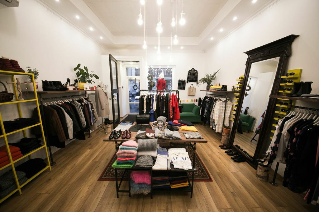
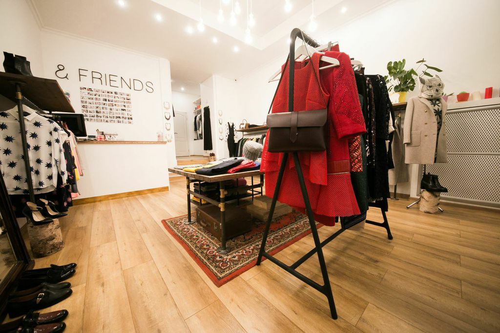
ira tataurova runs & friends, a womenswear shop in saint petersburg, russia. we met through a mutual friend while ira was in new york following her studies at parsons several years ago. she has always had an interesting aesthetic and i've long been obsessed with her tumblr. during her time in nyc, ira was very inspired by the intimate and informal shop culture of new york boutiques. so when she moved back to russia a few years ago she decided to open her own store with a friend who lives in france. ira says there are not many small independent businesses in saint petersburg and that the prices are infinitely higher there. most stores are bigger and more commercial; thus it is harder for a customer to establish a relationship with the staff. & friends was born out of ira's desire to offer customers a small and friendly experience as well as a selection of cool european brands at a reasonable price. more about ira below ~

cultureisland: tell us more about you.

ira tatourova: i grew up in saint petersburg, russia and lived their until i graduated high school. since i was super young my parents always pushed me to study english. so when i graduated high school i moved to ireland to study hotel management. when i was 17 it sounded like a great idea, but soon i realized that this was not for me -- it didn't suit my personality at all and i couldn't imagine working in a hotel for the rest of my life. a summer before my last year i applied to parsons (just a few days before the deadline) and somehow got in. there i studied design & management in paris for 2 years and then transferred to new york. in the end my student visa expired and sadly i had to move back to russia. i always knew i wanted to do something on my own back in saint petersburg. my parents had their own business so they are a great example and support system for me.

cultureisland: tell us more about & friends. where did you get the name and how did the shop come about?

ira: the name & friends comes from the concept behind the store. we wanted to create a small space with a friendly atmosphere, where our customers would feel almost like home. we try to learn their names, some general information about them, their taste, etc. russia is famous for its bad service and a lot of times people are judged on how they are dressed in stores. so our goal was to do things differently. almost everyone i know never shops in the city, unless it is an emergency. people shop when they travel or online. the 2 main reasons for that are very high prices (the markup in russia is usually extremely big) and quality. korean clothes became really popular in the last few years and they are not famous for being well made garments. we made a list of what we wanted in the store and try to stay as close to it as possible. living in new york i loved all the little neighborhood shops around the city. you would go have brunch on a weekend and just spend an afternoon walking around from one store to another. in saint petersburg this kind of culture is just starting so i really wanted to be a part of it. people are still scared of opening a business, but more and more young people take the risk which i find amazing. of course i worry about competition but hearing about a new store popping up always makes me really happy.

cultureisland: what kind of products and brands do you have in the store?

ira: we have women clothes, shoes and accessories. some of the brands we carry include custommade, baum und pferdgarten, won hundred, dress gallery, gertruda, chloe stora for my pant’s and antik batik. we really gravitate towards scandinavian brands since i feel like they have amazing quality and design with a great price point. also their climate is similar to saint petersburg so it's easier to do. 

cultureisland: how do you hope to grow the store in the future?

ira: our first goal is to survive the economical recession that is happening in russia right now. but in general i hope to get involved with the community more, get to know local artists, creatives and collaborate with them. also hopefully soon we can do something with menswear since a lot of people have been asking for it. and i absolutely love menswear!

cultureisland: what are your favorite places to see art, shop, get coffee, eat and hang out around st. petersburg?

ira: i’m lucky because saint petersburg has so many museums, the city is a museum itself. so just walking around is amazing. not in the winter though. during winter i mostly hibernate at home. but my favorite museums since i was a child are state hermitage museum of art and culture (it used to be a resident palace for tsar and his family), kunstkamera (the first museum in russia) which is a little freaky since it holds a collection of human and animal fetuses with anatomical deficiencies in jars. some of them are like 300 years old. i also love to walk around the museum of anthropology and the museum of ethnography which are in the same building. in terms of food i usually eat at home because my family always makes the best food or i go somewhere near my house. my favorites are schengen, right place barbrixton. and for drinks, dead poets and gin tonic. for going out i love dumskaya street, it is full of trashy bars that look like someones apartment. i think they were inspired by similar places in berlin. and it's the best place to go with friends and dance like nobody is watching.

cultureisland: what are some of your favorite websites or magazines for inspiration? 

ira: i have a million blogs on my feedly reading list. i also love tumblr and lately i’m into pinterest which i was avoiding for many years. i get all my magazines from le big mag. they have a pretty good collection and some of my favorites are apartmento, cereal, kinfolk, the gentlewoman, and love magazine. lately i've stopped buying magazines. in russia i have to go through a whole process of ordering them online so i stop and think first.

Idupx0fmeJGJoOi_XbLXo3a5rifDmFIF_Pgc3WbDGTs,EAeeq6C2DuMdm7DZaq6qzAUfGu3uBGPzubpcPhj_wZU.jpeg

cultureisland: where do you find inspiration?

ira: lately i’ve been really inspired by people around me. i feel like when you have your own business people start sharing advice, their experience or just stories that they think you might relate to. i love it!

cultureisland: what are you listening to lately?

ira: st. lucia's "closer than this"

* be sure to follow & friends on facebook and instagram and visit them next time you're in saint petersburg *


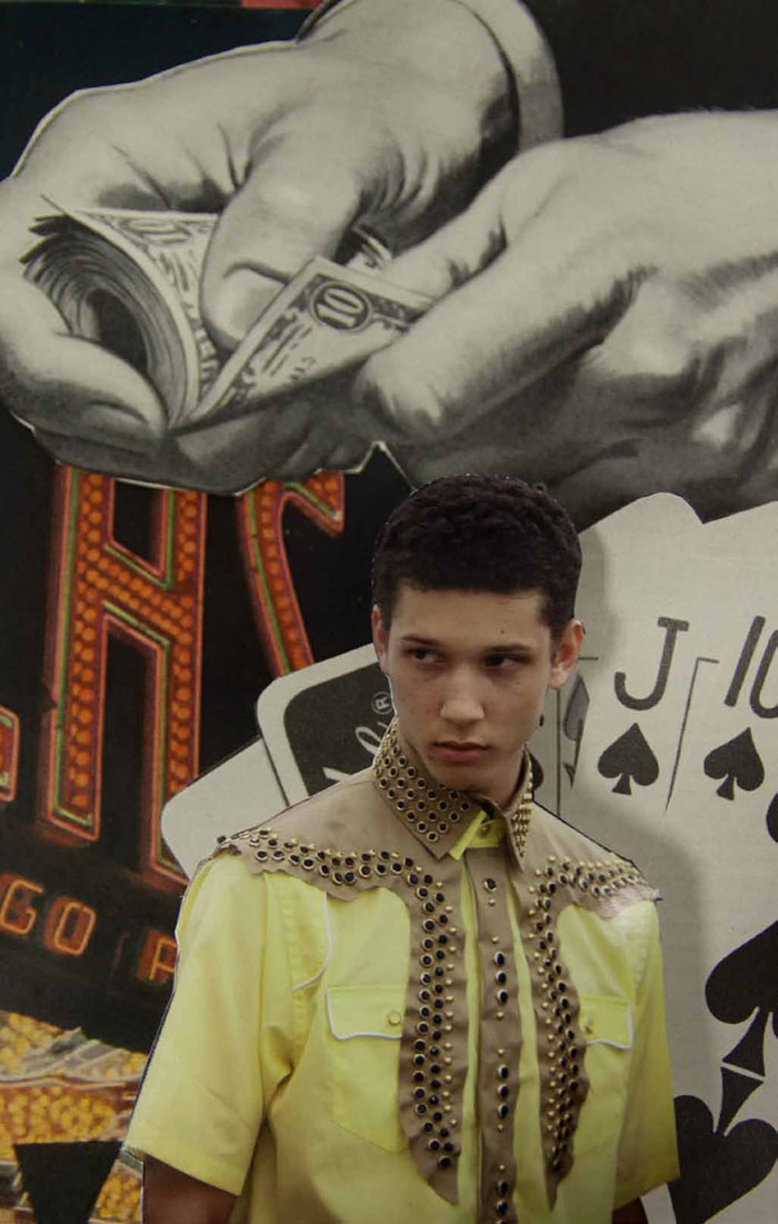
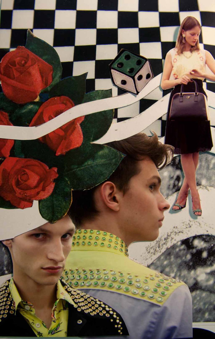
campaign // prada menswear // spring summer 2012


prada menswear // spring summer 2012

prada menswear // spring summer 2012

in luv with these prada collages of retro golf men's outfits for spring/summer 2012 // art directed by ippolito pestellini laparelli and fausto fantinuoli, photography by phil meech with art work by jeroen koolhas and lok jansen.

is it spring yet?! // images via thefashionisto

prada menswear // spring summer 2012

prada menswear // spring summer 2012

prada menswear // spring summer 2012

prada menswear // spring summer 2012

prada menswear // spring summer 2012

prada menswear // spring summer 2012

prada menswear // spring summer 2012

prada menswear // spring summer 2012

prada menswear // spring summer 2012

prada menswear // spring summer 2012