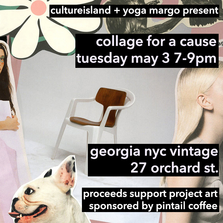
cultureisland + yoga margo event // collage for a cause // may 3 @ 7-9 pm


i'm teaming up with yoga margo and georgia nyc vintage again for a collage workshop that will benefit project art! tickets are $25 through eventbrite HERE with proceeds going to project art. margo will lead a short meditation session and then we will collage -- all supplies are included + there will be provided snacks plus free coffee and tea courtesy of pintail nyc. georiga is offering a discount on really rad vintage clothes this night, with a percentage of store sales going to projectart too. p.s. there are only 15 tickets available!

more about our collaborative partners:

cultureisland: cultureisland is a passion project by sara r. radin in which sara collaborates with emerging creatives, non-profits and brands to create unique experiences. she loves nothing more than bringing people together, introducing her friends and celebrating all kinds of creativity. this will be sara's 16th event since february 2015 and she has many more in the works.

yoga margo: margo chabot, or yoga margo, is a certified yoga instructor, health coach, artist, and founder of #projectgoodness -- a community dedicated to noticing and adding to the goodness that surrounds us always. she is passionate about giving people the tools to live happier, healthier, and more fulfilling lives through teaching the importance of gratitude, mindfulness and self care.

projectart: projectart is an award winning nyc based arts education nonprofit, providing free after school visual arts classes in public libraries across the city. founder adarsh alphons not only believes art is a right but that it also saves lives.

georgia nyc: georgia nyc was founded by georgia fenwick in june 2014. a londoner who moved to nyc at age 13, she has had a transatlantic upbringing, being inspired by both europe and america. georgia nyc is a women's vintage clothing shop, focusing mostly on styles from the 60s and 70s. georgia has created a space that encourages experimentation with clothes that have individuality and are accessible.

+ pintail coffee: michael little, the owner of lost weekend (lower east side's former coffee + surf shop) has opened a new coffee counter inside georgia nyc. thank you to pintail for providing us with coffee and tea! 

+ allison stefanoni: allison is a current student at FIT studying fashion business but in her spare time she collages under the name magazine hacker. she created our invite as part of a "girls who collage" exchange with sara.

RSVP/buy tickets here


small talk // artists tribble & mancenido


atwood road // 2014 // panels 1 -5 // tribble & mancenido

atwood road // 2014 // panels 1 -5 // tribble & mancenido

* my friends * frank tribble and tracey mancenido, or tribble & mancenido, are recent graduates of sva's art practice graduate program. they met back in 2004, while both in undergrad working at the same jean georges' restaurant in the meatpacking district of nyc. after helping each other out with personal projects, they started collaborating and creating projects together. their ideas became seamless and they decided to collaborate from that point on. they have now been making work together for almost a decade. 

tracey and frank say, "if outkast and wu-tang had babies, we could be those babies." their work featured in this post will be shown at miami project with sasha wolf gallery, during art basel miami (from dec 2-7 in the wynwood district).

255 W 88 // 2014 // panel 1 // tribble & mancenido

255 W 88 // 2014 // panel 1 // tribble & mancenido

cultureisland: what is your artistic process?

tribble & mancenido: for us, art is deliberately and precariously held together without formal resolve. we see our work as allegories of connectedness and similarity, touching on themes of personal space, memory and the domestic. our practice is photo-based, with express regard for being both voyeur and subject, and a particular interest on social interactions and its documentation. these interests range across three areas: the everyday, the home and the archive. embedding ourselves into different social and cultural situations has become an integral part of how we make art. for a former project, hurry up & wait, we became truck-drivers in the united states for an entire year to live, work and be part of that subculture- documenting our journey, and the anonymity of living on the road.

255 W 88 // 2014 // panel 2 // tribble & mancenido

255 W 88 // 2014 // panel 2 // tribble & mancenido

cultureisland: can you tell us more about your recent work?

tribble & mancenido: our current practice considers the similarities of the everyday of the domestic space, of the necessities of each individual’s life, and the familiarity of a home. in the work atwood road, we continue our investigations of being both subject and voyeur, investigating the interiority of our shared lives, moments and objects while using each other as a mirror reflection of one another. our constant dialogue as a collaborative is also a constant reflection. our intent is for the viewer to contemplate its interiority in relationship to his or her own domesticity. they may not even know it was once our own, but what is most important is that it is a distinct portrait of a home. an actual physical place for a person to simply exist. from august 2013 - august 2014 we lived in and sublet 7 apartments mostly through the commonly used online platform airbnb. during this time we stayed in many apartments and differing neighborhoods such as bed-stuy, clinton hill, south slope and the upper west side. in doing so, we stepped into the domestic lives of others, temporarily assuming their daily rituals and surrounded by their objects, both precious and utilitarian. we focused on the details that could possibly tell the story of a person’s life, while also addressing the anonymity of such constructions. the significance of personal objects was transferred onto us by the owners, and now onto the viewer as objects and photographic archives that we have created. the work ranges from nuanced shifts in dimension created by printing inside the edges of the frame taking on the subtlety of sculpture, to using actuals grids as an ode to typography often used in photography, to several polyptychs with fading color that visually mimic the fading of memory and time. our work challenges the everyday perceptions of our environments with close studies of photography’s materiality and subject at hand. we are all creators and anthropologists of the dailyness of daily life.

255 W 88 // 2014 // panel 3 // tribble & mancenido

255 W 88 // 2014 // panel 3 // tribble & mancenido

cultureisland: where do you find inspiration? who are some of your favorite artists?

tribble & mancenido: we find inspiration everywhere everyday, concentrated on a shared experience, with lots of reading, seeing, doing and conversation. some of our favorite artists include judd, irwin, kosuth, duchamp, gary simmons, tim rollins and kos, lorna simpson, bernd and hilla becher, taryn simon, do ho suh, on kawara.

255 W 88 // 2014 // panel 4 // tribble & mancenido

255 W 88 // 2014 // panel 4 // tribble & mancenido

cultureisland: what are your favorite places to see art in nyc?

tribble & mancenido: les galleries, bushwick galleries, museums and other artists' studios. 

255 W 88 // 2014 // panel 5 // tribble & mancenido

255 W 88 // 2014 // panel 5 // tribble & mancenido

cultureisland: what other places in miami do you plan to check out during art basel?

tribble & mancenido: the private collections -- rubell, margulies and de la cruz. the moca and perez museums. the nada and independent fairs.


* photographs are by tribble & mancenido // frank tribble & tracey mancenido // check out more of their work here + here, follow them on instagram here *

required reading // clothing narratives


what poignant moments do our clothes instill in our minds? how do we collect clothing items like memories? how does fashion become part of our collective history? why do we wear what we wear? how is the process of getting dressed emotional? i just purchased two recently published books that explore personal memory through our sartorial choices:

photo from worn stories by emily spivak

photo from worn stories by emily spivak

1 // worn stories by emily spivak is a collection of stories about clothing and memory featuring accounts from sixty cultural figures including andy spade, simon doonan and cynthia rowley. (new york times article here // npr interview here)

excerpt // from david carr's memoir (p. 27-28):

"and then i saw one -- extra large, thank god -- in which the classic new york script had been misprinted upside down. i knew what to do. i turned to the guy running the shop and said, "this one is a misprint. i'll give you three bucks." he said nothing, but nodded. i paid in two crumpled bills and quarters, ducked behind a rack, and put it on. as soon as i stepped out on the street, people stared. i got on the c train to 23rd, and a kid next to me stared at the logo over my burgeoning middle-aged middle section and said, "i like your shirt." "thanks, man. three bucks."

whenever i wear the shirt in new york, waitresses, bartenders, cab drivers, they all say nice things about the shirt and ignore the fact that the rack it's hanging on could use some work. when i travel, which is fairly often, and wear the shirt, which is less often, nobody ever says anything. i like that about my shirt: it is something that is intuitively understood in the city, as we insufferable locals call it, and is baffling to others, akin to many other aspects of living in new york.

i day dreamed for a while about getting some pals of wife in the clothing business to crank out a few hundred. i even had a slogan for the back: "turning new york upside down one shirt at a time" but then someone in the business explained to me you couldn't trademark the idea of turning lettering someone else created upside down. so i just wear mine instead.

it won't last. it's white, for one thing, and a series of small food and beverage disasters have already begun to dapple its surface. one day, it will acculumate enough stains and history soo that it will mysteriously disappear from my drawer. i will miss it."

2 // women in clothes by sheila heti, heidi julavits + leanne shapton features original interviews, conversations, surveys, projects, diagrams and drawings by over six hundred and thirty women, including lena dunham, molly ringwald and cindy sherman. (new york times article here // npr interview here).

women in clothes

excerpt // from the color survey (p. 141-143):

gillian king: "when i was in art school, and i realized that painting was my medium of choice, i began dressing in a palette similar to my paintings. i was obsessed with dyeing my hair different colors, and for about a year or two my head was the rotating colors of the rainbow."

nicole lavelle: "one winter my friend elizabeth said 'i am going to wear only gray this year.' she did it, and it worked, and she didn't have to think about clothes. i tried it too, but it made me feel upset."


nostalgia // a (wearable) piece of history


hypebeast's gavin brown says a jacket tagged by jean-michel basquiat and stephen sprouse was recently auctioned off // "new york’s underground art scene of the 1980′s was an environment charged with artistic potential, at the center of which was the popular after-hours club danceteria. the club was often frequented by the likes of andy warhol, keith haring, run dmc, the beastie boys and the young madonna. a relic of that time and place is this jacket, the result of an elevator attendant of the club who invited celebrity guests and artists to leave their mark on this jacket that she wore. of these, the most notable is the prolific graffiti artist jean michel-basquiat, and fashion designer and artist stephen sprouse. estimated at $7-10,000, the jacket finally went for $9,100 for what is a last remaining mark of two creative powerhouses of the 20th century."

time to save up for the next fashion relic!

* images via hypebeast *


runway // etro menswear spring 2015


etro // spring 2015

etro // spring 2015

where fashion + food are typically an odd couple, etro's spring 2015 menswear collection was clever, humorous and visually stimulating. bright colored sportswear was combined with swirling paisley prints and plates of seafood, pasta and fish among other cooking concoctions. style.com says "etro being something of a philosopher, there was the obvious subtext that you are what you eat. so if you wear what you eat, you're punching the point home even harder." just some food for thought.

etro // spring 2015

etro // spring 2015

etro // spring 2015

etro // spring 2015

etro // spring 2015

etro // spring 2015

etro // spring 2015

etro // spring 2015

* images via style.com *


nostalgia // when barry met keith haring


keith haring // untitled // 1985 from artnet

keith haring // untitled // 1985 from artnet

in 1985 my cousin barry met keith haring outside of his pop shop in new york city and asked him to sign his denim shirt. the above, unrelated artwork was created around the same time // here's what happened when barry met haring: "in 1985 i happened to ride my bike past the pop shop on lafayette the day it opened. a small crowd of 15 or 20 people were huddled around keith haring who was signing prints, t-shirts and other merchandise they just bought from haring's new store. having always loved his work but not carrying a lock to ditch my bike and run to buy something, i asked him if he could draw a crawling baby on my back. we talked for a minute about how wonderful the new store was and that i was always a big fan of the murals he used to do in the subways and at construction sites on the black paper they covered up old advertisements with. he agreed and said he especially liked those posters. i still have the shirt he signed. i keep it in a box with the new york times announcement of his death from 1990."

inspiration // winter wardrobe


winter wardrobe // cultureisland 2014

winter wardrobe // cultureisland 2014

* preparing for a long, cold winter with oversized peacoats, chunky black leather boots, champagne colored silks, cozy + oversized neutral-toned knits, delicate lingerie, geode + rose gold jewelry, sleek + simple hair with extra pale skin and brick red lips/lids. time for a chilly trip to the beach *

runway // doodled dior homme // spring 2015


dior homme // ss 15

dior homme // ss 15

dior's homme spring 2015 collection emphasized traditional tailored menswear updated with brightly colored doodles. the artful scribbles look like new, abstract stripes in which creative director kris van assche expressed the feeling of "letting it go." next spring, i'll be sporting the doodled sneakers and denim pieces from the men's department (despite cost + size!).

dior homme // ss 15

dior homme // ss 15

dior homme // ss 15

dior homme // ss 15

dior homme // ss 15

dior homme // ss 15

dior homme // ss 15

dior homme // ss 15

* images via style.com *

small talk // a gallery girl's love for jeff koons


* my gallery galpal ellen is jeff koons' biggest fan // here's why as well as her favorite pieces from the artist's recent retrospective at the whtiney *

jeff koons // split-rocker (orange/red) * photo from the whitney museum of american art *

jeff koons // split-rocker (orange/red) * photo from the whitney museum of american art *

cultureisland: you're a big fan of jeff koons. can you share with us why?

ellen: like so many others, i could not help but wonder "who is the man behind this huge puppy made out of flowers?"  before there was split-rocker, there was puppy, and, no pun intended, it planted my curiosity for and love of jeff koons. recently, i was at the new school and had the privilege of hearing koons speak. i've always loved his originality, obsession with execution, at time youthful subjects, and use of flowers, both inflatable and living, and was impressed to hear the stories behind the works. not only do his sales, auction records, retrospective at the whitney, internationally located floral sculptures and impressive list of collectors amaze, but he is showing the viewer ideas in unexpected ways. no one pushes the envelope more than he does and for that, i applaud him. 

cultureisland: what are your favorite koons artworks?

ellen: in 2001 jeff koons collaborated with espresso company illy to design a limited edition set of six cups with saucers. a decade later, i saw them displayed in a family friend's home and thought "i have to have these!"  fast forward to 2014, i received them for my birthday (a lucky find!), and was excited to see the artworks that inspired them at his recent retrospective at the whitney. i find koons' work reminiscent of my childhood, youth, and even drawings i once made. in this way, his easy fun series resonates with me. the flattened stainless steal "mirror" animals are both masterfully executed and yet perfectly simple shapes... all too many of which flooded our instagrams with shameless selfies captured in their reflective surfaces. i didn't miss the whitney's last night of the exhibit on sunday, october 19th when the museum stayed open for 36 straight hours.

jeff koons // tulips // 1995-98 * photo from the whitney museum of american art *

jeff koons // tulips // 1995-98 * photo from the whitney museum of american art *

jeff koons // kangaroo (red) // 1999 * photo from the whitney museum of american art *

jeff koons // kangaroo (red) // 1999 * photo from the whitney museum of american art *

jeff koons // inflatable flowers // 1979 * photo from the whitney museum of american art *

jeff koons // inflatable flowers // 1979 * photo from the whitney museum of american art *

// more about jeff koons >> here


runway // james long menswear spring summer 2015


james long // menswear // ss 15

james long // menswear // ss 15

inspired by sportswear + youth culture, james long designed striped and color blocked athleisure + denim for his spring/summer 2015 menswear collection. the very cool getup has a definite street/punk vibe. and with primary colored patchwork, each piece looks like a work of contemporary art. as james long put it: "for me, it's more than just sportswear, it's fashion. it's what i wear."

* images via vogue uk // check out james long's website here *

james long // ss 15 menswear

james long // ss 15 menswear

james long // ss 15 menswear

james long // ss 15 menswear

james long // ss 15 menswear

james long // ss 15 menswear

james long // ss 15 menswear

james long // ss 15 menswear

james long // ss 15 menswear

james long // ss 15 menswear

james long // ss 15 menswear

james long // ss 15 menswear

james long // ss 15 menswear

james long // ss 15 menswear


runway // misspelling by deola x clan // rtw spring summer 2015


this past spring/summer 2015 NYFW, nigerian haute couture designer deola sagoe teamed up with her daughters teni, tiwa and aba sagoe, who run contemporary fashion label, clan. their cool collaboration emphasized the mix of minimal sporty silhouettes made in elevated fabrics, showing a true amalgam of clan and deola's diverse ideologies. their designs also utilized clever wordplay with misspelled versions of casual, carefree, laidback and relax. a fresh, fun/ny take on luxury sportswear.

more about their collaboration here //

deola x clan ss15 rtw

deola x clan ss15 rtw

deola x clan ss15 rtw

deola x clan ss15 rtw

deola x clan ss15 rtw

deola x clan ss15 rtw

deola x clan ss15 rtw

deola x clan ss15 rtw

compare + contrast // blue + white wears


blue + white wears // cultureisland 2014

blue + white wears // cultureisland 2014

compare + contrast: taking inspiration from ancient chinese blue + white porcelain as well as dutch delft pottery from the middle ages, valentino's fall 2013 collection (middle + bottom images) + undercover's fall 2014 collection (top left) have made what once was fragile and antiquated, modern and wearable.

* art details // portrait painting by kris knight (middle left), 2013 + fragile flow blue photograph by kim joon (upper right corner), 2010*

art exhibit // the shapes project: perfect couples by allan mccollum


Allan McCollum // The Shapes Project: Collection of Twenty-four Perfect Couples // 2005 - 2014Acrylic with varnish on New England Rock Maple with cradled basswood panelsEach panel size: 10 x 10 inches; 25.4 x 25.4 cm

Allan McCollum // The Shapes Project: Collection of Twenty-four Perfect Couples // 2005 - 2014
Acrylic with varnish on New England Rock Maple with cradled basswood panels
Each panel size: 10 x 10 inches; 25.4 x 25.4 cm

to put it simply, allan mccollum's recent exhibit at petzel gallery in chelsea, new york was colorful + abstract. "perfect couples" featured over 30 billion unique shapes meant to represent every person in the world. while the shapes were paired together due to their similarity in form and color, the work is a beautiful representation of unique human relationships. some 280 custom colors were used, ranging from darks to brights to pastels. "perfect couples" was a compelling installation that just gave off organic energy. and as my friend rebecca stated candidly, "there's a thing behind it that causes you to think." indeed it did that.

for a saturday in september, the gallery was surprisingly empty but that made for the best viewing (and instagramming) experience. one very important person happen to make an appearance, allan mccollum himself! i thought we had asked a stranger to snap our pic in front of the art, little did we know it was the actual artist. and though the instagram turned out blurry, it was certainly a cool happening. i then (stalked) picked mccollum's brain about his work. he was approachable and honest as he explained his color usage and process. i briefly explained my own vocation and mccollum suggested i listen to terry allen's song "pink and black is coming back" from the 1950s. an appropriate recommendation, since pink is really back and black... well, it's always in. especially in new york.

AM_14_007L1.jpg

* images via petzel gallery // more about allan mccollum's work here *


color palette // red + purple hues


red + purple hues // cultureisland 2014

red + purple hues // cultureisland 2014

loving the range of reds + purples out this fall season including rust, raspberry, eggplant and wine. they feel super saturated and rich // styling idea: monochromatic looks that mix one shade of the same color or multiple shades of the same color.

* items are shoppable now @ topshop *

campaign // carven menswear fall winter 2014


carven1
carven3
carven2

the fall/winter 2014 carven campaign resembles the work of surrealist/dada artist, man ray. it was shot by fashion photographer viviane sassen, whose photographs are similarly surreal and ambiguous.

more about sassen from dazed digital: "for seventeen years, viviane sassen has been challenging the intersection between fashion and art. her hyper-vibrant, ambiguous photographs question what constitutes a fashion image and vice versa what constitutes one classed as artful. subjects often materialise as mysterious shapes and figures formed by the human silhouette, hybrid shadows and clothing brought to life by flurries of dislocating movement."


color palette // falling for neutrals


fall neutrals // cultureisland 2014

fall neutrals // cultureisland 2014

all about the fall feelings and neutrals these days. milky whites mixed with shades of camel, light rust and blush // styling idea: head-to-toe neutrals with a mix of sheer and shiny garments paired with heavier/bulkier knits and wools.

* items are shoppable now @ topshop *