small talk // allie pohl // visual artist


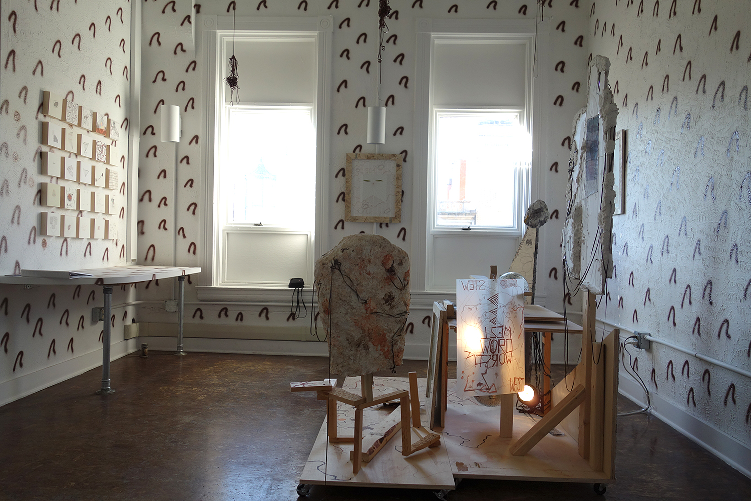
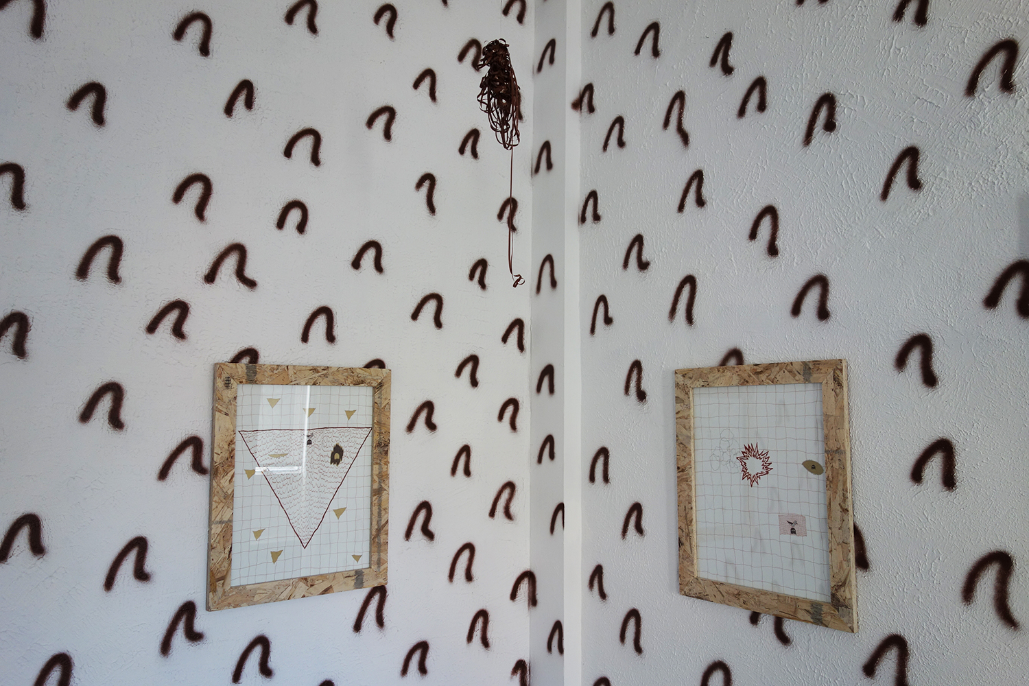
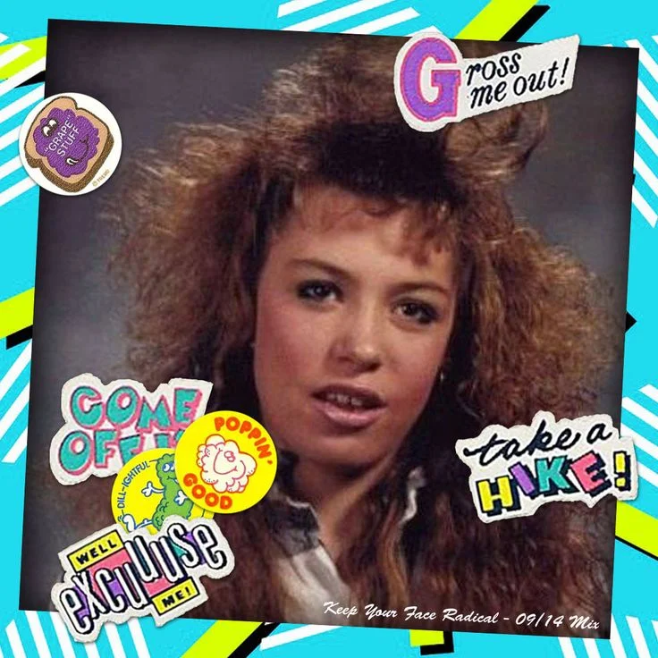
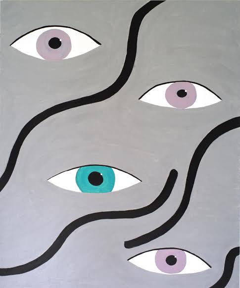
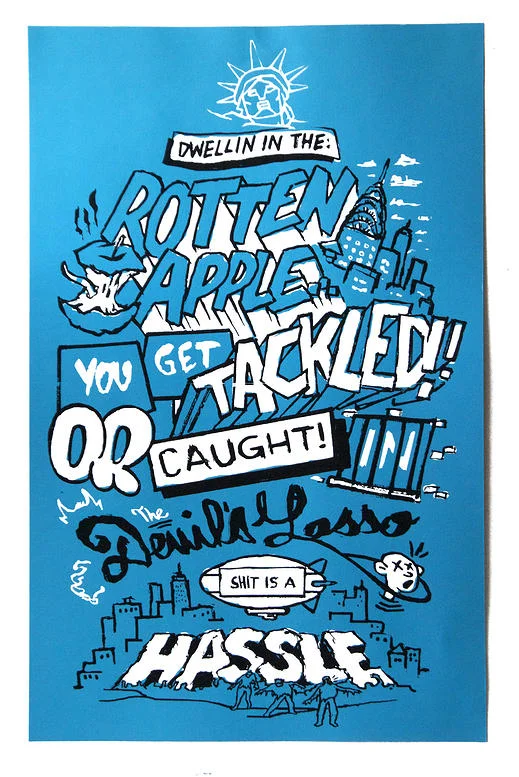
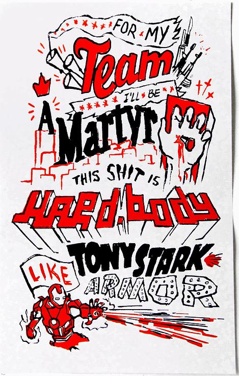
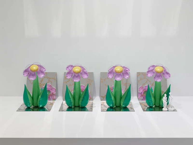
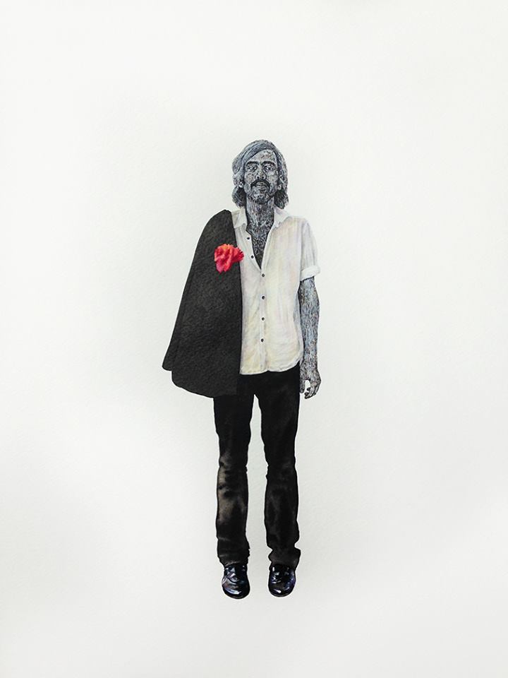
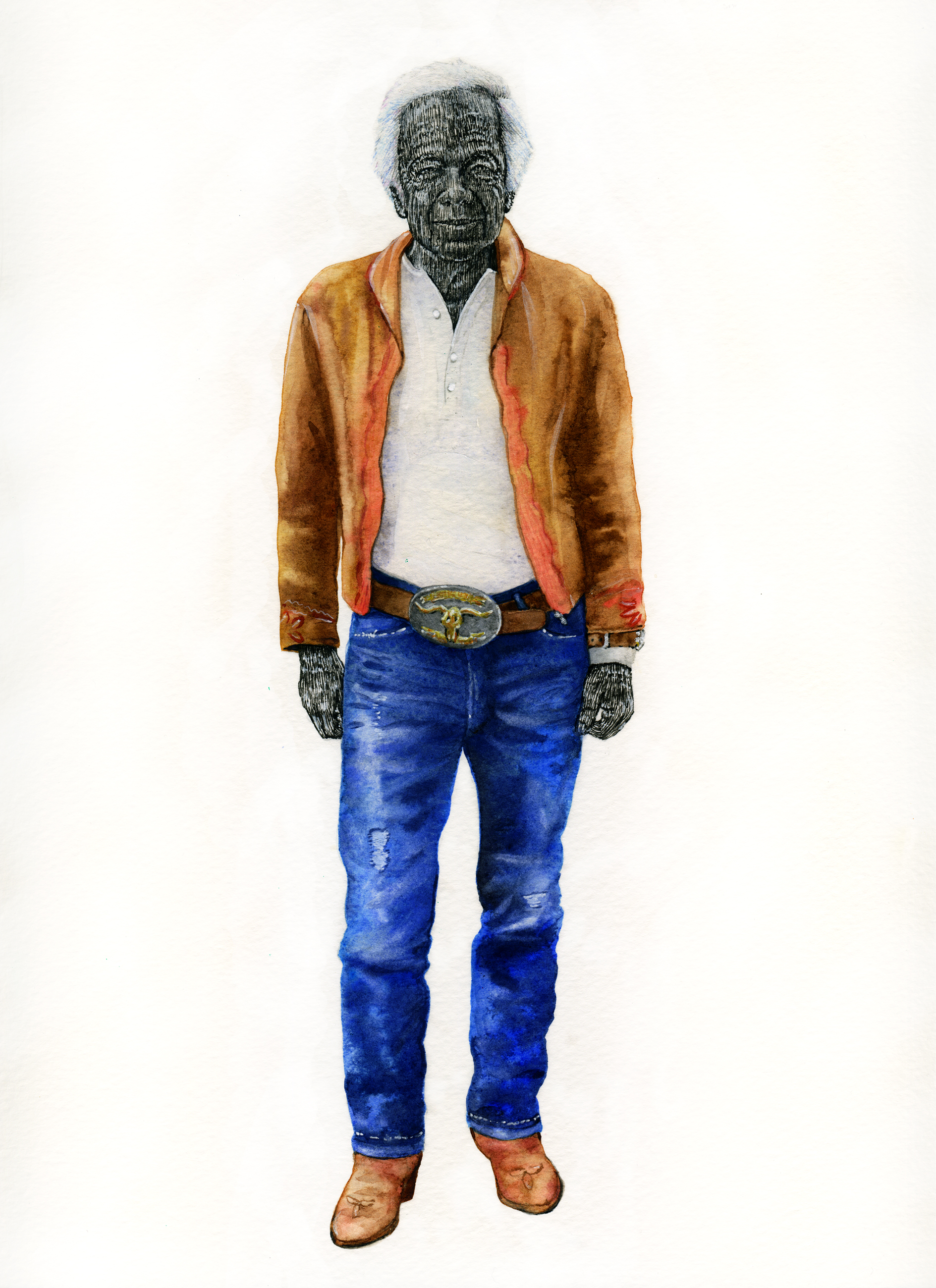
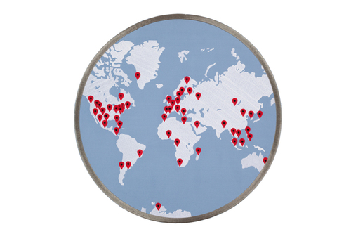
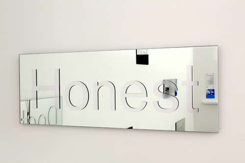
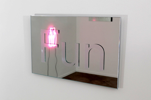
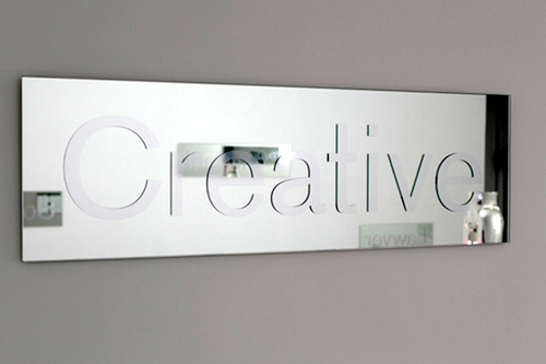
i first discovered visual artist allie pohl's work at spring/break art show this past march. the fair took place on two decrepit floors of the new york city post office, and it was comprised of some very cool projects like an installation of colorful treadmills by bret birnbaum and an interactive light and sound installation by visualpilots. while the fair has been around for a few years now, this was my first time there and i was blown away. i was especially drawn to some large scale embroidered patches by allie pohl (see below). i immediately reached out to her after and over the phone, we chatted about her upbringing, her creative work as well as life in los angeles (see this nyt article). i learned allie is most interested in why we follow certain cultural trends. her work challenges the guidelines society instills in us from a young age involving hair removal, femininity and masculinity, dating, marriage and pregnancy. i connect with her work in a lot of ways. and i just love those damn patches.

more about allie below:

cultureisland: tell us more about you.

allie pohl: i grew up in a very conservative town (winter park, florida) where people held “traditional” jobs. i always took art classes and did several years of ap art in high school. i went to hamilton college in upstate new york and was a communications major and a studio art minor. i wrote my thesis on the rhetoric and trajectory of the peace symbol. after college, i went to parsons, the new school of design in new york to study graphic design. i thought it was creative, and i could get a “real job” with my “skills.” i quickly realized i was not meant to have a client! i then went to the university of denver for my mfa in electronic media arts (it was technology driven). i chose the program because it was not a medium specific mfa. it worked with how i think. the conceptual artist “title” was placed on me. 

cultureisland: what is your creative process?

allie pohl: i become fixated on a cultural phenomenon, read extensively on that subject matter, talk to everyone who will talk to me about it, formulate what i want to say, and then start thinking about the best way to visually express my thoughts.

cultureisland: tell us more about your ideal woman series.

allie pohl: i have always been interested in why we follow certain cultural trends. for example, the concept of body hair and hair removal: we remove hair from certain parts of our body and add it to others. as a way to respond to this cultural phenomenon, i created a series of sculptures using a “my size barbie” (the doll), as a metaphor for the ‘ideal woman,’ and i had chia grow out of areas where our society removes unwanted hair, i.e. the armpit, vagina, and legs. the sculptures transformed from prepubescent to womanhood during the time of the installation. i was captivated by the shape of the midsection and started to explore different ways to appropriate the shape and what it really represented.    

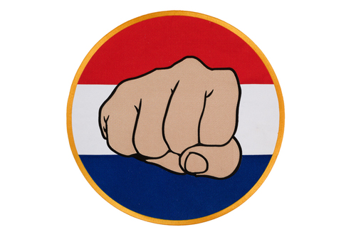
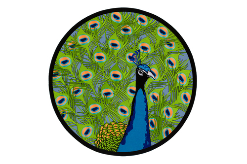
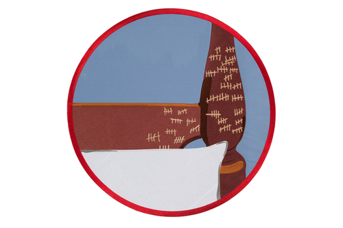
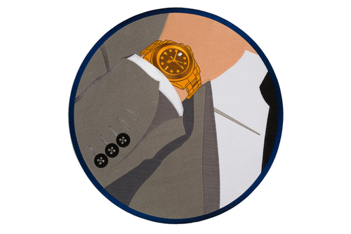
cultureisland: tell us more about your peacocking series.

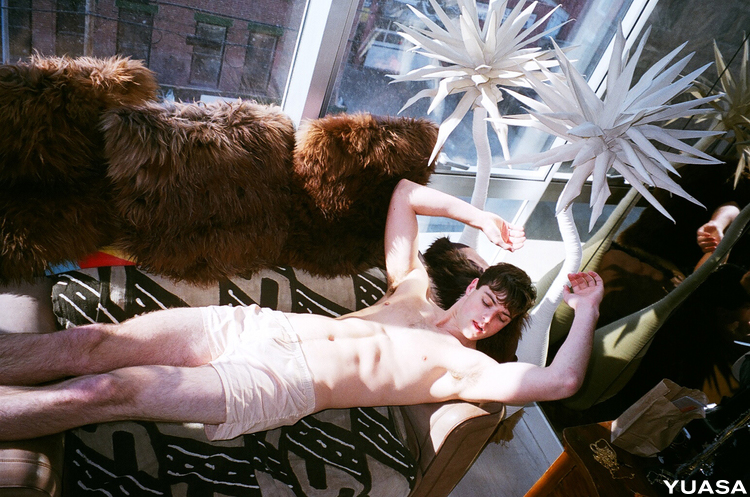
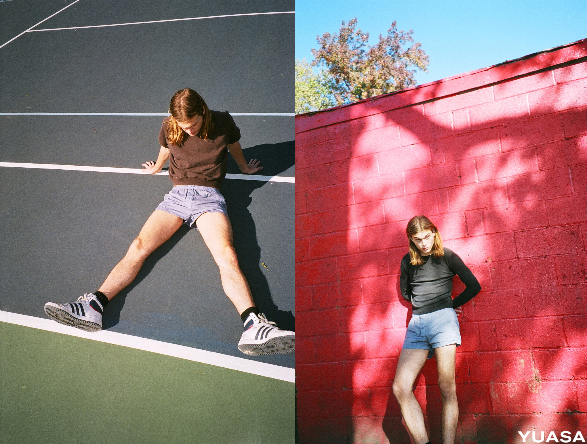
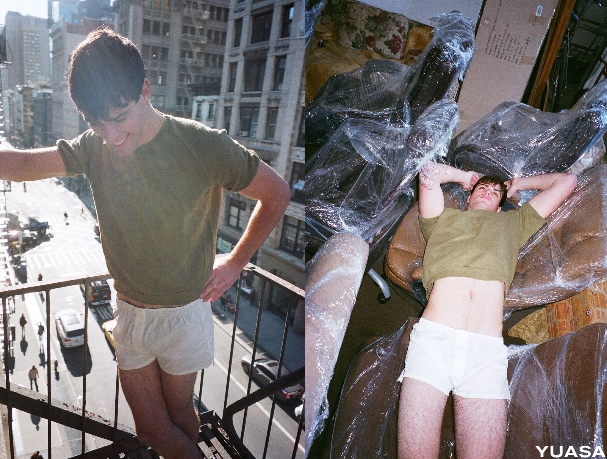
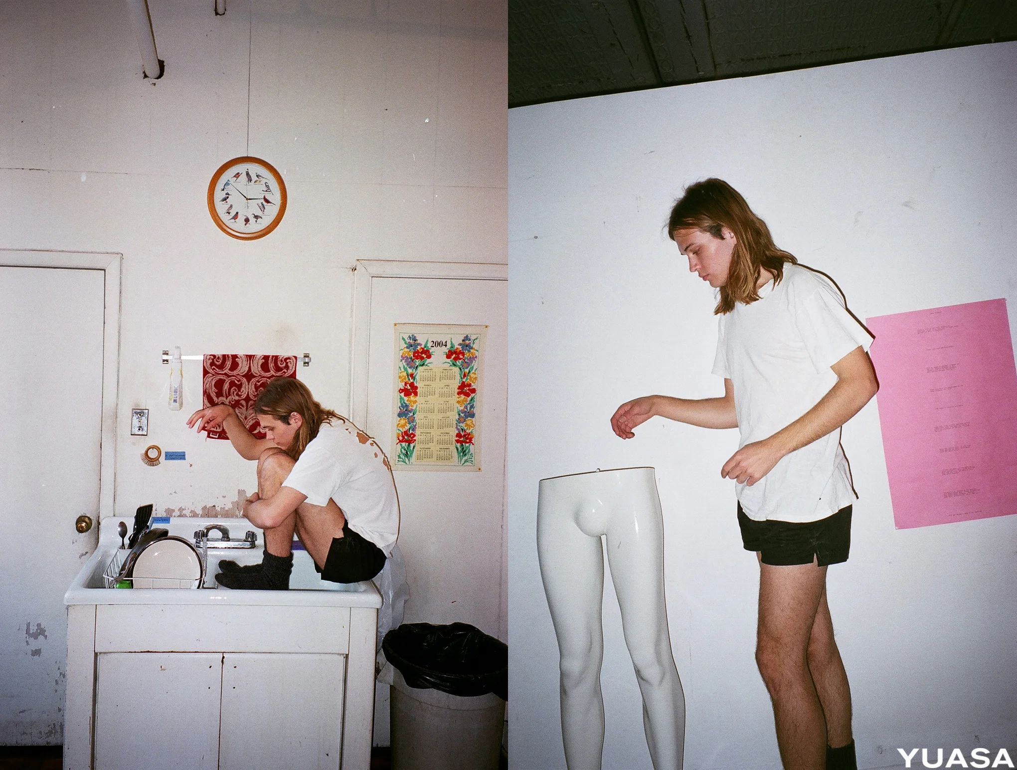
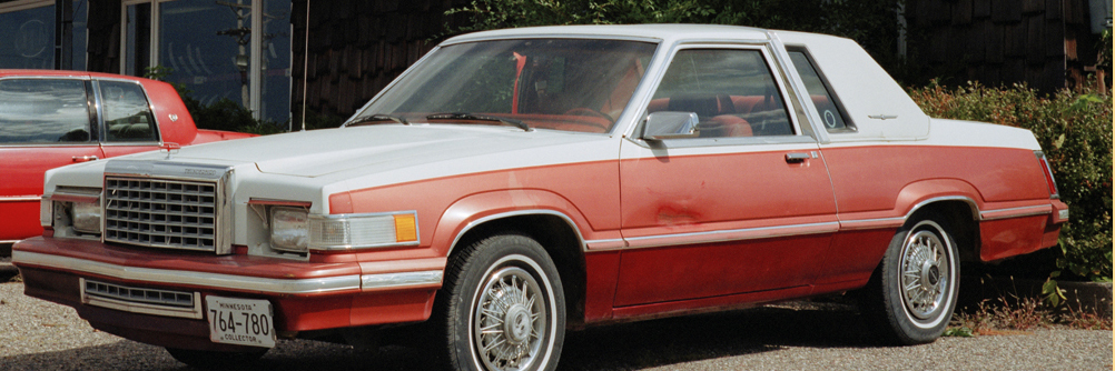
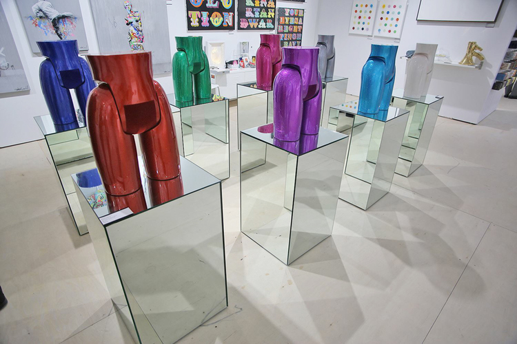
allie pohl: inspired by online dating, particularly the ever-so-popular tinder, i chose to explore how men market themselves to women. from my research (online and in person), i created man merit-badges (based on the traditional boy-scout badges) of the qualities men most commonly try to convey. i also made sculptures of dissected mannequin parts from different decades (finished in the most popular car color of the corresponding decade) to show how the idealized form has changed, and to highlight how contemporary men are also subject to society’s notions of perfection. given the change in cultural trends, this is not surprising. gay culture has become more accepted—both socially and politically—men are getting married later in life, resulting in them spending more money on themselves. you open up gq today and you might as well be reading cosmo; there’s everything from designer clothing to shaving products. 

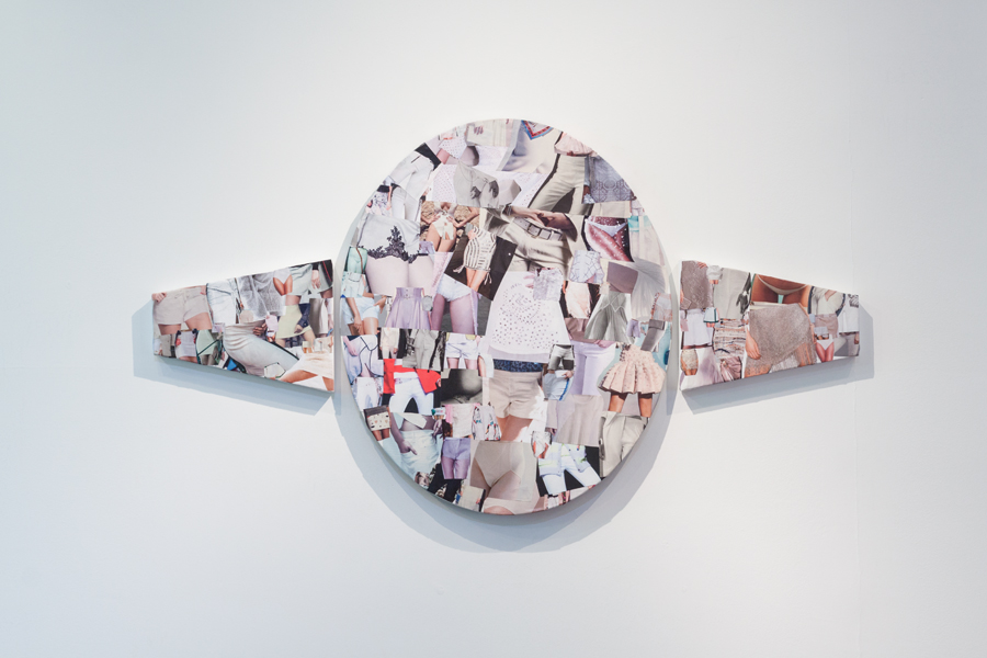
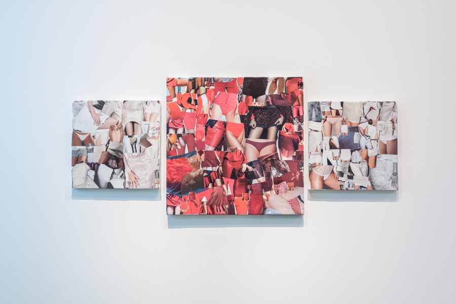
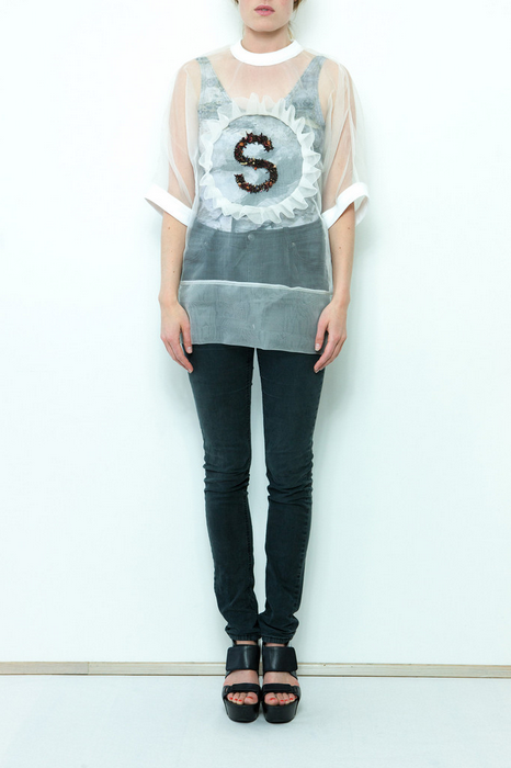
cultureisland: tell us more about your recent work, the engagement ring series.

allie pohl: i collected all of the high fashion magazines for the year (2013-2014) and cut out the ideal woman shape on the models. i collaged the images on canvases in the shape of engagement rings. these pieces are just touching the surface of discussing the pressures that are placed on women to be engaged or married by a certain age. 

cultureisland: who are some of your favorite artists?

allie pohl: barbara kruger, yayoi kusama, tracey emin, sophie calle, marry bell, claes oldenburg, mike kelly to name a few.

cultureisland: what are your favorite places to see art in LA?

allie pohl: the hammer, lacma, moca, cherry and martin, françois ghebaly gallery, various small fires, blum and poe, honor fraser.

cultureisland: what are you listening to right now?

allie pohl: haim + icona pop pandora stations, elliphant.

* check out more of allie's work here // follow her on instagram  *


small talk // anthony hawley // visual artist


anthony hawley // the business of the future perfect // video still // 2009 // (exhibited in text + message)

anthony hawley // the business of the future perfect // video still // 2009 // (exhibited in text + message)

anthony hawley is a visual artist based in lincoln, nebraska. we met back in 2013, through an art show i curated (text + message), featuring some of anthony’s work. at the time, he was in the art practice mfa program at sva with my friends tribble mancenido. anthony and i reconnected a few weeks ago and chatted about his recent installation, loculus, hybrid creativity, and the role of family life on his work. one of the many things i find inspiring about anthony: he doesn’t apologize for working in so many different mediums, instead he believes they inform each other.

more about anthony below:

anthony hawley // dear ghostesses (detail) // 2013 // 60" x 43" // ink, graphite, toothpaste, aftershave, staples, shirt, towel, hairclip, yarn, book-binding thread, beaded letters, shower curtain and torn tape // (exhibited in text + message)

anthony hawley // dear ghostesses (detail) // 2013 // 60" x 43" // ink, graphite, toothpaste, aftershave, staples, shirt, towel, hairclip, yarn, book-binding thread, beaded letters, shower curtain and torn tape // (exhibited in text + message)

cultureisland: tell us more about you.

anthony hawley: i grew up in newburyport, massachusetts, about 45 minutes north of boston. when we were there it was very much still a fishing town, a port town, a little rough around the edges. now it’s not at all. my dad is a painter and we lived in a lot of spaces that could accommodate big paintings—an old firehouse; the chemtron building (an old chemical plant and warehouse where we lived on the top floor); an old ballroom dancehall that was converted to a loft and studio space where my parents still live. i spent a lot of time in these studio spaces, especially when i was younger, and there were always amazing and odd things there. for instance, we took a lot of stuff from the chemtron building to the newer space; stuff that was just left—huge earthenware; glassware that looked like it was straight out of a mad scientists lair; an old oscilloscope! strange outsized and outmoded items that let the imagination run wild. when i was younger i also did a lot of studio chores. but i couldn’t get out of newburyport fast enough! when i was in high school and middle school it felt like a ‘good old boys’ town run by a gaggle of old conservative men. obviously memory is selective so take this with a grain of salt, but what my mind sees when it thinks about that town is a huge conservative gaggle on the one hand and then a few stray, weird figures on the other who were total anomalies—my dad had a friend named sam who was a tuna fisherman who lived in a van; and there was fran(k) who was a photographer who began as a male and transitioned to a female when his girlfriend died. these are only tiny drops in a bigger memory pool, but i think figures like this meant a lot much later—i wrote stories about these people and now they represent this kind of in-between state that is at the heart of what i do.  

anthony hawley // dear ghostesses // 2013 // 60" x 43" // ink, graphite, toothpaste, aftershave, staples, shirt, towel, hairclip, yarn, book-binding thread, beaded letters, shower curtain and torn tape // (exhibited in text + message)

anthony hawley // dear ghostesses // 2013 // 60" x 43" // ink, graphite, toothpaste, aftershave, staples, shirt, towel, hairclip, yarn, book-binding thread, beaded letters, shower curtain and torn tape // (exhibited in text + message)

cultureisland: what is your artistic process?

anthony hawley: when i am in the studio i always work on a lot of things at once. i  might have a group of paintings going along with small daily drawings, a larger project with several media components that takes awhile to plan, along with video or performance sketches. usually an idea, or a feeling, or a material interests me and i try to generate work around that. then i hone in on what hits at that the most. i take notes all the time—sometimes to get the work moving and often during the day. i read different things and sometimes watch movies too. but i try to focus all this work around that feeling or idea i’m after. so it’s not just work to pass the time, but it’s loose and there’s always room for spontaneity and the unexpected. it’s like this: i’m inside a big gelatinous thing that i’m trying to move somewhere. i have a sense of where we’re going but it’s a little difficult to steer and sometimes i just have to trust. sometimes we pick up strangers along the way. sometimes they stay with us and sometimes they exit. sometimes they leave something in the blob because we really need it for the final destination. then we arrive and i crawl outside. 

cultureisland: tell us more about your recent installation work, loculus.

anthony hawley: i started this work at the very end of 2012. i got interested in this word “loculus” because of its multiple meanings. in latin, the word “loculus” means “little place.” in the ancient world, a “loculus” was an architectural niche that housed a dead body--a chamber or cell in a catacomb. but “loculus” also refers to the ovary in a plant and to the satchel carried by roman soldiers and to a 14-piece puzzle that’s like a tangram. i loved the idea of making a sculpture that could be all of these definitions at once. a place to house the dead and dead or buried things; a place to produce or reproduce things; a kit; a puzzle to be played with and solved. i was trying to make a work that felt really alive with different media, a real hybrid, and this seemed like a way to do that. a burial chamber, an ovary, a satchel, a puzzle: they’re all containers and that overlap allowed me to combine video, performance, drawing, and sculptural materials into a single work. the shapeshifting let me work in various formants simultaneously. then larger show this year that opened expanded on that. there are a group of drawings that i think of as little loculi. and then the whole space becomes a kind of chamber. i think it all has to do with mapping the body and self, mapping the different selves and stories we travel through and how we care for those. 

cultureisland: how does hybridism play a part in your work?

anthony hawley: it plays a huge part! i think for years i felt like i had to apologize for making different kinds of work. i had to apologize for being a writer and a visual artist and for having a huge array of interests. but now i have come to own that. sometimes less is more, yes, fine; but sometimes more is more. now i find ways to keep all those interests close and in contact with each other. this way they infect each other. i constantly move between them. i don’t know why painting has to be separate from video or why that has to be separate from making strands of bead necklaces with texts. i move between these things because sometimes a video might entail a kind of thinking that’s inherently different from painting thinking, but i am very interested in the kind of process and actions that emerge when these modes are combined, or even when they start slipping into each other. the most exciting work to me feels uncertain in what exactly it is. 

cultureisland: your family is like its own little art collective; how does your wife, a violinist, and your daughters play a part in your art?

anthony hawley: well let’s start with the fact that as i’m trying to answer these questions i have one daughter banging on the piano and the other running around playing a pitch pipe. ha. but no joke, i always have to fight for airwaves. i have been married to my wife, a professional violinist, for almost 13 years and since we have known each other we’ve always had to negotiate space and time. in a very practical way that helps us build a very clear work ethic, especially with two children: you can either get swallowed up and lose the work or you just let art and life be a thing and find a balance. but that seems like a minor issue at this point because we’ve been doing it so long and it’s just what we do. we are very close and each other’s first “editors.” a few years ago we started to collaborate, which was amazing. we want to do a lot more of that, but it’s also challenging because we each have our own careers too. the ladies (daughters) are a huge influence. they talk about my work, what i’m making, wander in and out of the studio etc. also i like to play with what we think of as “good” or “bad” in taste and i like to bring things in from their world to mine—like bead letters that kids use to make charm bracelets and necklaces or hand-crocheted stuff. i don’t want to rule that out. my daughters became central figures in a big video i was working on too: “fehlerdiagnose/fault diagnosis.”

cultureisland: what effect has teaching had on your own work?

anthony hawley: i currently teach in the art department at the university of nebraska-lincoln. i teach drawing, color theory, foundations, and upper level painting and drawing and hybrid courses. also a senior capstone course. well every course pushes my work. for instance, color theory. i had no idea what i was doing when i first taught color because i’d never really taken a traditional art class in my life! but i had been teaching writing and lit classes for 13 years so i just threw myself in whole hog. it wasn’t like a particular “theory” influenced my work; just being in color so deeply. but for me the studio and the teaching very much inform each other and they have to in order to work. i always want to push what my work can do and likewise i want to push a class can do, what art teaching can do. i think some of our ways of teaching art and thinking about art school are a bit tired and we need to start envisioning what art school may or may not be for the present moment. 

cultureisland: what are some of your own words to live by?

anthony hawley: “living is a form of not being sure, not knowing what next or how. the moment you know how, you begin to die a little. the artist never entirely knows. we guess. we may be wrong, but we take leap after leap into the dark.” – agnes de mille

“when in doubt add french techno.”

* check out more of anthony's work here // follow him on instagram  *


small talk // steph beard // designer + owner of esby apparel


esby apparel season two // shot by jackie lee young // modeled by lauren kirby + duffy stone

esby apparel season two // shot by jackie lee young // modeled by lauren kirby + duffy stone

steph beard and i met about four years ago while both working at converse. she's been like a big sister and mentor ever since. now steph lives in austin and runs esby apparel, a clothing line for women with a menswear mentality that's made in the usa. each step of steph's journey to make esby happen continues to inspire me. last spring, i helped launch her tumblr, which was a fun process. i've always admired steph's personal aesthetic and i love her easy-going yet go-getter attitude. excited to watch steph and her brand keep growing!

more about steph / esby apparel below:

esby apparel season two // shot by jackie lee young // modeled by lauren kirby + duffy stone

esby apparel season two // shot by jackie lee young // modeled by lauren kirby + duffy stone

cultureisland: tell us more about you.

steph beard: i grew up in north carolina with a strong interest in art and fashion. i studied fashion design at appalachian state university, as well as marketing and studio art. i got a job at tommy hilfiger with one college course to go, so I moved to nyc and finished class while working at tommy. my experience as a technical designer helped make me a better designer.  after tommy, i worked a short stint at levi's designing men's shirts and later worked for converse. it was my time at converse that made me the most interested in going out on my own and launching an american-made womenswear label. 

esby apparel season two // shot by jackie lee young // modeled by lauren kirby + duffy stone

esby apparel season two // shot by jackie lee young // modeled by lauren kirby + duffy stone

cultureisland: tell us more about esby apparel. where did the name esby come from?

steph beard: esby apparel is a womenswear brand that rides the fine line of having long-lasting appeal while remaining relevant. we want our clothing to be that favorite piece you wear again and again. your go-to. we concentrate on styles that are chic and wearable, flattering and comfortable. we make everything here in the united states and we pre-wash our natural fabrics. esby is the phonetic pronunciation of my initials, sb, turned into a word.

cultureisland: who is the esby customer?

steph beard: she is confident and educated in the world she lives in. she's conscious of the decisions she makes for every purchase. she cares about style and the way that she looks, but she knows that comfort is key and less is more. when she gets dressed in the morning, it's easiest for her to grab her go-to esby pieces.

esby apparel season two // shot by jackie lee young // modeled by lauren kirby + duffy stone

esby apparel season two // shot by jackie lee young // modeled by lauren kirby + duffy stone

cultureisland: how has esby grown since you started? what plans do you have to continue growing it?

steph beard: we’ve been growing at a great pace. we’re in more and more stores across the country and our third collection is about to launch. we are introducing new fabrications, such as linen and silk, and we’re also launching our first few pieces of outerwear this fall. we hope to launch a small menswear capsule next year. we’re also going to collaborate with a few other apparel lines…stay tuned!

esby apparel season two // shot by jackie lee young // modeled by lauren kirby + duffy stone

esby apparel season two // shot by jackie lee young // modeled by lauren kirby + duffy stone

cultureisland: tell us more about your collection featured here. what involved it and how has it evolved from your first season?

steph beard: this is our second collection that launched late last year. we experimented with more stylish silhouettes with the intention to be on trend, but remain relevant for years to come. the jumpsuit trend inspired us to create a piece anyone can wear. it was such a successful style for us, we’ll continue to run it in future season. the dresses this collection were inspired by easy, over-sized pieces that were still flattering. for our first collection, we played it a little more safe so it was exciting to take more risks with season two.

cultureisland: the photos were shot by jackie lee young. how did that collaboration come about and where did the inspiration for the shoot come from?

steph beard: jackie is a friend of ours and we've been long admirers of her amazing work. she scouted the botanical gardens at zilker park for its lush vegetation and contrast to our indigo blues, grays and blacks. our models were lauren kirby and duffy stone. lauren is now employed with esby apparel as our production, marketing and sales assistant. duffy just launched an independent interior design company, studio duffy.

esby apparel season two // shot by jackie lee young // modeled by lauren kirby + duffy stone

esby apparel season two // shot by jackie lee young // modeled by lauren kirby + duffy stone

cultureisland: where do you find inspiration? what are some of your favorite magazines or websites for inspiration?

steph beard: from vintage and modern sources. from classic menswear to the runways. i find a lot of colored inspiration from my natural surroundings. austin is filled with sun-faded, muted colored palettes. favorite magazines + websites include darling magazine, w magazine, kinfolk and jjjjound.

esby apparel season two // shot by jackie lee young // modeled by lauren kirby + duffy stone

esby apparel season two // shot by jackie lee young // modeled by lauren kirby + duffy stone

cultureisland: where can we find esby apparel in stores?

steph beard: you can shop our current season online and our next season, spring/summer 2015, will be available at these stores in may: sunroom, olive and kickpleat in austin, broome street general in la, old north in asheville, and hawthorne in oakland.

esby apparel season two // shot by jackie lee young // modeled by lauren kirby + duffy stone

esby apparel season two // shot by jackie lee young // modeled by lauren kirby + duffy stone

cultureisland: what are your favorite places to see art, shop, get coffee, eat and hang out around austin?

steph beard: for art, common house, the contemporary and billy reid art shows. favorite shops include sunroom, olive, kickpleat and stag. for coffee, seventh flag, friends and neighbors. for eats, curras for tex-mex breakfast and buffalina for wine and pizza. for hanging out, hotel san jose, weather up, yellow jacket social club and by the pool.

esby apparel season two // shot by jackie lee young // modeled by lauren kirby + duffy stone

esby apparel season two // shot by jackie lee young // modeled by lauren kirby + duffy stone

cultureisland: what are you listening to right now?

steph beard: the growlers, future islands and big data.

* check out esby apparel here // blog // instagram // tumblr // pinterest // facebook // twitter *


small talk // kristy santelli // jewelry designer of drift / riot


i met kristy santelli at the capsule womenswear tradeshow this past february. kristy is a jewelry designer and art educator based in richmond, virginia. she runs drift / riot, a line of incredibly cool handmade jewelry. i immediately fell in love with kristy's knot chokers above and found chatting with her just like talking to an old galpal. since metals are very malleable, kristy's design process is both organic and sustainable allowing her to easily re-use jewelry by melting it down and starting over. is it just me or does this sound like a life metaphor?

more about kristy + drift / riot below:

cultureisland: tell us more about you.

kristy santelli: i moved around a lot growing up. that's really where the drift concept comes from. i was always moving to the next place and readjusting to my surroundings -- i loved it! i studied at fit for my undergrad and have a degrees in fashion merchandising + ad comm. i took the first job i could get out of college and waitressed to make my rent, i was first a set designer (working on sets for oprah + jay-z) and then got into fashion pr. i realized working there that i had to do something with my hands, i hated sitting at my desk and writing. so i started taking a photoshop class to help with press releases and flyer's. then took a lifestyle drawing class at sva and became addicted to making. i decided to pursue teaching art where i could work with students making all day and still teach. i'm in my 5th year teaching high school art classes while also running drift / riot. it's getting harder and harder to juggle both but i really love working with my kids so i will keep teaching as long as i can. i started working with metal at fit but revisited the medium during my masters at vcu. taking metals at vcu started as way to get out of taking another theory class but it really became something i feel in love with. i would be at the studio until midnight working on a ring instead of working on my thesis! from there i started making pieces for friends and then met my fiancé, who not only is the love of my life but really the reason i began drift / riot. he motivated me to take it to the next level and just go for it. he also designs my kick ass website so we're a pretty good team! 

drift / riot signet ring + drifter cuff

drift / riot signet ring + drifter cuff

cultureisland: tell us more about drift / riot.

kristy santelli: drift / riot is my baby. i started selling at a local boutique before i had a name. but product kept moving and people wanted to know about the brand. i decided it was finally time to put myself out there. i am a drifter at heart and have always drifted so that was the easy part. but i wanted my company to be more dynamic than just drifting. so my sister and i started brainstorming names that might work. i think she came up with riot  and as soon as she said it that was it! i like how it's a juxtaposition, kind of dueling philosophies. i liked the idea of making it a riot -- going crazy with it, maybe adding a little humor, and really just going for it! i like to hear what other people think it means. 

drift / riot brass tube + textured hoops

drift / riot brass tube + textured hoops

cultureisland: what is your design process? what kind of products do you make?

kristy santelli: we make lovely things for your ears, neck, fingers, and wrists! i just started making tie clips for men and hair pins which i love. my design process is a bit chaotic. i don't have a lot of time so when i'm in making mode i tend to kind of vomit all of my ideas i've had built up. i'm working on creating more of a collection when i design now and trying to sketch out my ideas before hand. i want to have more of a theme or fluid direction. but it's definitely challenging when time is limited. 

cultureisland: do you stick with the same styles and/or release new styles seasonally?

kristy santelli: i have products that i love and that are really timeless so they will stay but i'm working on releasing new products that have more of a theme every season. i go back and forth and cut products when i don't feel like they fit anymore. again, it's hard for my to scale it back! a lot of times it's about the challenge of making it. 

cultureisland: who is the drift / riot customer?

kristy santelli: i love our customers -- it's crazy but we really cater to every age. i know high schoolers that rock drift / riot but i also sell at many high end boutiques that cater to women 40 and up. i have a lot of women that are in their 50's that are my best customers! and they know how to wear it. that's another thing i love about making jewelry -- it's something you collect over your lifetime + pass down. 

cultureisland: what plans do you have to grow the brand?

kristy santelli: oh wow -- where do i begin? we are looking at buildings in rva to open a store. my dream is to have the bauhaus of jewelry. where people can come and learn, shop and hang out. to create a place that encourages other artists and helps them expand. would love to house visiting artists and help them get their start, build them a website and watch them grow as well. it's not about me but it's about the community and bringing people together.

cultureisland: where can we find drift / riot in stores?

kristy santelli: we have always been focused on bringing people to our site as an in-house brand. but have just started working with wholesalers. although we are trying to be mindful as to where we place the brand. we want to sell to store we admire and care about their customer. right now we are at need supply co., sunroom austin, rosewood clothing co. and have a few others on the horizon which we are very excited about! 

cultureisland: where do you find inspiration?

kristy santelli: everywhere! it's hard not to be inspired. i have to sometimes shut off my surroundings so i can focus on a collection. it's so easy to go crazy but limiting that selection is what's challenging for me. 

cultureisland: what are your favorite places to shop, eat, hang out and grab coffee around richmond? any other richmond based brands we should check out?

kristy santelli: my favorite places to shop are need supply co. + rosewood clothing co. they are my go-to's. my favorite restaurant is stella's and the most amazing coffee is the nitro brew at sasion. richmond full of makers! my two other favorite jewelry brands are giantlion + young frankk, na nin makes my favorite candles + perfume oil, emimade has really cute ceramics, and ledbury for the men in your life. 

cultureisland: what are you listening to right now?

kristy santelli: ha, right now kygo / firestone is playing! but i also teach spin classes at a local boutique here in richmond so i'm constantly making playlists and love love love all music. when i first started drift i named all the product after songs. i think i'm going to start that again. 

* check out drift / riot jewelry here // instagram // facebook // twitter *


small talk // michael yuasa // yuasa studios


yuasa shot by andreas lux

i first came across the yuasa brand at the capsule menswear tradeshow this past january and loved their minimal approach to men's boxers. i especially fell in love with their leather boxers, immediately imagining them as a staple in my summer wardrobe. as a little lady, i would wear any of their boxers, to sleep in or for the everyday. i met up with michael and his boyfriend james who run yuasa together last month to hear more about their brand. they had just moved into a new place in the west village. we talked parties, collaborations and their simple yet unique approach to men's underwear over a hot tea during the perfect sunday snowstorm. their digs had wonderful plant life and an awesome old fireplace. i'm excited to see what michael and james will do with yuasa next. i also hope to collaborate with them someday soon since they're as kind and cool as they come. this summer all i want to do is frolic around in some yuasa boxers, just like the male models in their andreas lux shoot featured here.

more about yuasa below:

cultureisland: tell us more about you.

michael yuasa: i grew up in seattle, washington and was living there before moving to nyc. i used to throw a lot of parties in seattle, which were always really fun to do. we had a great following! i was tour managing as well as releasing records however i knew that in the long run promoting parties would not necessarily be sustainable and the music industry was shaky. a clothing line seemed like it would be more sustainable in the long run and continue to keep me motivated from a creative perspective. from there yuasa was born and launched a few months after arriving in nyc.

yuasa shot by andreas lux

cultureisland: tell us more about yuasa.

michael yuasa: yuasa strives to create clothing that is simple yet powerful, paying homage to the modern american design aesthetic: minimal, experimental, and innovative. the brand started as a platform for all of my artistic and creative interests. the boxers are the physical product combining my interests in fashion, photography, art and lifestyle. it's also about exploring the evolution of creative expression and working on a collective product where i can involve my friends in totally opposing worlds. our sole product is a men's short cut boxer, every season we introduce a few new colors. i wanted to create a boxer that could be worn under jeans comfortably or around the house. the boxers from other brands that are currently available in the market are long and clumsy and totally devoid of sexiness. yuasa boxers were designed to make you feel desirable, sexy and confident.

yuasa shot by andreas lux

cultureisland: what kind of collaborations have you done?

michael yuasa: when i started the brand i knew that i wanted collaborations with other artists or like minded companies to be a part of our dna as a brand. our main ongoing collaboration is the yuasa photo series which we have been releasing periodically over the last year. each few months we put together a shoot with an up and coming photographer. at the most recent shoot andreas lux shot michael baily gates, who i've been wanting to shoot for so long. i love how the shoot came out, the guy of yuasa appears more multifaceted and complex and the shoot adds a lifestyle glimpse into the brand. the andreas lux shoot was styled by my friend david casavant who is beginning to make waves with his personal archive. we have also previously worked with remi lamande and shannon sinclairthe photo series are awesome as we get to collaborate with photographers and stylists in an intimate setting and dive deeper into who the yuasa man is, exploring him. last year, for pride we did a collaboration with international playground and visual aids where we printed four images from photographer benjamin fredrickson's photos on yuasa boxers in support of visual aids. we sold the boxers at international playground and at printed matter nyc with the funds raised going to visual aids.

yuasa shot by andreas lux

cultureisland: how do you hope to grow the brand in the future?

michael yuasa: i want to have more fun with the brand in the future, we're working on getting out our made to order leather boxer campaign now and we are working on designing a few swim trunks. for the summer, i want to have a tie dye collection. it's really interesting to see how we will start with a design idea and it will lead us to some amazing location. the swim trunks will give us reason to do beach shoots in the winter and get out of nyc which sounds like a good plan to me. we will of course continue to build out our mens essential offerings with the adding of briefs and trunks to the line.

yuasa shot by andreas lux

cultureisland: what are your favorite places to see art, shop, get coffee, eat and hang out around the west village?

michael  yuasa: my boyfriend james and i just moved to the west village. there's not a lot here that we haven't seen already, but it's awesome to be so close to the chelsea galleries. i really like installations by diana thater, she had one at david zwirner a few weeks ago. i'm really into sound and lighting immersive experiences. i've lived in nyc for five years now and james for eight so i'm really excited to explore new neighborhoods. i love hanging out at kenka on st. marks for some izakaya cheap eats and a sopporo for $1.50. my favorite coffee is caffé vita in the lower east side on ludlow. once the weather warms up a bit more we'll probably continue riding our bikes east to boerum hill and deep brooklyn and pick up where we left off last exploring out there and riding to the beach in the summer. i'm really into prospect park -- one of my favorite spots is the boathouse, built at the turn of the century. grabbing a kite and a sandwich and hanging out at the boathouse with our bikes and friends is a perfect day in my opinion. i would love to create some sort of installation in the meadowport arch, which is one of the beautiful aging archways in prospect park.

yuasa shot by andreas lux

cultureisland: what are you listening to right now?

michael yuasa: on my playlist lately has been tops, this really great band from montreal, real estate and miles davis when i feel like really chilling out.

* check out + purchase yuasa boxers here // instagram // facebook // soundcloud *


small talk // karen light // gallery owner // garde rail gallery + the show on the road


i met karen light at the outsider art fair in nyc a few months ago. i loved her gallery's booth which featured paintings of everyday objects by self taught artist holly farrellembroidered muslin pieces by self taught artist rebecca shapiro and drawings by gregory blackstock, an autistic savant. karen actually runs two art businesses: 1. garde rail gallery which started in seattle and now operates online. the gallery specializes in work by contemporary folk, self-taught, outsider, visionary, and developmentally disabled artists // and 2. the show on the road, a mobile gallery that brings art to the streets and people of austin, texas.

i've enjoyed getting to know karen and hearing more about her unique journey as a gallerist. what's been even more enjoyable is that she's taken an interest in what i'm doing too. i am grateful for this and we've discussed working together on a concept for art basel miami next december, which i hope can come to fruition. more about karen below:

cultureisland: tell us more about you and garde rail gallery. how did the name garde rail come about?

karen light: i grew up in georgia and worked as a flight attendant for nine years. along the way, i saw art all over the world and began collecting folk art. i quit delta in 1997 and moved to seattle. one day i was visiting artists in a homeless shelter and a stranger came in and said he had space for rent in a building that was going to be demolished several months later. it was a 1930s art deco building and he was charging $200 a month for rent. i immediately jumped at the opportunity and became an art dealer over night. ultimately we renovated the space like we would be there forever. garde rail gallery opened in june of 1998 in the belltown neighborhood of seattle. since i recently moved to austin, i now operate the gallery online. garde rail has specialized in what is known as self-taught, contemporary folk, and outsider art. the gallery represents 30 or so artists from the northwest, deep south and other regions of the united states and canada. i've traveled extensively to hand pick artists from alabama, florida, georgia, louisiana, michigan, ohio and the carolinas. many of the artists have been included in major collections, museums, and traveling exhibits. many of the artists are african american and all are self-taught. the name garde rail actually came to me in a dream. it's directly related to prolific southern folk artists obsessively creating art, filling their house, their yard, and on out to the guard rails, visible from highways.

gregory blackstock // the huts // 28.5" x 45 3/4" // 2013 // graphite, crayon, ink, marker on paper

gregory blackstock // the huts // 28.5" x 45 3/4" // 2013 // graphite, crayon, ink, marker on paper

cultureisland: how did you discover artist gregory blackstock? tell us more about him and his work.

karen light: gregory blackstock's cousin's neighbor knew me and my gallery and recommended his drawings to me. he had worked as a pot washer at the washington athletic club for twenty five and a half years where his work was featured in the company newsletter under the title "blackstock's corner" since 1986. i went to see him and he began pulling roll after roll of drawings from under his bed and in his closet. they were all stunning, catalogue-like drawings. his subjects range from state birds to state prisons, tools to wwii bombers, and mackerel to boeing jet liners. gregory's drawings are often large, on several sheets of paper pieced together with tape and glue. using pencil, crayon, ink and marker, gregory depicts insects and baskets with incredible precision, straight lines and text executed without the aid of a ruler. the detail is minute and the shading is impeccable. in gregory's world, everything around him needs to be identified, ordered and arranged. discovering his work really changed everything.

gregory is an autistic savant and has overcome many of the limitations of autism. he exhibits many of the remarkable traits of the autistic savant; he speaks many languages, is an incredible mimic, and is able to recall events with uncanny precision. it is without doubt in our minds that gregory blackstock would be an artist under any circumstance -- his autism did not make him become an artist, nor is he an artist because of it. still, autistics exhibit an inherent inability to show intimacy and intimate communication with those that are close to them and others. it is through his art and his music (he plays the accordion), that gregory has effectively been able to combat this disability and to meet the challenge, with fantastic results. discovering gregory's work changed his life and he's the happiest he's ever been. he brands all of his shirts with the word "artist" and has truly enjoyed the positive identifier of this title. circa 2007, commes des garçons contacted me about wanting to collaborate with him for their men's ready to wear. they chose several images and used them as patterns on the clothing they sent down the runways. the seattle art museum gift shop once produced a t-shirt using his drawing of "the art supplies." gregory is also in the permanent collection of the collection de l'art brut in lausanne, switzerland.

cultureisland: you recently moved from seattle to austin and started a new gallery, the show on the road. what is the concept?

karen light: in austin there is no gallery district or art space building yet. while austin is full of food trucks, i got the idea to do a visual food truck that would sell art and art "produce" such as t-shirts, cards and art books. i bought a truck on craigslist and it took a year to get it renovated and ready as a full-service art gallery. i call it road art. it's an unexpected model for a gallery as it's friendly and approachable. i launched it a year ago and i drive around different areas of austin and tweet the location. i try to be in as many places around town as possible. the art features mostly small scale original art of all disciplines, from a carefully selected roster of contemporary artists. most works are $500 and under. (watch video above)

poster was designed by christian bland of the black angels.

poster was designed by christian bland of the black angels.

cultureisland: tell us more about your upcoming exhibit, the visual transmission tour, at sxsw.

karen light: during south by south west, the show on the road will be stationed indoor the austin convention center for the music gear expo. the truck will feature rock-and-roll themed paintings by berlin-based eddie argos of art brut and the lost highway drawings and record etchings of sonic youth guitarist and co-founder lee ranaldo. the show will be inside the convention center from march 19th through the 21st and the work will be up in my truck until june. my vision for the sxsw show is rooted in my love of music and my interest in spotlighting another level of creativity of musicians. on tour and during their downtime, these artists can effectively escape their hectic schedules and touring demands by making art –- expressing a quieter side of their creativity. touted by rolling stone and spin magazines as one of the “greatest guitarists of all time” (along with bandmate thurston moore), lee ranaldo is an accomplished singer-songwriter, guitarist, writer and record producer. he has also been a visual artist for many years, exhibiting his work in numerous galleries and museums, as well as in several published books. his lost highway drawings were inspired by over 30 years on the road as a musician. not ironically, eddie argos’ art brut band name is also the term for ‘outsider art’ coined by french artist jean dubuffet. argos is considered one of the most charismatic lead singers in rock ‘n roll and will be in austin for sxsw with two appearances at the show on march 19th + 20th. my hope is that by revealing the visually-creative side of some of our favorite musicians, people will develop a deeper sense of connection to art and music since the two work so well together! 

lee ranaldo // to bilbao 042413 #12 // 16.25" x 13.75" // 2015 // block print

lee ranaldo // to bilbao 042413 #12 // 16.25" x 13.75" // 2015 // block print

eddie argos // transparent mixtape // 12" x 24" // 2014 // acrylic on canvas

eddie argos // transparent mixtape // 12" x 24" // 2014 // acrylic on canvas

cultureisland: what are your favorite places to see art, shop, get coffee, eat and hang out around austin? and what are you currently listening to?

karen light: for cocktails, rio rita is my cheers. best pizza, bufallina. my favorite music venue is hotel vegas, it's very psych heavy. best shopping is blue velvet vintage. favorite lunch spot is the austin daily press. best coffee shop is cenote. and my favorite place for true austin grub and atmosphere, the texas chili parlor. i just bought a record, "lost souls volume 1, arkansas psychedelic and garage rock from the 1960's, the dodos, fat white family and bass drum of death and i still can't get over that perfect salad days by mac demarco.

* check out garde rail gallery and the show on the road // and if you're in austin during sxsw, check out karen's exhibit at the austin convention center from march 19th -- 21st *


small talk // florence tang // co-founder of lot, stock and barrel


i came across lot, stock and barrel at the pop up flea in nyc several months ago. there, the brand had a unique selection of interesting vintage tees, lots of quality denim and outerwear, and several items that had beautiful embroidery and huge patches. i reached out to florence tang, the co-founder of lsb, to pick her brain about the company and have since learned a few things: 1. the embroidery and patches are created by the chain gang in la who are experts at chain stitching (florence's partner ben is currently apprenticing and learning their techniques) // 2. most of lot, stock and barrel's apparel was made in the united states and is sourced on their many trips across the country // 3. the product is mainly menswear with some smaller sized items but the company also offers custom tailoring and repairing // 4. lot, stock and barrel recently did a pop up with the chain gang featuring a full assortment of repaired, refurbished and quality vintage levi's denim at the levi's headquarters // 5. their store is located in downtown la, an area where people understand and appreciate what they do.

lsb's tagline "inspiring vintage goods and curiosities" has stuck with me and i love their thoughtful, personal approach to vintage buying and selling. you can really sense their own journey and the history of clothes through their curated offering and the "stories" section on their website. more about florence tang and lot, stock and barrel below:

lot, stock and barrel lookbook 2015 // photography by jon dragonette // chain stitch work by chain gang la

lot, stock and barrel lookbook 2015 // photography by jon dragonette // chain stitch work by chain gang la

cultureisland: tell us more about you.

florence tang: it's been quite a long journey to where i've landed in starting lot, stock and barrel. growing up in toronto, i started with a degree in graphic design from york university and then continued my education in visual communications at fidm in san francisco. i then started my career as the assistant visual merchandiser for levi's xx at levi strauss working at their office before moving down to los angeles where i joined a creative consulting company, working for companies such as filson and spiewak. there was a point where i realized that there were many other interests i had and wanted to pursue those endeavors. i then teamed up with my partner, benjamin phillips, in building lot, stock and barrel last year. combining our passion of vintage items with our background from the creative field, we are a design studio servicing multiple other brands with anything ranging from store design and visual merchandising to seasonal concept design and graphic design. our store in downtown los angeles is our home base where we showcase vintage apparel, accessories and home goods in a retail setting to share our passion with other like minded individuals.

lot, stock and barrel lookbook 2015 // photography by jon dragonette // chain stitch work by chain gang la

lot, stock and barrel lookbook 2015 // photography by jon dragonette // chain stitch work by chain gang la

cultureisland: tell us more about lot, stock and barrel. how did the name come about?

florence tang: lot, stock and barrel is a vintage store in downtown los angeles where we curate vintage items with select production pieces and also offer the service of chain stitch embroidery. we have been lucky to meet some great friends along this path such as the chain gang, who are the ones creating the beautiful chain stitch pieces that we have in our store. in addition to our store, we offer a large variety of design services derived from the backgrounds of both benjamin and myself. the concept came about very organically as we started out as an e-commerce website only, and quickly realized that we missed the human, tactile experience. we then opened a store by the ace hotel to showcase our vintage products to the public in an environment that was not ideal, but worked for the budget we had. shortly after we moved to the arts district of los angeles to continue growing the store presence and we've been loving it ever since. the name came from the saying "lock, stock and barrel" which means all or everything. we used "lot" instead as we are also a wholesale business where we offer large lot units to other resellers. we also offer a very broad assortment of vintage items, hence the name lot, stock and barrel seemed very fitting.

lot, stock and barrel lookbook 2015 // photography by jon dragonette // chain stitch work by chain gang la

lot, stock and barrel lookbook 2015 // photography by jon dragonette // chain stitch work by chain gang la

cultureisland: what kind of products do you sell and what other brands do you feature? what is your process for sourcing products?

florence tang: we try to include something for everyone at our store, which includes anything from kids lee jackets to vintage biker tees and levi's cut off shorts to vintage french indigo textiles. our product categories include vintage native american turquoise and sterling silver jewelry, vintage apparel, accessories such as bandanas and hats, and home goods. we travel all over the country to source and secure items for the store. on our last trip we went to colorado, new mexico and arizona where we stopped at multiple private dealers, thrift stores, and even hoarders. every item is handpicked, washed, and repaired before it is placed in the store. we pay very close attention to details in every repair and even try to replace missing buttons with the historically accurate ones we find. 

lot, stock and barrel lookbook 2015 // photography by jon dragonette // chain stitch work by chain gang la

lot, stock and barrel lookbook 2015 // photography by jon dragonette // chain stitch work by chain gang la

cultureisland: tell us more about the "stories" section on your website.

florence tang: all of the stories on our website are written by benjamin and reflect a theme that we've either found in the items we source, or something we find interesting and want to share while curating vintage garments with each theme. for each story, we only use imagery we've found in vintage publications or private family photo albums. we like showcase material that has not been seen multiple times and we go through very extensive research to keep everything in our stories authentic. 

lot, stock and barrel lookbook 2015 // photography by jon dragonette // chain stitch work by chain gang la

lot, stock and barrel lookbook 2015 // photography by jon dragonette // chain stitch work by chain gang la

cultureisland: what plans do you have to grow lot, stock and barrel in the future? 

florence tang: we would love to open another lot, stock and barrel store on the east coast to expand our offering. as of now we have our hands full but we would love to be bicoastal and showcase our findings to a larger audience and offer the best possible store experience in addition to continue our creative consulting work where we can help other brands tell their story. we want to continue collaborating with like-minded individuals and we would love to open a space some day to host other related brands including makers, furniture and accessories.

lot, stock and barrel lookbook 2015 // photography by jon dragonette // chain stitch work by chain gang la

lot, stock and barrel lookbook 2015 // photography by jon dragonette // chain stitch work by chain gang la

cultureisland: have you discovered any unique places or hidden gems on your travels?

florence tang: sedona is one of my favorite places to visit and on a recent visit, we found a store on the top of a mountain where there was a beautiful selection of vintage native american jewelry. but the best part of our visit was being able to get to know bob, who's been working there for over 10 years and has been repairing vintage jewelry for as long as he could remember. not only did i learn quite a bit that day, but it also reminded me that the experiences of meeting and learning from people on my travels is what has become the most fun and exciting part of my travels. 

lot, stock and barrel lookbook 2015 // photography by jon dragonette // chain stitch work by chain gang la

lot, stock and barrel lookbook 2015 // photography by jon dragonette // chain stitch work by chain gang la

cultureisland: what are your favorite places to see art, shop, get coffee, eat and hang out around la?

florence tang: my go to places include creatures of comfort for shopping, blue bottle for coffee, proof bakery for eating, and the thirsty crow for hanging out.

lot, stock and barrel lookbook 2015 // photography by jon dragonette // chain stitch work by chain gang la

lot, stock and barrel lookbook 2015 // photography by jon dragonette // chain stitch work by chain gang la

cultureisland: what are you listening to right now?

florence tang: ryan adams.

lot, stock and barrel lookbook 2015 // photography by jon dragonette // chain stitch work by chain gang la

lot, stock and barrel lookbook 2015 // photography by jon dragonette // chain stitch work by chain gang la

* check out the lot, stock and barrel website here // facebook // instagram // twitter *


small talk + some sounds // tyson schenk // graphic designer + mix maker


Screen Shot 2015-03-04 at 7.22.13 PM.png

tyson schenk is another graphic designer friend from converse. tyson is wildly talented and makes rad monthly playlists with equally rad album art under the moniker, keep your face radical. since i'm working on incorporating more music into cultureisland, tyson created a playlist specially for his interview titled "polar sunburn." the mix features up-beat indie meets tropical sounds, making it the perfect contrast to this never ending winter. i love how his artistry translates into both the audio and visual worlds. hope you dig his words, images and sounds just as much as i do.

tyson schenk // keep your face radical // polar sunburn mix

tyson schenk // keep your face radical // polar sunburn mix

cultureisland: tell us more about you.

tyson schenk: i grew up in idaho falls. it's a town of about 60,000. so pretty low key. it sits somewhere around the middle of salt lake city and yellowstone national park. i spent most of my time skateboarding, snowboarding, drawing and learning to play instruments. i'm mormon, so when i was 19 i chose to serve a two year mission and was sent to mexico city. being so young and living in a foreign country really exposed me to other ways of life, which i'm extremely grateful for. while in mexico i became heavily influenced by latin american culture, especially typography. i came home and decided to study design. i got a minor in illustration and a bachelors of fine art with an emphasis in graphic design from byu-idaho. i began experimenting with apparel design/t-shirts during my last year, which later led to a job at abercrombie and fitch. i worked for their brand ruehl no. 925 for three and a half years. after it closed i moved to new york city and started working for american eagle outfitters. after a year or so of that, i ended up designing apparel for converse. i still work for converse, but remotely, back in idaho.

tyson schenk // keep your face radical // august 2014 mix

tyson schenk // keep your face radical // august 2014 mix

cultureisland: how did keep your face radical come about?

tyson schenk: in college i got really into the indie music scene and music blogging. i played in several bands during college and music has always been a massive part of my life. the first blog i started writing for was called "oh no oh my." the guys that ran it were two friends from canada. they were into a lot of the same music i liked. i reached out to them to give them a few music suggestions and they asked if i wanted to be a part of it. the blog got taken down because they were posting full album leaks. we later started another blog called "former child star." again it didn't last long. music blogs back then were a dime a dozen. one thing i learned doing these blogs was that i love to share music with people. looking for new music will always be a hobby of mine, and sharing it with others is equally important. back in college, some friends and i had started a mix-share called "ssemtc" (super secret elite mix tape club). if you were in the club you would make a physical mix (cd) every couple of months, with custom art. then you'd send it around. it was great because every month you would get 8-10 custom created mixes. some were pretty elaborate with letter-pressed or silkscreened art. the idea of creating mixes always got me super stoked. but the club kinda died and i wanted to keep the mixes going. so i started doing my own mixes, adding custom artwork every month. back then i called them blogmail mixes and i would just send them over email, trying to avoid all the legal issues with posting music online. i did my first blogmail mix in january 2008 and i've been doing one every month since then. it wasn't until january 2012 that i stopped calling the mixes blogmail and started using the name keep your face radical. the term "blogmail" always felt vague. i had started getting a big following and really felt the need to rebrand everything with kyfr to give it more of a voice. the name came from a band called radical face that i used to listen to in 2006. at the end of the emails i would write something like, "ENjo! the mix, hopefully it keeps your face radical." music makes me happy in so many ways and i have always felt like it can keep your face feeling radical and alive.

tyson schenk // keep your face radical // february 2014 mix

tyson schenk // keep your face radical // february 2014 mix

cultureisland: what is your process for creating the mixes?

tyson schenk: the process has more or less remained the same since i started. during the month i start the hunt for new music. i use rss feeds to stay on top of my favorite music blogs. i use feedly for all that. i create a playlist in itunes and begin adding songs that fit the kyfr vibe. throughout the month i am constantly listening, adding and editing tracks until near the end of the month i have a solid mix that i'm happy with. sometimes earlier, but usually at the end of the month i will design some covers and then work on track order etc, getting the mix ready for upload. another thing i’ve been doing for a while is creating ridiculous, ironic music genres to describe the songs. i'm sure a lot of people never notice them, but i have a lot of followers that love reading all the insane music genres. it seemed like 5-6 years ago there was all this nonsense of trying to describe up and coming indie bands with nonsensical genres. for example: chill wave, beach wave, lo-fi, slow core, and post psych-pop. it was always super crazy hearing all these music blogs trying to one up everyone with some new made up genre one of them had coined. i take that a step further and really get weird with it. for example: post-halloween, post-macarena, windmill hippie psych pop, post partum indie, clam bake retro pop, space sunburn, jet ski rock, hipster telephone on hold pop, unicorn fangs, weirdo friendo electro, i could go on. it's a fun little bonus for the followers that look for it, and i actually think it describes some of the songs super well. that clam bake retro pop genre is from a tennis song, and yeah, that pretty much describes tennis. 

cover art for polar sunburn // keep your face radical x cultureisland

cover art for polar sunburn // keep your face radical x cultureisland

cultureisland: tell us more about this mix and your album art.

tyson schenk: knowing that this mix was going to focus on tropical/beach songs to help us get through the rest of winter, a friend suggested the title polar sunburn. after that, the concept just became juxtaposing images of summer and winter. i collected a bunch of images and then filtered them to make them fell old. i love to do hand-done collages but ultimately decided to do everything digitally. it was easier to work with the unexpected cropping of the images. the bold stripes help tell a clean story and I kept the type small so it wouldn't distract from the images.

tyson schenk // keep your face radical // special valentines mix february 2014

tyson schenk // keep your face radical // special valentines mix february 2014

cultureisland: how does your background as a graphic designer influence this project?

tyson schenk: i think since college i realized that the "art scene" is where i always felt most inspired. all my hobbies have heavy connections to the arts. i make a living off being an artist and i can't help but immerse myself in it from every angle. i am grateful that i have a career that allows me the freedom to be creative and express my ideas through visual media.

tyson schenk // keep your face radical // september 2014 mix

tyson schenk // keep your face radical // september 2014 mix

cultureisland: where do you find inspiration?

tyson schenk: my answer for this has changed in the last year and 1/2 after leaving Bbrooklyn and moving back to idaho. inspiration was around every corner in nyc. i could stop at a gallery on my way home from work, see someone doodling something in the subway or hear a concert happening in prospect park from my apartment window. nyc, and especially brooklyn, will always have a soft spot in my heart. but now that i live in rural idaho i get inspired by different things, mostly nature. i snowboard 1-2 times a week during the winter and some of my best ideas for t-shirt designs or mix art come from sitting on the chair lift admiring nature. being on a mountain exposed to the elements is very alien if you think about it. we choose to be out of our element and exposed. i find it strangely therapeutic. besides nature i try and travel a lot. i have been spending lots of time in san francisco and northern california and am constantly amazed by that area of the country.

tyson schenk // keep your face radical // august 2012 mix

tyson schenk // keep your face radical // august 2012 mix

cultureisland: what are your favorite places to hang out, eat, shop and see art where you live?

tyson schenk: i'll answer this in 3 parts. nyc: places - prospect park, lower east side, redhook, coney island brooklyn flea and the high line area. and the subway for the best people watching in the world. eats - lucky's burgers, blue ribbon sushi, pineapple fried Rice at pong sri. fried shrimp at balaboosta in nolita. tacombie's esquites and tacos. dough donuts. brussle sprouts at thistle hill in park slope. and ample hill’s ice cream. i could go on and on about this. art - Seeing friends do gallery shows was always a highlight (tipi thieves) and probably my favorite art related thing i did was seeing the frieze art show on randalls island. that, and just stumbling into places around the city. in sf/northern california: mission street, the entire coastline but hurst castle, mendocino, and monterey have stood out. eats - tacolicious anything. burma superstar tea leaf salad and pork curry with potatoes. and the lamb kebab at kokkari. and the burger and brussel sprouts at tempest bar in the tenderloin area. idaho: places - palisades area, grand targhee resort, jackson hole, bear lake and the teton mountains. eats - snake bite, republic, and morenita's. art - thrift stores and vintage signage. idaho fashion. to be honest, most of the art i see in idaho is pretty bad.

* check out more keep your face radical album art here and contact tyson (tysonschenk@gmail.com) if you want to sign up for his monthly mailing list *


small talk // artist caris reid


i recently discovered caris reid's work on instagram. she's a brooklyn based visual artist who also runs a curated collage workshop, in which she "soothes you with scissors" (@collagewithcaris). we sat down a few weeks ago at her studio in greenpoint and had a lovely chat about her paintings, spirituality and her recent residency in corsicana, texas. with metronomy's "love letters" playing in the background, i immediately learned that both caris and her work have an energy that is at once calming and intriguing. i have since attended one of her collage workshops and it was lovely. there's just something about caris that makes you appreciate the simple moments. more about caris below:

cultureisland: tell us more about you.

caris reid: i had a nomadic childhood, we lived in washington d.c, chicago, boston, austin, and dallas before i graduated high school, often living in multiple homes and attending multiple schools within each city. growing up, change was a constant, which may have played a role in cultivating my more introverted side, so did a lot of reading, drawing and painting: all solo activities. later, i went to art school in boston, and moved to ny straight after graduating. i've been here ever since.

cultureisland: what is your artistic process?

caris reid: my work deals with inner worlds: emotional, spiritual, and psychological. meditation has become a part of my process in the studio, it helps take me to the mental space needed to paint for hours. i've been working with a psychotherapist named andrea k. baum, who works with hypnosis, and together we co-designed a 20 minute guided meditation, inspired by the high priestess card in tarot, which i listen to before painting, to help get me into deeper states of consciousness. i've also been doing a lot of work with reiki and visualizations, working closely with a friend and reiki healer in joshua tree named kathrin smirke. my paintings themselves use water based paints, mostly acrylic, on wooden panels. my palette tends to be very saturated, with flat planes of color, and lots of repetition. in my most recent paintings, there's a lot of symmetry and undulating shapes.

cultureisland: can you tell us more about your recent work, water warrior?

caris reid: the water warriors are an archetypes for a powerful feminine energy, an energy that comes from a deeply intuitive place, that sees emotion as a strength rather than a weakness, that understands the power of compassion and of empathy, and uses wisdom to not only improve oneself, but others as well. and of course, the energy i'm capturing is that of a warrior, someone who is unbelievably strong. the energy is feminine, but i see it as existing in both men and women. we live in a very patriarchal society that places great value on more traditionally masculine attributes, which are incredibly vital, but need to be balanced. formally, the paintings work with symmetry, circular and undulating forms to create a very visually soothing space. the waves in her hair mimic the waves of her lips, as well as the water, and many of the designs on her chest.  this idea of a tattooed woman was inspired by an image i had seen years ago of a pictish warrior, covered in tattoos of flowers... it felt as though the psyche was imprinted on the flesh. 

cultureisland: and you recently did an artist residency in corsicana, texas -- how did the location affect the work?

caris reid: i just got back from a residency in corsicana, texas, where i had an enormous studio in a building built in 1898 that was originally owned by the oddfellow, an all male fraternity.  my actual studio was the room where their meetings were held, and i would sit on the podium at the end of the room, where i imagine the head officials must have stood during meetings, and start every day by meditating there. it felt very powerful. the room had these gorgeous arched widows that faced in three different directions, so the sun had a strong presence in the room, and rotated around the studio every day. in the evenings, as the sun would set, birds would travel from all over and land on the tree just outside where i painted. most days i would stop to watch the birds and the sunset. my days were filled with order, beauty and simplicity. it infused the paintings. i've been studying buddhist mandalas and making work for an upcoming show called "diamond seat" with amanda valdez at circuit 12. to be in such a focused and contemplative space was perfect for this body of work. the word "mandala" is a sanskrit word that means "essence" or "center" and all the paintings made there have very concentric, repetitive designs. the rhythm of my days mirrored the rhythms of the paintings. 

cultureisland: where do you find inspiration? who are some of your favorite artists?

caris reid: lately i've been really inspired by mandalas and tantric art, and from reiki and hypnosis. i'm deeply interested in the meeting point between the physical and the spiritual and ways in which i can actively control my mental state in order to affect the energy of the paintings.  my favorite artists are always changing, but not suprisingly, i've been drawn to those who use the spiritual as part of their subject. artists like  dorothy iannone, stephen muller, kenneth noland, and hilma af klint.

caris reid // clarity. after claire. // acrylic on wood // 2015

caris reid // clarity. after claire. // acrylic on wood // 2015

cultureisland: what are your favorite places to see art in nyc/brooklyn?

caris reid: when i'm not in the studio i'm usually out seeing art. i try to see as much as i can and support as many artists as i can. there are galleries everywhere... the lower east side in particular has amazingly vibrant galleries: sargent's daughters (i was in a group show there this past summer), nicelle beauchene, denny gallery, lisa cooley, longhouse projects and james fuentes. in brooklyn there's interstate projects, cleopatra's, among others. i recently saw some amazing phillip taaffe paintings at luhring augustine's bushwick space, which is worth the trip. the space is enormous.

* check out more of caris's work here and follow her on instagram here *


small talk // ira tataurova // shop owner of saint petersburg's & friends


ira tataurova runs & friends, a womenswear shop in saint petersburg, russia. we met through a mutual friend while ira was in new york following her studies at parsons several years ago. she has always had an interesting aesthetic and i've long been obsessed with her tumblr. during her time in nyc, ira was very inspired by the intimate and informal shop culture of new york boutiques. so when she moved back to russia a few years ago she decided to open her own store with a friend who lives in france. ira says there are not many small independent businesses in saint petersburg and that the prices are infinitely higher there. most stores are bigger and more commercial; thus it is harder for a customer to establish a relationship with the staff. & friends was born out of ira's desire to offer customers a small and friendly experience as well as a selection of cool european brands at a reasonable price. more about ira below ~

cultureisland: tell us more about you.

ira tatourova: i grew up in saint petersburg, russia and lived their until i graduated high school. since i was super young my parents always pushed me to study english. so when i graduated high school i moved to ireland to study hotel management. when i was 17 it sounded like a great idea, but soon i realized that this was not for me -- it didn't suit my personality at all and i couldn't imagine working in a hotel for the rest of my life. a summer before my last year i applied to parsons (just a few days before the deadline) and somehow got in. there i studied design & management in paris for 2 years and then transferred to new york. in the end my student visa expired and sadly i had to move back to russia. i always knew i wanted to do something on my own back in saint petersburg. my parents had their own business so they are a great example and support system for me.

cultureisland: tell us more about & friends. where did you get the name and how did the shop come about?

ira: the name & friends comes from the concept behind the store. we wanted to create a small space with a friendly atmosphere, where our customers would feel almost like home. we try to learn their names, some general information about them, their taste, etc. russia is famous for its bad service and a lot of times people are judged on how they are dressed in stores. so our goal was to do things differently. almost everyone i know never shops in the city, unless it is an emergency. people shop when they travel or online. the 2 main reasons for that are very high prices (the markup in russia is usually extremely big) and quality. korean clothes became really popular in the last few years and they are not famous for being well made garments. we made a list of what we wanted in the store and try to stay as close to it as possible. living in new york i loved all the little neighborhood shops around the city. you would go have brunch on a weekend and just spend an afternoon walking around from one store to another. in saint petersburg this kind of culture is just starting so i really wanted to be a part of it. people are still scared of opening a business, but more and more young people take the risk which i find amazing. of course i worry about competition but hearing about a new store popping up always makes me really happy.

cultureisland: what kind of products and brands do you have in the store?

ira: we have women clothes, shoes and accessories. some of the brands we carry include custommade, baum und pferdgarten, won hundred, dress gallery, gertruda, chloe stora for my pant’s and antik batik. we really gravitate towards scandinavian brands since i feel like they have amazing quality and design with a great price point. also their climate is similar to saint petersburg so it's easier to do. 

cultureisland: how do you hope to grow the store in the future?

ira: our first goal is to survive the economical recession that is happening in russia right now. but in general i hope to get involved with the community more, get to know local artists, creatives and collaborate with them. also hopefully soon we can do something with menswear since a lot of people have been asking for it. and i absolutely love menswear!

cultureisland: what are your favorite places to see art, shop, get coffee, eat and hang out around st. petersburg?

ira: i’m lucky because saint petersburg has so many museums, the city is a museum itself. so just walking around is amazing. not in the winter though. during winter i mostly hibernate at home. but my favorite museums since i was a child are state hermitage museum of art and culture (it used to be a resident palace for tsar and his family), kunstkamera (the first museum in russia) which is a little freaky since it holds a collection of human and animal fetuses with anatomical deficiencies in jars. some of them are like 300 years old. i also love to walk around the museum of anthropology and the museum of ethnography which are in the same building. in terms of food i usually eat at home because my family always makes the best food or i go somewhere near my house. my favorites are schengen, right place barbrixton. and for drinks, dead poets and gin tonic. for going out i love dumskaya street, it is full of trashy bars that look like someones apartment. i think they were inspired by similar places in berlin. and it's the best place to go with friends and dance like nobody is watching.

cultureisland: what are some of your favorite websites or magazines for inspiration? 

ira: i have a million blogs on my feedly reading list. i also love tumblr and lately i’m into pinterest which i was avoiding for many years. i get all my magazines from le big mag. they have a pretty good collection and some of my favorites are apartmento, cereal, kinfolk, the gentlewoman, and love magazine. lately i've stopped buying magazines. in russia i have to go through a whole process of ordering them online so i stop and think first.

Idupx0fmeJGJoOi_XbLXo3a5rifDmFIF_Pgc3WbDGTs,EAeeq6C2DuMdm7DZaq6qzAUfGu3uBGPzubpcPhj_wZU.jpeg

cultureisland: where do you find inspiration?

ira: lately i’ve been really inspired by people around me. i feel like when you have your own business people start sharing advice, their experience or just stories that they think you might relate to. i love it!

cultureisland: what are you listening to lately?

ira: st. lucia's "closer than this"

* be sure to follow & friends on facebook and instagram and visit them next time you're in saint petersburg *


small talk // lyrical imagery by graphic designer wes niven


back when i worked for converse, we started an employee art exhibition program called art / work. the idea was to give our employees, in whatever job they were in, the chance to exhibit their art around the office for a month. i'm happy to hear from my friends still there that the exhibition program is going strong. last month, my friend and converse graphic designer wes niven showed some killer prints titled "lyrical imagery." more about wes + his art below:

cultureisland: tell us more about you.

wes niven: i was born in toronto, canada. i grew up around a creative setting at home and was exposed to the art world from a young age. i developed a comfort around studios, galleries and hands-on workshops. i got into skateboarding and underground comics around age 9 or 10. but i think once i discovered music everything was different. high school was kinda crazy for me, but a lot of development came out of all that turbulence. at that point i was deep into painting graffiti and making music with my friends, which lead me to look out west and move to calgary where i attended the alberta college of art and design. i graduated with a bachelors of design and earned a scholarship to do a 1 year design program at sva in nyc. right now, i work full-time at converse as a graphic designer.


wes niven // flyer for lyrical imagery // 2015

wes niven // flyer for lyrical imagery // 2015

cultureisland: what is your artistic process?

wes niven: recently i've been messing around with motion graphics, doing some freelance artwork, sketching out a few tattoo designs.

wes niven // "the world is yours" by nas << click for music video

wes niven // "the world is yours" by nas << click for music video

cultureisland: tell us more about lyrical imagery.

wes niven: lyrical imagery is a series of band posters and compositions that visually examine the lyrics from a personal selection of some of my favorite songs at the moment. the prints are presented as arrangements existing somewhere on the border between illustration, typography, design and graffiti. the music i listen to while i'm working is what informed the idea, so consequently i was inspired by the lyrics and melodies to start drawing these images as they generated in my head. all the artwork was hand painted or screen printed onto various colors / stocks of paper using textile ink, acrylic paint, sumi ink and krink markers.

wes niven // "get no better" by clear soul forces &lt;&lt; click for music video

wes niven // "get no better" by clear soul forces << click for music video

cultureisland: where do you find inspiration? who are some of your favorite artists?

wes niven: sometimes just walking around the city does it for me. i'm snapping photos and taking notes with my phone all the time it's crazy. i take inspiration from music, movies, books, zines, the internet, friends/co-workers... i keep a hard drive of this big archive of reference material and my own work i've been putting together for a while. it helps me get ideas when i start a new project. as for favorite artists... jean michel basquiat. i saw his paintings up close in new orleans and they were dope. i really like barbara kruger's work too. definitely into some of the old greats: da vinci, michelangelo, van gogh, monet, the list goes on. lately, i'm pretty into 123-klan from montreal, canada. very stoked on the work they're putting out.

wes niven // "the one feat. t3 from slum village" by onra &lt;&lt; click for music video (i had to take this one home)

wes niven // "the one feat. t3 from slum village" by onra << click for music video (i had to take this one home)

cultureisland: what are you listening to right now?

wes niven: just everything really. lately i go on soundcloud and listen to mixes, whatever is good that day, doesn't matter. i can't stay on the same genre too long. most played lately though: the doors greatest hits, breakbot, mf doom, childish gambino, tupac, nirvana, massive attack and those majestic casual mixes on youtube.

wes niven // "bring da ruckus" by wu tang clan &lt;&lt; click for music video

wes niven // "bring da ruckus" by wu tang clan << click for music video

check out more of wes's work on his site and follow him on instagram here.


small talk // israel through the eyes of a fashion designer // naama tzur of israel's amalia boutique


while at the israel museum in jerusalem a few months back, i discovered a small section of the gift shop that featured israeli-designed goods. my eyes were immediately drawn to a minimal black backpack by amalia boutique. it was medium sized with soft yet durable leather, simple brass hardware, interior lining and even pockets. it had a simple embossed logo on the back that would be hidden while wearing. it was perfect. and it was under three hundred dollars. i thought, i could never find a minimal, well-made backpack like this, for this price in america. so i took the bag home and tracked down the designer's info through her website. we set up a time to skype and it was one of the most enlightening convos i've ever had.

amalia btq is run by israel native naama tzur, a former journalist for haartez, the "world's leading english-language website for real-time news and analysis of israel and the middle east." several years ago, she wanted to start an ecommerce website featuring goods handmade in israel. naama had trouble selling the idea to designers there since they typically don't partake in the global fashion race. so naama started her own fashion line, sold in israel and online. she believes in having an, "authentic vision that's related to the place you come from" and that, "design isn't about making things beautiful, it's about taking a stand." as a citizen of such a spiritually conflicted place, her aesthetics are actually her beliefs manifested in modest designed accessories with beautiful leather that represents her love for the israeli desert.

cultureisland: tell us more about amalia boutique? how did it come about?

naama: amalia started as a web-store that offers indie israeli fashion. i was very interested in the idea of local fashion as an answer to the globalization of the fashion industry. as a person who is interested in fashion and design in their cultural aspect, i wanted to engage myself in fashion in a way that is relevant, up to date (global digitized environment) while representing the place i'm living in (in cultural and geographical local terms). i have collaborated with many excellent israeli designers and at one point started producing amalia's bags. first as a collaboration with an israeli designer and later on as the main activity of amalia. israel has a rich tradition of small leather workshops. i not only know the people making my product but i have a close relationship with them.

cultureisland: what is your design process?

naama: my working process is very long! it always starts with a visual vision. many times i draw inspiration from the dialectical tension between components in the place i'm living in. then i'm drowning a little bit, searching for materials (which is very difficult in a shrinking fashion industry like the israeli one) and starting to work on a mock-up model with my team at our workshop. at that point begins a long process of re-evaluation and examination of our work. i am consulting my team of designers and non-designer friends (my own personal focus team) - and together we are questioning every little detail. the next stage will be producing a small amount of items and releasing it to a store - to get the feedback from the salespersons and most important the customers. with this feedback starts another round of reevaluation. it takes several rounds for me to feel that the design process is complete.

cultureisland: how has living in israel affected your process, aesthetic and creative identity?

naama: i grew up in jerusalem. jerusalem is a city of conflict in the most beautiful and magical sense there is, but also in a ruthless way. one side of the city is in the desert and the other side is in the woods. it is one of the most pluralistic cities in the world and one of the most religious ones. where ever you look in jerusalem you see conflict -  between the old and new, the desert and the city, male and female, delicate and harsh - and the list goes on endlessly. as a child growing up i remember that conflict as something beautiful, fascinating in its complexity and i believe this is the foundation of my aesthetic perception. 

i remember as a child we use to take most of our vacation in the desert of sinai - which is maybe one of the most beautiful examples for that tension i am talking about. the red mountain of the sinai desert clashes into the red sea. the scenery is so magnificently dramatic and yet so serene. above ground, the red pastel pink sandy mountains ascend and under water - inside the sea - there is the richest, most neon colorful life there is (it is one of the richest coral reefs in the world). the bedouins that live there, although extremely different from us, became our intimate friends. many times when i envision an aesthetic image, i go back to that beautiful surreal desert. now my studio is located on the tel aviv - jaffa border, a place where diverse cultures directly intersect.

cultureisland: what plans do you have to grow the amalia brand?

naama: my goals are to do what ever i do well, to react to the changes in my surroundings, to be as relevant as i can be and to reach people.

cultureisland: where are your favorite places to see art, shop and eat around tel aviv?

naama: i love jaffa. the renewing port is a great junction of the old city of jaffa, the mediterranean and an urban art scene. the flea market is a great place to do some shopping for contemporary israeli designers and also one of the best spots to check out the night life in tel aviv. my studio is next to a popular coffee shop, cafe felix. i've started collaborating with the owners on project, felix and i, in which we take the burlap sacks of the coffee beans and make notebooks, purses and baskets out of it. cafe felix is like a collaborative community and we often bring our designs into the shop to get feedback from the customers.

cultureisland:  what other israeli designers should we check out?

naama: i love lara rosnovsky (clothing) and maya bash (clothing), oded arama (shoes), michal oren (jewelry), sharon brunsher (fashion and life style accessories) and many others. i am also a great fan of photography - oded balilty is a pulitzer awarded israeli photographer. i love his work and the way he is drawing a fine line between photojournalism and art. 


small talk // taylor johnston // horticulturalist + gamine co. founder


i first learned about gamine co. while shopping the recent northern grade her event in brooklyn, a pop up event featuring american made womenswear brands. there was a wide range of cool merchandise, including my good friend stephanie beard's line, esby apparel (stay tuned for a small talk with steph sometime soon). at the event, gamine co. caught my eye and i immediately reached out to the designer and founder, taylor johnston, to chat.

taylor johnston is one of the most interesting people i've met on this visual vacation. her interest in making clothes is secondary to who she is as a person. she's a full-time horticulturalist at the isabella stewart gardner museum in boston and has a masters in philosophy where she discovered "you never really have answers, you just have more questions." as a horticulturalist, taylor spends her days managing the museum gardens and working with her hands to preserve isabella stewart gardner's unique exhibition vision, one where art should truly be experienced. taylor's desire to take more pride in how she dresses for work led her to found gamine co., a trade-inspired, edited collection of beautiful and durable workwear goods for women. her inspiring personal and brand philosophy go hand in hand, with a focus on thoughtfulness, craft and an appreciation for nature. when starting her line, she thought about integrity, necessity and authenticity. taylor cares deeply for tradition and wants to honor the history of workwear and american denim while also redefining it for women. for her there's something magical about having people who work for a living making the clothes people go to work in. it's really no wonder gamine's inaugural dungaree release is back-ordered.

cultureisland: tell us more about you.

taylor: i grew up in maryland on an old orchard that was a part of the underground railroad. as a kid i knew how extraordinarily fortunate i was to have been born when i was, with freedom to play outside and explore my interests. most of my earliest memories involved being out in the garden, and i distinctly remember finding an antique diamond ring while "helping" my dad clear out a bunch of overgrown plans on the land. fast forward a solid 18 years: i studied a lot of subjects in school including philosophy, geology and horticulture. my degree was in botany with a focus on horticulture so after i left school i apprenticed around the country from northern california to massachusetts. i worked on flower farms, estates, botanic gardens growing all manner of edibles and ornamentals. working in the garden gets you thinking about all sorts of big picture questions: is there a coherent concept of time? what is the role of perfectionism? what is nature? etc. as a result, i took some time away from the day to day work to travel (a van in hawaii to a flat in a small town in denmark). i think it's funny how people think of gardening as an abstraction from a well rounded life (food, arts, travel)... in fact, the more you do to broaden your horizons, the better your work. after my time traveling i decided i wanted to try my hand at something totally different and i spent about a year working on water reclamation research. i quickly realized what a blessing it was to find what i loved to do at an early age. so i decided i wanted to go back into gardening full time, but only after scratching an itch that plagued me for years: going to graduate school to study philosophy. i had the fortune of having a wonderful advisor who told me if he had to do it all over again, he'd get out of academia and work with his hands. it struck a nerve and after school i returned to my trade with a renewed sense of purpose and excitement. i realized there are no short cuts to success: it's all about getting your hands dirty, making mistakes and working with a heavy dose of humility. my current mentors at the gardner museum, where i work managing the gardens and greenhouses, tell me it's dangerous to think of yourself as an expert in anything. i think this is eternal advice.

cultureisland: tell us more about gamine co. how did it come about?

taylor: gamine is an extension of my work as a gardener and my stubborn need for answers to questions. the inspiration for gamine grew out of my work as a horticulturalist over the last 11 years. i tried everything from menswear, big box store clothes, mountaineering gear, high-end knockoffs (i.e., anything that looks like workwear but doesn't stand up to the abuse in the field), and of course, anything falling in the brown duck cloth category. i couldn't find anything that was both functional and polished, so i went about fixing the problem. it was when i was photographed by bill cunningham at the museum looking like a little orphan annie that really set this thing in motion -- seeing myself in his column looking like i didn't take myself seriously in my trade really made me want to do something about the problem of women's workwear.

cultureisland: where did the name "gamine" come from?

taylor: the name came about in two parts: first, i love the idea that i get to have an interaction with a person not knowing if they can pronounce the name... it's built in entertainment. but also, put most simply, 'gamine' is a french word that roughly translates to a woman with a boyish or mischievous charm. french is so atmospheric as a language, which is really appealing when speaking to a community of outstanding women.

cultureisland: who is the gamine customer?

taylor: i'm not sure i have her figured out, which is probably part of the equation. she's someone with equal parts wit, grace, smarts and strength.

cultureisland: how has gamine co. grown beyond denim? what plans do you have to grow it in the future?

taylor: we've had a lot of projects in the works that are just starting to go online. as a small workwear company, we're super interested in traditions from around the world, but most especially from the united states. we're excited to release some new products that celebrate vintage textiles -- those that aren't being made anymore, and that tell the story of the american worker. we're experimenting with cottage industry production: having blue collar ladies who celebrate self-reliance and yankee thrift create beautiful garments for other blue collar ladies... we're also pumped about our ongoing collabs with jungmaven -- they cut/sew/dye out of los angeles and make the softest, most rugged gear out of hemp and organic cotton. both projects play into the sustainability category, but are important for us to feel like we're contributing to the idea of workwear rather than making mere reproductions. aside from new products and collaborations, we're working as hard as we can behind the scenes to grow our fits and sizes of our dungarees (and new top secret products).

cultureisland: where are your favorite places to see art, shop, get coffee, eat and hang out around boston?

taylor: so many. obviously the gardner is a top choice -- there's no museum quite like it. i also love, love, love the ica. and shout out to the wonderfully old and quirky harvard natural history museum for its glass flowers and assorted curiosities. walden pond in concord, and world's end in hingham are some of my favorite parks but i also love to wander and eat in the south end, north end and beacon hill. hands down the best shopping is done at bobby from boston and the best people watching and meal can be had at life alive in cambridge.

cultureisland: what inspires you most?

taylor: honed manual work, worn garments, comedy, travel and Nature with a capital N.

cultureisland: what are some of your favorite websites or magazines for inspiration?

taylor: i love chuck close's take on this: "inspiration is for amateurs; the rest of us just show up and get to work.

cultureisland: what are you listening to right now?

taylor: after the gold rush by neil young.


small talk // benjos by ben hertz


* ben hertz is the older brother of my friend, annie, from college. we recently connected and have since become instant friends // an entrepreneur, life style curator and overall funny + candid guy from minneapolis, minnesota, ben runs benjo's, a shoelace company *

rosso scudiera dress shoe laces // "the originator. rosso scudiera was first seen at the base of the spanish steps in rome. the beautiful red hasn't changed a bit since arriving on american soil. rosso benjos make a statement in just about any crowd…

rosso scudiera dress shoe laces // "the originator. rosso scudiera was first seen at the base of the spanish steps in rome. the beautiful red hasn't changed a bit since arriving on american soil. rosso benjos make a statement in just about any crowd."

cultureisland: tell us more about you.

ben: i am an entrepeneur. i used to beat around the bush on this one. i'd tell people i work in real estate development and then they'd pry for information on other projects i was working on. i guess i have trouble admitting that i'm just an entrepreneur -- it's a weird thing to be. i grew up in minneapolis and always was motivated by money; a natural sales person, but again didn't want to admit that. i wanted to do big things, but never really had a road map. i just tried things that felt right. in high school, i started a car detailing company, advant detail. i promoted the business to customers at the drive-thru starbucks where i also worked. in college, i studied city planning and business at the university of arizona.

cultureisland: tell us more about benjo's.

ben: benjo's wants to make accessories for inimitable people. benjo's lends an accessible premium means of expressing distinct style. i was in rome, wearing a friend's grandfather's shoes when my shoelace broke. i was jet lagged and irritated and walked into one of the nearby shoe repair shops. they had black, brown and red laces. i bought the red ones. everywhere i went, people asked where i got my shoes or shoelaces. when it came time to replace that pair, i found it impossible to find red or colorful laces anywhere so i called a friend of mine who works in textiles. he gave me some people to call for waxed cotton laces. i called around and when i couldn't get a sample pair of red 30" laces. i was forced to buy 10,000 pairs. i called people who had told me they'd carry them in their stores and the rest was history. i also designed the logo in a word document.

cultureisland: who is the benjo's customer?

ben: i think they're sophisticated and confident, individual and want to do their own thing.

cultureisland: what plans do you have to grow the benjo's brand?

ben: i need to fundraise. that's the next step and then we will really grow.

cultureisland: what are your favorite places to shop, eat and hang out around minneapolis?

ben: for restaurants, try tilia - steven brown's 40-seat flagship. incredible and well rounded. no reservations so go for lunch or get there early. also, great brunch. not fancy. just really good. lucias is a staple. three restaurants, the bakery for a coffee or quick breakfast. great soups and salads at lunch. for fancier lunch or brunch go to the restaurant. for dinner go to the wine bar for both the dinner and bar menus. a reservation is only necessary for the restaurant. france 44 cheese shop - authentic and cute european deli. retail cheese and meats as well as soups and provisions. order one of their sandwiches to stay or go. and ngon bistro - le coloniel style vietnamese fare, but better! mostly local and provisions, wonderful bar program. order well! i like to shop at askov finlayson for all of my odds and ends and black blu for denim, sweaters and outerwear. for women, go to mille mercantile for jewelry and this and that. room number 3 for cozy sexy clothes and idun for the best women's lines right now.

lutjanus boxed set

lutjanus boxed set

cultureisland: what are some of your favorite websites or magazines for style inspiration?

ben: this is a great question because i should probably work on this list. i'm becoming a stranger to the internet. we used to be so close and now, i feel like we grew apart. i have a long list of tumblrs that i look at in archive view, so i guess i don't really "follow" them. now that i'm looking through them, i'm realizing that while there are great images and cool stuff, there is a ton of nudity out there; i need more stuff, like stuff i can buy or find inspiring. william yan, enthusiam documented, one documented obsession, nickel cobalt, and gearheads (i love cars, such beautiful machinery), simplypi, a bit of color, je te veux, and spooky home but i wish i had better home ones because we are doing a lot of work on the house right now. magazines - this has gotten out of hand! kinfolk and cereal. i got a subscription to one called apartamento a couple of months ago. i like all of the food magazines but don't have a favorite. the off duty section of the wsj is a personal favorite. i'd love for them to feature benjos sometime. oh, ny magazine is one of the best deliveries of the week. i like knowing what's going on and it makes me want to open a ton of restaurants.

cultureisland: tell us more about the images in the winter lookbook (above).

ben: i work with an amazing photographer, dylan james nelson. he's more of a fine arts photographer, but i have been trying to get him to open up to commercial work. he is brilliant along the lines of alec soth or john spinks and will go very far. we have a few of his pieces in our home in minneapolis too. i asked him to do a series of images that represent our core colors, so you'll see red images, purple, green etc. i thought it was cool. maybe we will get rid of the fish soon. i went to zambia this summer and maybe will use some of those images this winter.

* check out benjos.com + an interview ben previously did with gq *


small talk // kiosk // concept store in reyjkavik, iceland


* on a recent trip to reykjavik, i discovered a dreamy shop called kiosk *

kiosk is a co-op store owned by nine different fashion designers. most of them graduated from the icelandic academy of arts in reykjavik and one studied in milan. the store was opened in 2010 and was voted the best place to stock up on local icelandic fashion design by grapevine in 2011, 2012, 2013 and 2014.

cultureisland: tell us more about kiosk?

eygló // kiosk: the way we run the store is that we split the rent and all work in the store at least once a week. we´ve found it good to be able to meet the client once in a while. and it seems the clients like to meet us, the designers, as well.

cultureisland: what kind of products do you feature in the store?

eygló // kiosk: we have mostly womenswear, dresses, swimsuits and accessories. all designed by us (some of it made by us as well).

cultureisland: i noticed in reykjavik there aren't many commercial stores. instead there are more small, local boutiques. can you tell us more about the shop culture?

eygló // kiosk: most of the commercial stores are in the big malls, fortunately we have smaller shops and they are mostly on our main shopping street in reykjavik. we´ve heard it´s quite unusual in other cities.

cultureisland: what are your favorite places to see art in reykjavik?

eygló // kiosk: sparkdesignspace which is a shop on klapparstígur, nýló (the living art museum) and kling og bang, a gallery on hverfisgata.

cultureisland: what kind of music are you listening to right now?

eygló // kiosk: i've been listening to these artists a lot lately: jef barbara, moodoid, and blood orange.


small talk // artists tribble & mancenido


atwood road // 2014 //&nbsp;panels 1 -5 // tribble &amp; mancenido

atwood road // 2014 // panels 1 -5 // tribble & mancenido

* my friends * frank tribble and tracey mancenido, or tribble & mancenido, are recent graduates of sva's art practice graduate program. they met back in 2004, while both in undergrad working at the same jean georges' restaurant in the meatpacking district of nyc. after helping each other out with personal projects, they started collaborating and creating projects together. their ideas became seamless and they decided to collaborate from that point on. they have now been making work together for almost a decade. 

tracey and frank say, "if outkast and wu-tang had babies, we could be those babies." their work featured in this post will be shown at miami project with sasha wolf gallery, during art basel miami (from dec 2-7 in the wynwood district).

255 W 88 //&nbsp;2014 //&nbsp;panel 1 // tribble &amp; mancenido

255 W 88 // 2014 // panel 1 // tribble & mancenido

cultureisland: what is your artistic process?

tribble & mancenido: for us, art is deliberately and precariously held together without formal resolve. we see our work as allegories of connectedness and similarity, touching on themes of personal space, memory and the domestic. our practice is photo-based, with express regard for being both voyeur and subject, and a particular interest on social interactions and its documentation. these interests range across three areas: the everyday, the home and the archive. embedding ourselves into different social and cultural situations has become an integral part of how we make art. for a former project, hurry up & wait, we became truck-drivers in the united states for an entire year to live, work and be part of that subculture- documenting our journey, and the anonymity of living on the road.

255 W 88 // 2014 //&nbsp;panel 2 // tribble &amp; mancenido

255 W 88 // 2014 // panel 2 // tribble & mancenido

cultureisland: can you tell us more about your recent work?

tribble & mancenido: our current practice considers the similarities of the everyday of the domestic space, of the necessities of each individual’s life, and the familiarity of a home. in the work atwood road, we continue our investigations of being both subject and voyeur, investigating the interiority of our shared lives, moments and objects while using each other as a mirror reflection of one another. our constant dialogue as a collaborative is also a constant reflection. our intent is for the viewer to contemplate its interiority in relationship to his or her own domesticity. they may not even know it was once our own, but what is most important is that it is a distinct portrait of a home. an actual physical place for a person to simply exist. from august 2013 - august 2014 we lived in and sublet 7 apartments mostly through the commonly used online platform airbnb. during this time we stayed in many apartments and differing neighborhoods such as bed-stuy, clinton hill, south slope and the upper west side. in doing so, we stepped into the domestic lives of others, temporarily assuming their daily rituals and surrounded by their objects, both precious and utilitarian. we focused on the details that could possibly tell the story of a person’s life, while also addressing the anonymity of such constructions. the significance of personal objects was transferred onto us by the owners, and now onto the viewer as objects and photographic archives that we have created. the work ranges from nuanced shifts in dimension created by printing inside the edges of the frame taking on the subtlety of sculpture, to using actuals grids as an ode to typography often used in photography, to several polyptychs with fading color that visually mimic the fading of memory and time. our work challenges the everyday perceptions of our environments with close studies of photography’s materiality and subject at hand. we are all creators and anthropologists of the dailyness of daily life.

255 W 88 // 2014 //&nbsp;panel 3 // tribble &amp; mancenido

255 W 88 // 2014 // panel 3 // tribble & mancenido

cultureisland: where do you find inspiration? who are some of your favorite artists?

tribble & mancenido: we find inspiration everywhere everyday, concentrated on a shared experience, with lots of reading, seeing, doing and conversation. some of our favorite artists include judd, irwin, kosuth, duchamp, gary simmons, tim rollins and kos, lorna simpson, bernd and hilla becher, taryn simon, do ho suh, on kawara.

255 W 88 //&nbsp;2014 // panel 4 // tribble &amp; mancenido

255 W 88 // 2014 // panel 4 // tribble & mancenido

cultureisland: what are your favorite places to see art in nyc?

tribble & mancenido: les galleries, bushwick galleries, museums and other artists' studios. 

255 W 88 //&nbsp;2014 // panel 5 // tribble &amp; mancenido

255 W 88 // 2014 // panel 5 // tribble & mancenido

cultureisland: what other places in miami do you plan to check out during art basel?

tribble & mancenido: the private collections -- rubell, margulies and de la cruz. the moca and perez museums. the nada and independent fairs.


* photographs are by tribble & mancenido // frank tribble & tracey mancenido // check out more of their work here + here, follow them on instagram here *

small talk // a gallery girl's love for jeff koons


* my gallery galpal ellen is jeff koons' biggest fan // here's why as well as her favorite pieces from the artist's recent retrospective at the whtiney *

jeff koons // split-rocker (orange/red) * photo from the whitney museum of american art *

jeff koons // split-rocker (orange/red) * photo from the whitney museum of american art *

cultureisland: you're a big fan of jeff koons. can you share with us why?

ellen: like so many others, i could not help but wonder "who is the man behind this huge puppy made out of flowers?"  before there was split-rocker, there was puppy, and, no pun intended, it planted my curiosity for and love of jeff koons. recently, i was at the new school and had the privilege of hearing koons speak. i've always loved his originality, obsession with execution, at time youthful subjects, and use of flowers, both inflatable and living, and was impressed to hear the stories behind the works. not only do his sales, auction records, retrospective at the whitney, internationally located floral sculptures and impressive list of collectors amaze, but he is showing the viewer ideas in unexpected ways. no one pushes the envelope more than he does and for that, i applaud him. 

cultureisland: what are your favorite koons artworks?

ellen: in 2001 jeff koons collaborated with espresso company illy to design a limited edition set of six cups with saucers. a decade later, i saw them displayed in a family friend's home and thought "i have to have these!"  fast forward to 2014, i received them for my birthday (a lucky find!), and was excited to see the artworks that inspired them at his recent retrospective at the whitney. i find koons' work reminiscent of my childhood, youth, and even drawings i once made. in this way, his easy fun series resonates with me. the flattened stainless steal "mirror" animals are both masterfully executed and yet perfectly simple shapes... all too many of which flooded our instagrams with shameless selfies captured in their reflective surfaces. i didn't miss the whitney's last night of the exhibit on sunday, october 19th when the museum stayed open for 36 straight hours.

jeff koons // tulips // 1995-98 * photo from the whitney museum of american art *

jeff koons // tulips // 1995-98 * photo from the whitney museum of american art *

jeff koons // kangaroo (red) // 1999 * photo from the whitney museum of american art *

jeff koons // kangaroo (red) // 1999 * photo from the whitney museum of american art *

jeff koons // inflatable flowers // 1979 * photo from the whitney museum of american art *

jeff koons // inflatable flowers // 1979 * photo from the whitney museum of american art *

// more about jeff koons >> here


small talk // jonah leslie // shop owner of ibiki montreal


ibiki // montreal

ibiki // montreal

* on a recent trip to montreal, i discovered a neat avant-garde concept shop called ibiki *

owned by artistic director jonah leslie, ibiki is located on boulevard saint-laurent in the heart of montreal and features internationally designed, hand-curated apparel, accessories, books and magazines //

about jonah leslie: while jonah has lived in montreal his entire life, he's been traveling globally since a young age. the son of two contemporary dancers, he often went on tour with his dad to the united states and europe. after college he dabbled in dj'ing and promoting/hosting parties. he saved up some money and took trips to brasil and asia. in asia, he visited bangkok, tokyo and hong kong. there, he found the market culture very inspiring and collected cool product he bought on the streets and through out his travels. he sold his collected treasures out of a friend's shop in montreal and in 2006, jonah opened his own store, old gold boutique. old gold was a space where imagination and creativity ruled supreme. to trigger people's curiosity, the shop was devoid of any outside signage and the window displays showed elaborate, wacky surrealist art created by jonah himself. they were totally unrelated to the product in the shop. many objects in the store weren't actually for sale and the merch was constantly re-arranged in whimsical ways. the store had an online presence and served as a place for creativity, showing videos, dj mixes and photoshoots by jonah and his friends. old gold was part counter-culture retail and part art project. when his lease was up, he found a larger space which is now the home of present day ibiki...

ibiki2

cultureisland: tell us more about ibiki. what is the concept?

jonah leslie: ibiki is basically a modern day imports shop with a focus on apparel, accessories, publications and apothecary. the flavour gravitates towards scandinavian and north asian design. reasons being the climate of those areas are similar to ours and therefore the products apply in a practical sense to the lifestyle of montrealers. and also i like the pared down design sensibility which both these regions share.

ibiki3

cultureisland: what kind of products and brands do you feature in the store?

jonah leslie: some brands include our legacy, won hundred, hope, filippa k, cheap monday, saturdays, minimarket, ymc, porter, sisii japan, black crane, new balance and more. another important feature of the shop is the inauguration of a small homewares section with companies such as: maison martin margiela objects, areaware, l'atelier d'exercise, seletti, and normann copenhagen, as well as both a book and magazine section. the publications consist of art and design subjects which correspond to the aesthetics and philosophies of the shop: architecture, photography, painting, fine arts, industrial design, graphic design, dance and many other subcategories by publishers like moma, lars muller, and schrimer/mosel to name a few. magazines include: apartamento, acne paper, alpine review, bad day, Bauhaus, elephant, pin-up, encens, domus, tunica, day job, Saturdays, monoculture, printed pages and many more.

ibiki4

cultureisland: what does ibiki stand for?

jonah leslie: it is a name which transcends language, and deliberately has no inceptive meaning, no psychological association, leaving room for the brand's visual image, recognizable graphic to be the main connection to the word. an entity that speaks of perpetual creativity and of the overall philosophy of the creative rule, which has always been the underlying drive for this business.

ibiki

cultureisland: where do you find inspiration?

jonah leslie: in fine arts, astronomy, nature, people, architecture, dance.

ibiki5

cultureisland: where are your favorite places to see art in montreal?

jonah leslie: the mac, dhc, gallery antoine ertaskiran amongst other places.

ibiki6

cultureisland: what kind of music are you listening to right now?

jonah leslie: loving this mix by din daa daa on redlight radio lately.


* check out ibiki's website here + be sure to visit next time you're in montreal // 4357 boulevard saint-laurent, montreal, qc, canada *

small talk // artist tipi thieves


anna wintour // tipi thieves // ink + watercolor on heavy paper 15" x 20"

anna wintour // tipi thieves // ink + watercolor on heavy paper 15" x 20"

* my pal * felipe merida, or tipi thieves, is a brooklyn based visual artist, illustrator and graphic designer. he was born in guatemala and moved to san francisco as a teen. since his english wasn't very good, academic subjects were tough and felipe barely finished high school. however, his creative passion landed him a fine arts scholarship at the san francisco art institute. after a year of struggling with the conceptual/analytical aspect of the program, felipe transferred to sheridan college in toronto, canada to study illustration. after graduating, he found a job in the fashion industry working as a graphic designer. his career took him all over the u.s. and introduced him to inspiring people in the industry.

felipe merida now lives in brooklyn with his wife, renata, and baby boy emilio. in december 2011, he exhibited his first solo show tipi thieves at ed. varie gallery in the east village. a year later he hosted his first pop up show polar at open house gallery on the bowery. in august 2013, felipe exhibited a series of monochrome portraits of hasidic jewish families. that same year, he was also part of a group show at paul loya gallery in los angeles. in 2014, felipe exhibited rappers at the converse new york design office. this past summer, he hosted his third pop up show called thank you, which included watercolor paintings of iconic plastic bags found in brooklyn + manhattan. this post features felipe merida's collection of illustrations entitled after hours, presenting portraits of iconic people in the fashion industry.

grace coddington // tipi thieves // ink + watercolor on heavy paper 15" x 20"

grace coddington // tipi thieves // ink + watercolor on heavy paper 15" x 20"

cultureisland: tell us more about tipi thieves and after hours.

felipe merida: tipi thieves is me as an artist. having a background in graphic design, i created an identity for my personal work. a logo that could be recognized as my signature and associated with my art. tipi thieves stands for originality that depicts our cultural surroundings. the new collection after hours is a study of individuals. the title is literal and very personal. i race home [after work] to draw my next subject - it's exciting for me and a form of meditation, a release from my day job. i wanted the format to be consistent, a single person placed centrally on a white page, with no foreground, background or shadow. i don't want any distractions around the subject. fashion is the field i work in and i love to illustrate clothing, suggest folds and fabrics through my mediums and focus on details like shoe laces and buttons. i try to capture the polished vs. the worn in... the subjects themselves are people i admire, or have an interest in. they are successful, smart + have an individual sense of style i want to capture.

mister mort&nbsp;// tipi thieves // ink + watercolor on heavy paper 15" x 20"

mister mort // tipi thieves // ink + watercolor on heavy paper 15" x 20"

cultureisland: what is your artistic process?

felipe merida: my obsessive eye is always searching for an image that will become the basis of my next drawing. i start with an outline sketch, already with a vision of the finished piece. my illustrations are built up of layers, detailed labored areas sit next to expressive ink washes. i improvise throughout - making decisions intuitively.  my goal is to capture the essence, personality and spontaneity of the image - without feeling staged.

willy chavarria // tipi thieves // ink + watercolor on heavy paper 15" x 20"

willy chavarria // tipi thieves // ink + watercolor on heavy paper 15" x 20"

cultureisland: where do you find inspiration?

felipe merida: culture, art, films, blogs, music, fashion, the city, my daily routine. 

hiroki nakamura // tipi thieves // ink + watercolor on heavy paper 15" x 20"

hiroki nakamura // tipi thieves // ink + watercolor on heavy paper 15" x 20"

cultureisland: who are your favorite artists?

felipe merida: francis bacon, raymond pettibon, jonas wood, toyin odutola and brendan donnelly.

michael gerner // tipi thieves // ink + watercolor on heavy paper 15" x 20"

michael gerner // tipi thieves // ink + watercolor on heavy paper 15" x 20"

cultureisland: what's your favorite place to see art in nyc?

the guggenheim, chelsea art galleries and book stores - around the world, there's one in chelsea that i cannot remember, they have really cool magazines & zines. 

ralph lauren&nbsp;// tipi thieves // ink + watercolor on heavy paper 15" x 20"

ralph lauren // tipi thieves // ink + watercolor on heavy paper 15" x 20"

cultureisland: what are you listening to right now?

felipe merida: keep your face radical monthly mix by tyson schenk. vince staples. sadgirl. bangers on XXLMAG.com.


* illustrations are by tipi thieves // felipe merida // check out more of his work here, like him on facebook here and follow him on instagram here *

small talk // fashion designer max gengos


maxgengos

* my friend * max gengos is a 24 year old fashion designer with a namesake fashion label based in new york city. he is currently showing his second ready-to-wear collection for spring 2015, entitled “arctic spring." gengos began his line with a made-to-measure business, dressing clients for red carpets and premieres, and then quickly expanded to ready-to-wear. committed to the concept of “responsible luxury” max works only with the best and most responsible vendors. the line sources its fabrics from italy, france and the united states, and produces its garments in high-end new york factories. after cutting his teeth as an intern at derek lam, anna sui, and marc jacobs (in high school nonetheless,) the cornell grad worked as a designer at calvin klein, where he quickly learned the ins and outs of the new york fashion industry from one of its biggest players before going out on his own at the end of 2013.

maxgengos3

cultureisland: tell us more about "arctic spring."

max gengos: “arctic spring” is the concept from which i designed my line for spring 2015. i found myself really drawn to imagery of glaciers, snow banks, and ice and i fell in love with the colors and forms they created. my spring color palette was built upon deep-sea navy, the bright blues of melting ice, reflective snow whites, and the soft greys of the arctic sky. i built my silhouettes around the soft curves i saw when glaciers meet the ocean, and the clean, sharp, and sleek look of ice. i also love the idea of being inspired by something that is “so not spring.” there is nothing further from spring than permafrost.

maxgengos4

cultureisland: what is the aesthetic of the max gengos line?

max gengos: the max gengos aesthetic is sleek and strong, with a touch of futurism and femininity. a signature element of my line is wrapping “incision” style seams that travel around the body, creating form-flattering and sexy silhouettes. i am heavily inspired by the marriage of space and futurism with the golden age of couture, which is echoed in the juxtaposition between clean, futuristic silhouettes with luxe natural materials like silks and wools, or more traditional feminine silhouettes in super sleek fabrics.

maxgengos5

cultureisland: what are your favorite pieces from this collection + why?

max gengos: it’s so hard to pick which are my favorite pieces. i will say the atria dress (the white strapless dress with blue side panels) is a really special piece. there is a lot of attention to interior architecture and details in that dress. another piece that i love is my navi crop top. i did this style in two different fabrics, a navy shimmer spring tweed, and an ice blue techno-quilted cotton nylon. the style is less like a top and more like a backward sleeveless jacket—i gave so much attention to the interior linings and facings-it would probably look just as nice if you wore it inside out! 

maxgengos6

cultureisland: what inspires you most?

max gengos: i always find myself gravitating toward science and nature. i think that there is such a limitless amount of inspiration from the natural world—from a microscopic scale to satellite images taken from miles away. i love space in particular. all of my pieces are named after stars and constellations.

cultureisland: what are you listening to right now?

max gengos: i’m pretty into banks right now. i think her music is really sexy and soulful, and i love her look. and it’s a bit of a throwback but i’ve also been listening to the killers a lot lately. i love the stories they tell with their music. 


digital collages // cultureisland

rtw + inspiration images from max gengos spring 2015 collection // photographs by christian lipinski // hair + makeup by emily cheng // model alyona shishmareva from q models 

follow max gengos // instagram // twitter // facebook