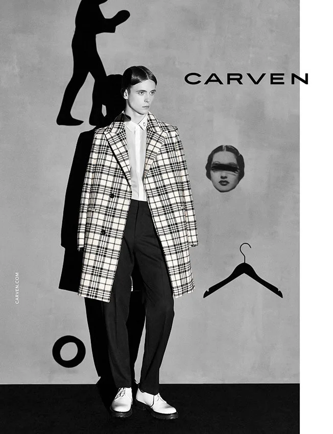
runway // james long menswear spring summer 2015

james long // menswear // ss 15
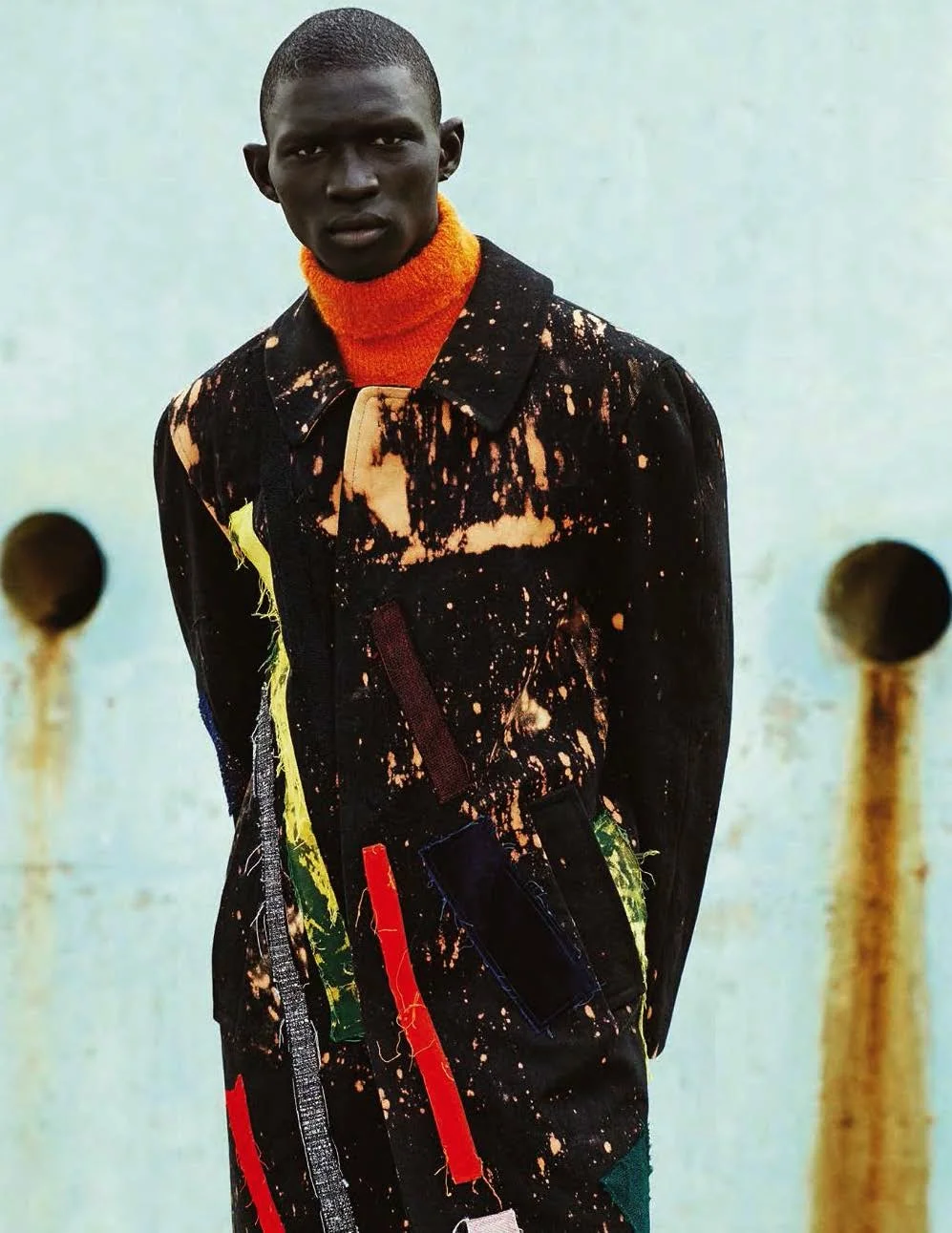
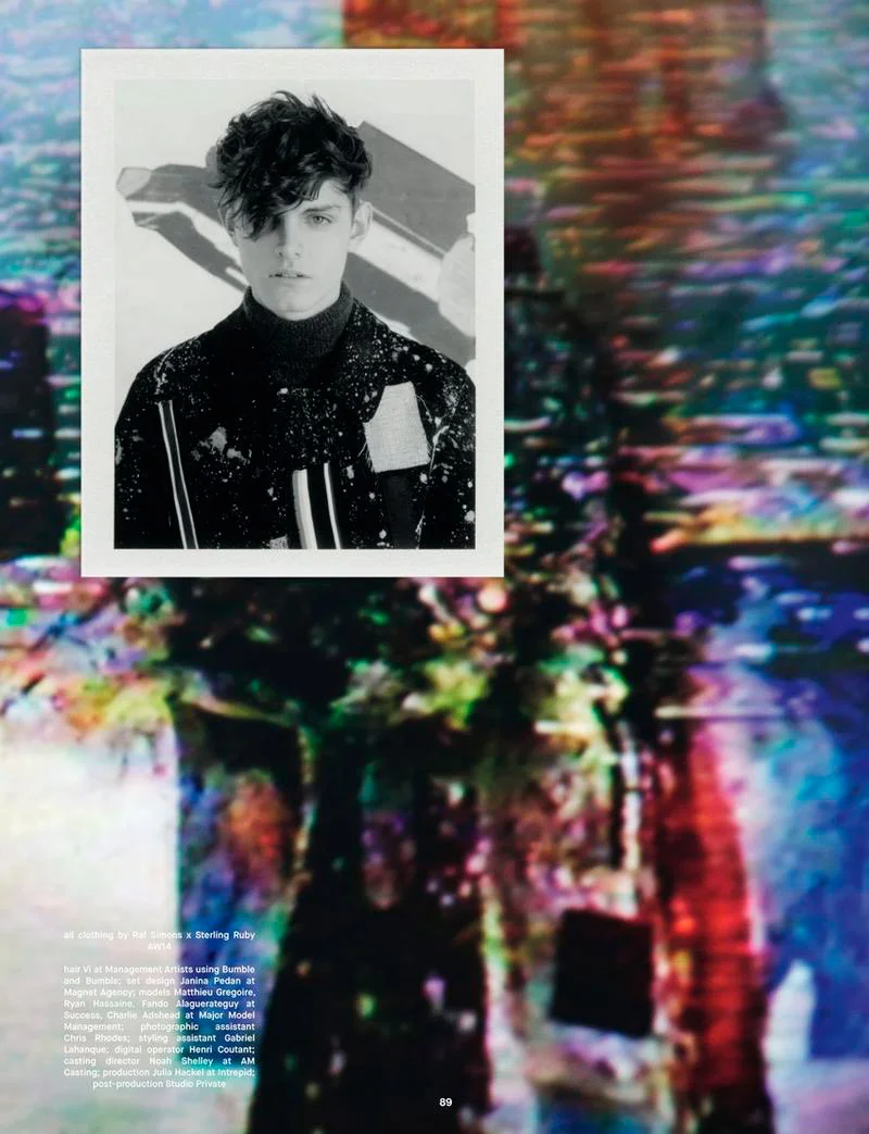
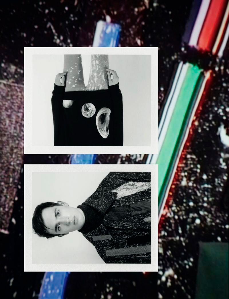
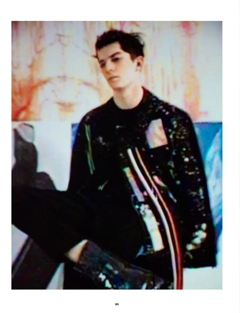
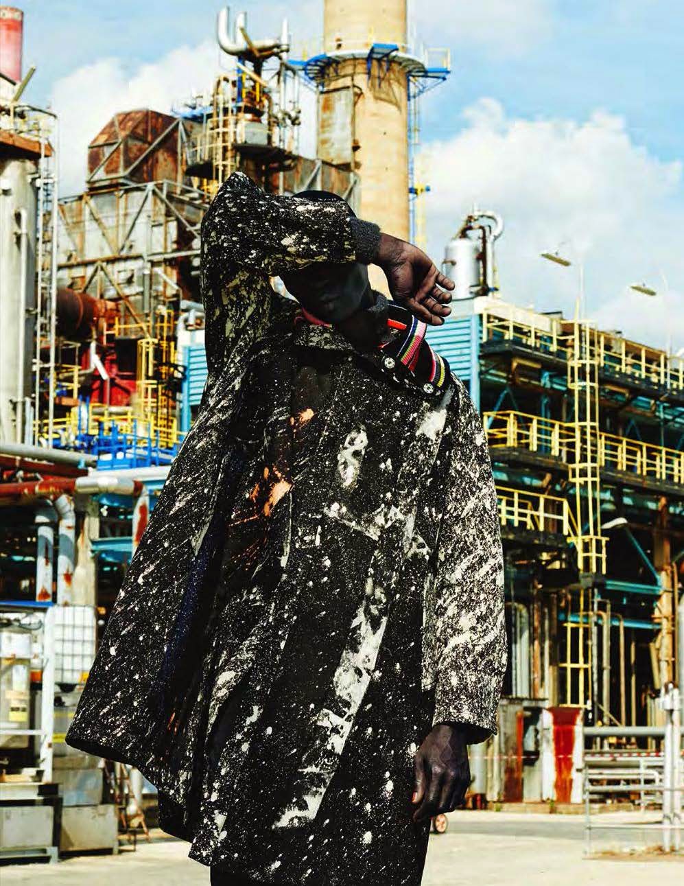
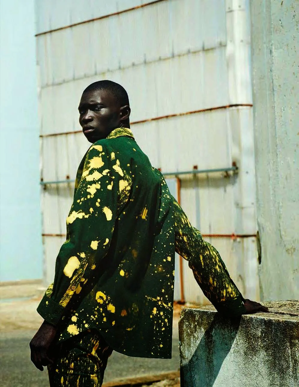
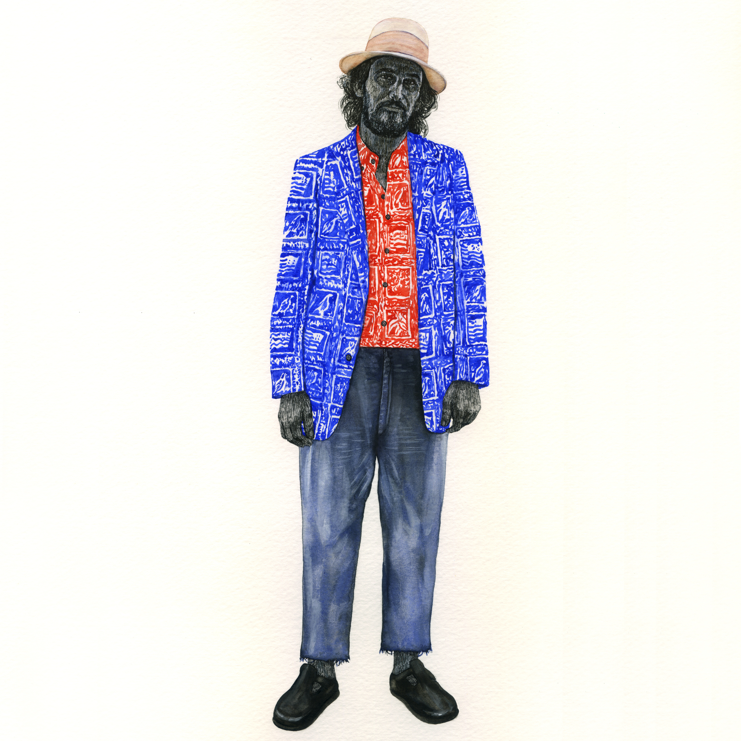
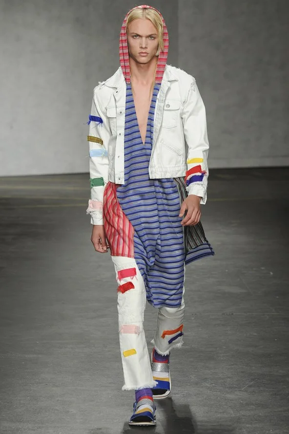
inspired by sportswear + youth culture, james long designed striped and color blocked athleisure + denim for his spring/summer 2015 menswear collection. the very cool getup has a definite street/punk vibe. and with primary colored patchwork, each piece looks like a work of contemporary art. as james long put it: "for me, it's more than just sportswear, it's fashion. it's what i wear."
* images via vogue uk // check out james long's website here *

james long // ss 15 menswear

james long // ss 15 menswear

james long // ss 15 menswear

james long // ss 15 menswear
james long // ss 15 menswear
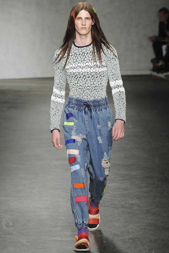
james long // ss 15 menswear

james long // ss 15 menswear